Bar Gauge shapes provide an easy graphical way to represent tag data. They are similar to the other gauge shapes, but with a simpler display and more configuration options.
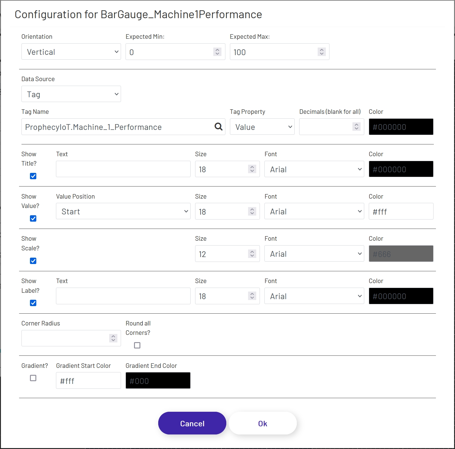
To add a pie chart to a diagram, drag the shape onto the canvas from the 'Live Data Shapes' section of the palette. Once the shape is on the canvas, click the 'Configure Bar Gauge' button in the left panel to configure which tag value will be shown and what the gauge will look like:
- Orientation: Choose whether the gauge is horizontal or vertical.
- Expected Min: Enter the lowest value you reasonably expect the tag being displayed to have, and it will be set as the minimum on the gauge. If the value goes outside of this range, the gauge will automatically pick a new range and change the scale dynamically, so setting a valid range will give better control over the display.
-
Expected Max: Enter the highest value you reasonably expect the tag being displayed to have, and it will be set as the maximum on the gauge. If the value goes outside of this range, the gauge will automatically pick a new range and change the scale dynamically, so setting a valid range will give better control over the display.
-
Data Source: This sets the source of the value displayed in the gauge, which can (among other things) affect how often the value refreshes. If a Data Point is being used, see here for details on how to configure that portion of the form.
- Tag Name: If 'Data Source' is set to 'Tag', this is the name of the tag whose data the gauge will display. Click the magnifying glass icon to open the tag selector window.
- Tag Property: This is the tag parameter whose value will be shown in the gauge.
- Decimal Places: It is not always preferable to show the value to the full level of precision, not to mention it would look bad in the gauge! It will rarely be important for an operator to know that a value is exactly 37.8427144109. Setting a number of decimal places to truncate the value to in this field will trim that to a value like 37.84. Note that this is a simple truncation - no rounding is done.
- Color: This sets the color that will be used for the tag value in the gauge.
Title
- Show Title?: If checked, a title will appear above the chart.
- Text: If 'Show Title' is checked, this is the text that will appear above the chart. It defaults to the name of the tag selected above, but can be changed.
- Size: The font size used on the title (if shown).
- Font: The font used in the title text (if shown).
- Color: This sets the color of the text used for the title.
Value
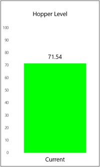
- Show Value?: If checked, a numeric value will appear in addition to the bar. This can make the gauge easier to read, especially if the scale is not being shown (see below).
- Value Position: This controls where the value appears, if 'Show Value' is checked:
- Start: The value will be fixed at the bottom or far left of the bar, depending on gauge orientation.
- Center: The value will float in the middle of the bar as it expands and contracts. Note that if the bar size gets too small, the value may not be visible, so keep that in mind when setting your expected range above.
- End: The value will float just above or to the right of the bar as it expands and contracts. Note that depending on whether or not your gauge is configured to show the title and the font sizes of the title and value, there may be some overlap when the bar value is very high. If necessary, you can disable the title and use a separate text shape to display the title. You may also want to leave the 'Show Title' option checked, but clear out the 'Title' field, to leave blank space at the top of the gauge within the border.
- Size: The font size used for the value (if shown).
- Font: The font used in the value text (if shown).
- Color: This sets the color of the text used for the value, if 'Show Value?' is checked. Depending on the 'Value Position' setting, you'll want to set a color that stands out against either the main diagram background or the 'Bar Color' chosen above.
Scale
- Show Scale?: If checked, a scale will appear to the left or below the gauge, depending on the orientation.
- Size: The font size used for the scale (if shown).
- Font: The font used in the scale text (if shown).
- Color: The color used for the scale (if shown).
Label
- Show Label?: If checked, a label will appear at the bottom or to the left of the gauge, depending on the orientation.
- Text: If 'Show Label' is checked, this is the text that will be used for the label. It defaults to the name of the tag selected above, but can be changed.
- Size: The font size used for the label (if shown).
- Font: The font used in the label text (if shown).
- Color: The color used for the label text (if shown).
Appearance
- Corner Radius: If a numeric value is put here, the corners of the end of the bar gauge will be rounded - either the top if in vertical orientation or the right if in horizontal. The higher the value, the more dramatic the curve will be. There is a maximum value which will have any effect, which varies based on the width of the end of the gauge.
- Round all Corners?: If checked, the value set above will be applied to all 4 courners of the gauge rather than just the end. This is useful for creating pill-shaped gauges.
- Gradient?: If checked, a gradient can be applied to the color of the value bar on the gauge. For example, a gauge could be green at one end, gradually shifting to red as the value gets towards the top of the gauge. Gradient colors override the value color set above in the form.
- Gradient Start Color: The color used for the start of the value bar - either the bottom if in vertical orientation or the left if in horizontal.
- Gradient End Color: The color used for the end of the value bar - either the top if in vertical orientation or the right if in horizontal.