HMIs can be used for simple "read only" Andon-style boards, or for allowing operators to submit values to the Data Acquisition Engine or CSI (through Mongoose). The shapes described here allow operators to perform actions. For shapes used only for displaying data, see here.
Submit Button 
The submit button is made up of several sections. The top of the config form applies to the entire button click. Below that, the green + icon can be used to add as many submit actions as desired for that button. When an operator clicks the button, the actions will be performed sequentially by priority (see below). If an action fails, further execution will stop and depending on the submit type and config, either the operator will see an error or a message will be logged for review.
Note that clicking these buttons in design view will not actually submit the button. The diagram needs to be in live mode for buttons to function.
To configure a submit button, drag it onto the canvas and then click the 'Configure Submit Button' button in the left panel. An editor window will appear, with some settings at the top:
- Show Clicked Message?: If enabled, a configurable message will be displayed to the operator immediately when the button is clicked, separate from any 'Success' messages configured below. This 'Clicked' message will always display, regardless of the success of the button's configured actions.
- Message Type: If 'Show Clicked Message?' is checked, this dropdown will be enabled and allow the selection of the type of 'Clicked' message that will display to the operator. This controls the color and how long the message will stay on the screen. 'Success' and 'Update'-type messages fade away over 5 seconds. The other types remain on the screen until the operator closes them.
- Clicked Message: This sets the text to display to the operator when the button is clicked, if 'Show Clicked Message?' is checked.
Below those options, the diagram designer can click the green + and red - icons to add/remove submit actions to the button click. Each action has a few settings in common:
- Submit Type: This is the type of action that will be performed when this submit's turn comes up - Tag, Mongoose, or Database.
- Priority: This sets the order in which the submits triggered by this button click will occur. As noted above, if a submit fails, the button processing aborts and any lower-priority submits will not happen.
- Show Success Message?: If enabled, a message will be displayed to the operator that says 'Action completed successfully.' if this action is successful. Note that only one success message will appear on the screen at once. Those messages fade away over 5 seconds, so if another submit succeeds after that long (after a long-running Mongoose query, for example) the message will display again and start fading again.
Below the standard options, each submit type also has its own config.
Tag Submit Config
This submit type allows operators to submit values to tags in the Data Acquisition Engine. A single submit button can do as many tag submits as is required.
- Tag Name: This is the name of the tag you want to change a value on. Click the magnifying glass icon to open a window to select the tag.
- Tag Property: This is the name of the tag property you are setting the value of, usually 'Value'.
- Value Source: Choose either 'Predefined', 'Shape', or 'Data Point'.
- Property Value: If 'Predefined' was chosen above, this field will display to specify the value that will be set on the tag. This can be a hard-coded value like "Bob", or tokens can be used to get live values when the button is pressed by an operator.
- Input Field: If 'Shape' was chosen for the Value Source above, this dropdown will be displayed to select the user input shape that the button should get the value from when the operator clicks it.
- Column Name: If the Input Field is a grid, this field will display to choose the column name to take the value from when submitting to the tag.
- Reset?: If an Input Field is being used for the data source, this box will appear. Checking it will cause the source shape to reset when this tag submit button is checked. If a default was specified for that shape, it will revert to that default. If not, the input field will be cleared.

Mongoose Submit Config
This submit type allows operators to interact with Mongoose IDOs - inserting a new record, invoking an IDO method, etc. A single submit button can make as many Mongoose calls as is needed, and each can be configured to submit property values from user input shapes, tokens, tag values, or predefined values.
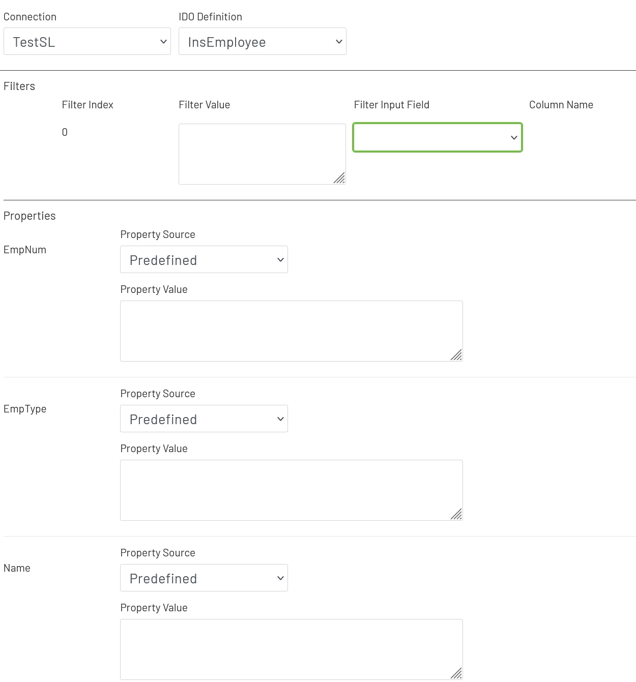
- Connection: Choose the Mongoose connection this button should make its IDO calls through. Most sites will only have one, in which case the option will be selected automatically.
- IDO Definition: Choose the name of the IDO Definition you want to submit to.
If filters were set up on the IDO, a row for each will be listed in this section of the form. The 'Filter Index' is the number that will be replaced with the value specified for each filter row (see the linked page above for more info). Each row can specify either a predefined value set by the diagram designer, or a value provided by the operator.
- Filter Value: If you want to use a predefined value, put it here. This field also supports tokens.
- Filter Input Field: If you want the filter value to come from a user input field on the diagram, choose its name from this dropdown.
- Column Name: If the shape chosen for a Filter Input Field is a grid (see below), choose the column the filter value should come from. The user will select that value by clicking on a row in the grid.
Each property set up on the IDO will also display on this form. Each row can specify either a predefined value set by the diagram designer, or a 'live' value provided by the operator.
- Property Source: This sets the source type that will be used for obtaining this property's value to submit to CSI - 'Predefined', 'Token', 'Shape', 'Tag', or 'Data Point'.
- Data Point: If the Property Source is set to 'Data Point', see here for details on how to configure that portion of the form.
- Property Value: If using a predefined value for the property source, this field will appear for you to enter a hard-coded value like "Bob".
- Token: If the Property Source is set to 'Token', this field will display for you to choose an option from the list of supported tokens.
- Property Input Field: If the Property Source is set to 'Input Field', choose the name of the input shape on the diagram from this dropdown.
- Column Name: If the shape chosen for the Property Input Field is a grid (see below), choose the column the value should come from. The user will select that value by clicking on a row in the grid.
- Tag Name: If 'Tag' is specified for the Property Source, choose the name of the tag to use here.
- Tag Parameter: If 'Tag' is specified for the Property Source, this is the tag parameter whose value will be sent to CSI. This will usually be 'Value', but there are many other tag parameters that can be used as well.
- Reset after Submit?: If an Input Field is being used for the data source, this box will appear. Checking it will cause the source shape to reset when this submit button is checked. If a default was specified for that shape, it will revert to that default. If not, the input field will be cleared.
Database Output Submit Config
This submit type allow operators to click a button and write information from the current diagram and Data Acquisition Engine to a SQL database. This can be used for logging and auditing, or getting machine and Mongoose data out of Prophecy for a custom process to use.
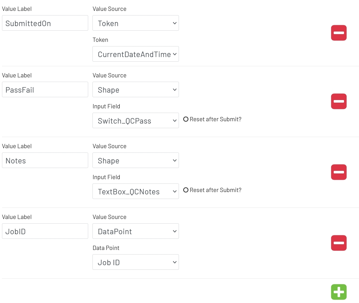
A single output submit can output multiple values. See here for details on the format of that output. To add or remove values from the output, use the green plus and red minus icons. Each row will be made up of some of these options:
- Value Label: This is just a label to indicate what the output value is for in the JSON doc, so it can be looked up. It would be something like "Employee ID", "Current Temperature", etc.
- Value Source: This determines where the value to be output is coming from - a predefined value, a token, another shape on the diagram, a tag value, or a Data Point.
- Data Point: If the Property Source is set to 'Data Point', see here for details on how to configure that portion of the form.
- Value: If the Value Source is set to 'Predefined', a text box will be shown for the diagram designer to enter a fixed value that will be output every time the button is clicked.
- Token: If the Value Source is set to 'Token', this dropdown allows the designer to choose which token's value will be output every time the button is clicked. Note that dates and times will be written in MM/DD/YYYY HH:MM:SS format.
- Input Field: When the 'Shape' Value Source is used, this dropdown allows the diagram designer to choose which shape's information will be output when the button is clicked. Note that each shape outputs slightly different information in addition to its value. See below for the full JSON doc format.
- Column Name: If the shape selected in the Input Field is a grid, this column will allow the designer to choose which column will be used for the output value.
- Reset after Submit?: If 'Shape' is being used for the Value Source, this box will appear. Checking it will cause the source shape to reset when this output button is checked. If a default was specified for that shape, it will revert to that default. If not, the input field will be cleared.
- Tag Name: When the Value Source is set to 'Tag', the designer can click the magnifying glass icon to choose which tag to get information from when the output button is clicked.
- Tag Parameter: If 'Tag' is specified for the Value Source, this is the tag parameter whose value will be output.
BarTender Submit Config
This submit type allow operators to click a button and print labels through BarTender.
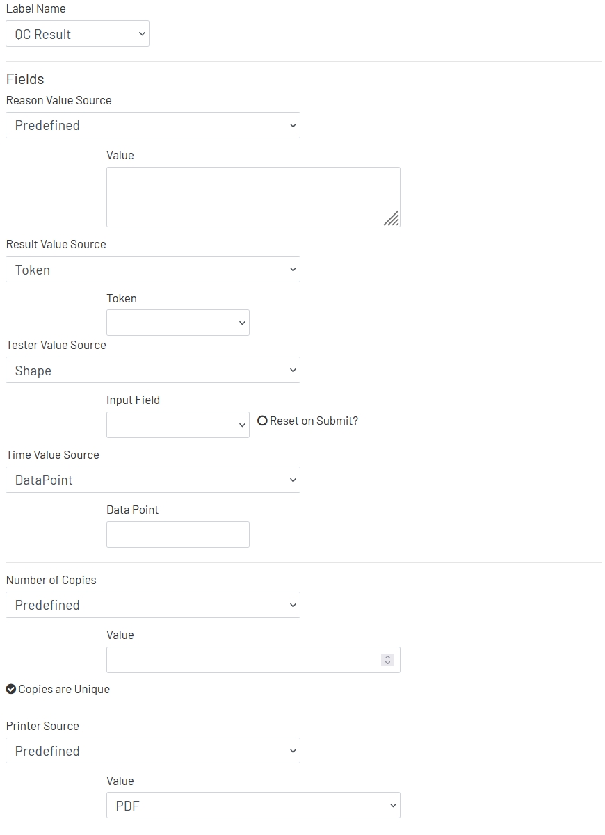
- Label Name: This tells BarTender which Label you want to print.
- #Field Name# Source: Each field for the selected Label will have an entry on the form, where you can choose the source of the live data that will be fetched when the operator clicks the print button.
- Data Point: If the Source is set to 'Data Point', see here for details on how to configure that portion of the form.
- Value: If the Source is set to 'Predefined', a text box will be shown for the diagram designer to enter a fixed value that will be used every time the button is clicked.
- Token: If the Source is set to 'Token', this dropdown allows the designer to choose which token's value will be used when the button is clicked. Note that dates and times will be sent in MM/DD/YYYY HH:MM:SS format.
- Input Field: When the 'Shape' Source is used, this dropdown allows the diagram designer to choose which shape's information will be used when the button is clicked.
- Column Name: If the shape selected in the Input Field is a grid, this column will allow the designer to choose which column will be used for the field value.
- Reset after Submit?: If 'Shape' is being used for the Value Source, this box will appear. Checking it will cause the source shape to reset when this button is checked. If a default was specified for that shape, it will revert to that default. If not, the input field will be cleared.
- Tag Name: When the Source is set to 'Tag', the designer can click the magnifying glass icon to choose which tag to get information from when the button is clicked.
- Tag Parameter: If 'Tag' is specified for the Source, this is the tag parameter whose value will be used for this field.
- Number of Copies: This sets the source for the number of copies that should be printed when this button is clicked. That will usually be 1, but if the value needs to be dynamic it has most of the same config options as fields do, listed above.
- Copies are Unique: This setting affects how serialized values are handled when this button is clicked. If a label has serialized fields and this is checked, each label will have unique serial numbers up to however many copies are printed. If the label has serialized fields and this is not checked, the configured number of copies will be printed all with the exact same values for all fields for each print job.
- Printer Source: This sets the source for the printer that should be printed to when this button is clicked. That will usually be predefined when the button is configured, but if the value needs to be dynamic it has the same config options as fields do, listed above. When 'Predefined' is selected, a list of the available printers will be displayed to choose from.
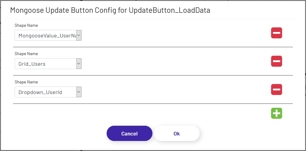
Mongoose Update Button 
This button tells the diagram to call the IDO(s) configured for one or more Mongoose value displays, dropdowns, or combo boxes to fetch new values. The individual configuration for each shape specified is used, which means that multiple calls to multiple IDOs (and even multiple connections) can be made at once.
To configure an update button, drag it onto the canvas and then click the 'Configure Mongoose Button' button in the left panel. Add as many rows as are needed, and specify each shape that should fetch a new value when this button is clicked:
Note that clicking these buttons in design view will not actually submit the button. The diagram needs to be in live mode for buttons to function.
Background Icons
Both submit and update buttons support using a set of icon images for their backgrounds:
To use one of these backgrounds, simply choose from the radio button list above. If a button uses icon backgrounds, there are a few changes to how it works:
-
Color Rules change the color of the icon lines, rather than the button background color. Icon buttons still allow you to choose a separate background color as well.
-
Icon buttons cannot have preset text or Text Rules. Use a separate text shape if a label is needed in addition to the icon.
-
Icon buttons must always be square to prevent warping of the icon image, so the diagram tool enforces that.
Note: To make the button round to match the icon shape, set the corner radius to 1/2 the width of the shape.