This shape allows you to show historical tag data over a period of X seconds. To add this to a diagram, drag this shape ![]() onto the canvas, then click the 'Configure Trend Display' button in the left-hand panel. The following window will open, with a few options to configure for the chart:
onto the canvas, then click the 'Configure Trend Display' button in the left-hand panel. The following window will open, with a few options to configure for the chart:
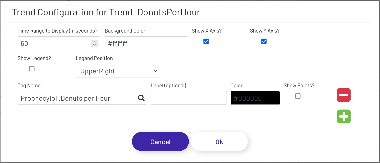
- Time Range to Display (in seconds): This sets how many seconds of data the trend chart should show. The max is 100. Unless the trend shape is very wide on the diagram, it generally looks best to set this to a low value, especially if points are being shown (see below).
- Background Color: This sets the color of the background of the 'main' area of the trend chart. Note that the outer area cannot be changed, so there will always be at least a small white area outside of the background, depending on the axis settings below.
- Show X Axis?: If checked, time stamps will be shown along the bottom of the trend chart. The chart will try to pick time stamps far enough apart that they display well given the width of the chart shape on the diagram, so the number of time stamps shown will vary.
- Show Y Axis?: If checked, values will be shown along the left side of the trend chart. The chart tries to scale the line and values shown to the range currently visible on the trend, so if the values of the tag being shown vary widely, the scale on the left will change over time. The chart will try to pick value labels far enough apart that they display well given the height of the chart shape on the diagram, so the number of values shown will vary.
- Show Legend?: If checked, a legend showing the line colors and labels of the displayed tags will appear at the location chosen below.
- Legend Position: This sets where the legend should appear in the chart - UpperRight, UpperLeft, BottomRight, or BottomLeft.
The next few config settings will be displayed for each tag showing on the trend shape. Click the green plus sign or red minus sign to the right of the form to add or remove tags to display on the trend.
- Tag Name: The name of the tag whose historical values should be shown. Note that the tag must be set as a 'Trend Point' in the Data Acquisition Engine. Contact the Prophecy Consulting Group for help getting that set up.
- Label: This sets the label to be shown for this tag in the legend if it is being displayed. If no label is set, the full tag name will be used.
- Color: The color of the line to draw for this tag on the chart.
- Show Points?: If checked, the trend line for this tag will have point marks (dots) at each value. This generally only looks good if a short time range is being displayed.