As of release version 6.0.0, some Live Data Shapes have had significant improvements and some shapes have changed to combine the functionlaity of multiple shapes. All previously availalbe shapes have been retained for backwards compatibility and are planned for complete deprecation in future releases.
Gauges 

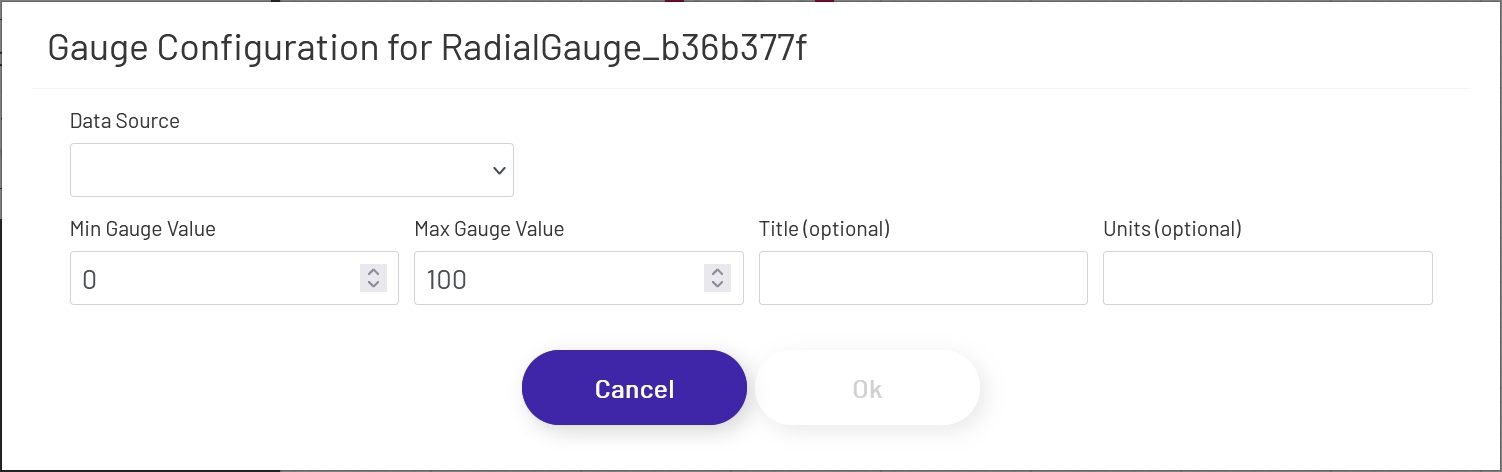
Gauges allow you to display numeric values in an easy to read graphical format. Radial gauges are always circular and will retain their aspect ratio as you drag and resize the shape on the canvas. Linear gauges will switch between vertical and horizontal display, depending on which axis is larger as you resize it. Once you have the gauge sized and positioned how you want, click the 'Configure Gauge' button in the left-hand panel and set it up:
- Data Source: This sets the source of the value displayed in the gauge, which can (among other things) affect how often the value refreshes. If a Data Point is being used, see here for details on how to configure that portion of the setup.
- Tag Name: If 'Data Source' is set to 'Tag', this is the name of the tag whose data the gauge will display. Click the magnifying glass icon to open the tag selector window.
- Tag Property: This is the name of the tag property you are display the value of, usually 'Value'.
- Min Gauge Value: This sets the minimum value expected by the gauge. If the actual value goes below this, the needle will 'bottom out' but the numeric value shown in the gauge will continue to update.
- Max Gauge Value: This sets the maximum value expected by the gauge. If the actual value goes above this, the needle will 'max out' but the numeric value shown in the gauge will continue to update.
- Title: If a title is provided, it will display near the top of the gauge.
- Units: If a value is provided, it will display near the bottom of the gauge.
Pie Charts 
Pie Chart shapes provide a familiar display format for multiple pieces of machine data at one time.
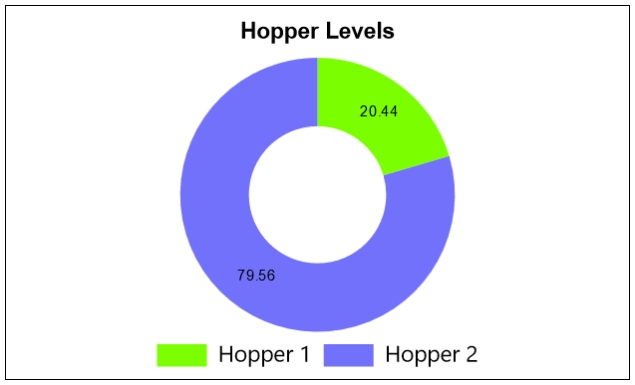
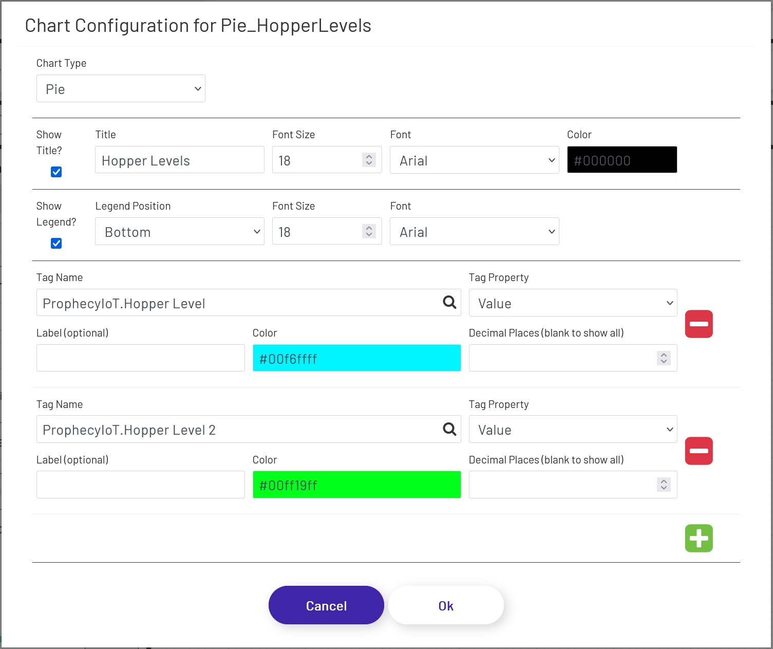
To add a pie chart to a diagram, drag the shape onto the canvas from the 'Live Data Shapes' section of the palette. Once the shape is on the canvas, click the 'Configure Pie Chart' button in the left panel to configure which tag values will be shown and what the chart will look like:
- Chart Type: Choose either 'Pie' or 'Doughnut'. The functionality of each is the same; this setting only changes how the chart looks on the diagram.
- Show Title?: If checked, a title will appear above the chart.
- Title: If 'Show Title' is checked, this is the text that will appear above the chart.
- Font Size: The font size used on the title (if shown).
- Font: The font used in the title text (if shown).
- Color: This sets the color of the text used for both the title and the legend labels.
- Show Legend?: If checked, legend text and color labels will display for each value being displayed in the chart.
- Legend Position: Controls where the legend will display in relation to the chart - top, bottom, left, or right.
- Font Size: The font size used on the legend (if shown).
- Font: The font used in the legend text (if shown).
Each tag being shown in the chart has the following config options. Use the + and - icons on the right to add and remove tags that will be shown.
- Tag Name: This dropdown allows the designer to choose which tag's value will be shown. Click the magnifying glass icon to open the tag selector window.
- Tag Property: This is the tag parameter whose value will be shown in the chart.
- Label: If a value is entered here, it will be used for the label text for that tag (if labels are enabled). If left empty, the tag name will be used.
- Color: This sets the color that will be used for the tag value in the pie chart.
- Decimal Places: It is not always preferable to show the value to the full level of precision, not to mention it would look bad in the chart! It will rarely be important for an operator to know that a value is exactly 37.8427144109. Setting a number of decimal places to truncate the value to in this field will trim that to a value like 37.8427. Note that this is a simple truncation - no rounding is done.
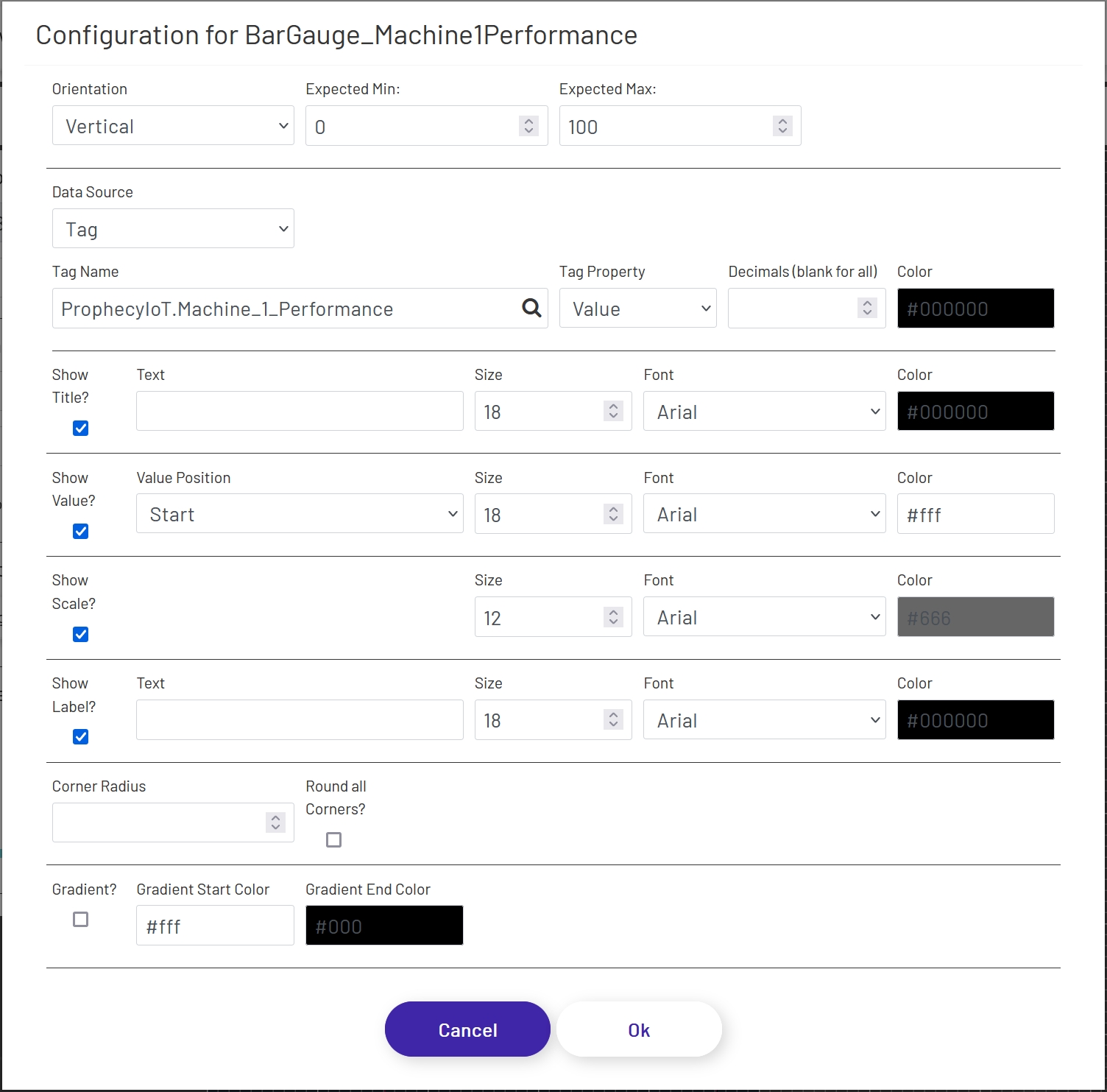
Bar Gauges 
Bar Gauge shapes provide an easy graphical way to represent tag data. They are similar to the other gauge shapes, but with a simpler display and more configuration options.
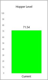
To add a bar gauge to a diagram, drag the shape onto the canvas from the 'Live Data Shapes' section of the palette. Once the shape is on the canvas, click the 'Configure Bar Gauge' button in the left panel to configure which tag value will be shown and what the gauge will look like:
- Orientation: Choose whether the gauge is horizontal or vertical.
- Expected Min: Enter the lowest value you reasonably expect the tag being displayed to have, and it will be set as the minimum on the gauge. If the value goes outside of this range, the gauge will automatically pick a new range and change the scale dynamically, so setting a valid range will give better control over the display.
-
Expected Max: Enter the highest value you reasonably expect the tag being displayed to have, and it will be set as the maximum on the gauge. If the value goes outside of this range, the gauge will automatically pick a new range and change the scale dynamically, so setting a valid range will give better control over the display.
-
Data Source: This sets the source of the value displayed in the gauge, which can (among other things) affect how often the value refreshes. If a Data Point is being used, see here for details on how to configure that portion of the form.
- Tag Name: If 'Data Source' is set to 'Tag', this is the name of the tag whose data the gauge will display. Click the magnifying glass icon to open the tag selector window.
- Tag Property: This is the tag parameter whose value will be shown in the gauge.
- Decimal Places: It is not always preferable to show the value to the full level of precision, not to mention it would look bad in the gauge! It will rarely be important for an operator to know that a value is exactly 37.8427144109. Setting a number of decimal places to truncate the value to in this field will trim that to a value like 37.84. Note that this is a simple truncation - no rounding is done.
- Color: This sets the color that will be used for the tag value in the gauge.
Title
- Show Title?: If checked, a title will appear above the chart.
- Text: If 'Show Title' is checked, this is the text that will appear above the chart. It defaults to the name of the tag selected above, but can be changed.
- Size: The font size used on the title (if shown).
- Font: The font used in the title text (if shown).
- Color: This sets the color of the text used for the title.
Value
- Show Value?: If checked, a numeric value will appear in addition to the bar. This can make the gauge easier to read, especially if the scale is not being shown (see below).
- Value Position: This controls where the value appears, if 'Show Value' is checked:
- Start: The value will be fixed at the bottom or far left of the bar, depending on gauge orientation.
- Center: The value will float in the middle of the bar as it expands and contracts. Note that if the bar size gets too small, the value may not be visible, so keep that in mind when setting your expected range above.
- End: The value will float just above or to the right of the bar as it expands and contracts. Note that depending on whether or not your gauge is configured to show the title and the font sizes of the title and value, there may be some overlap when the bar value is very high. If necessary, you can disable the title and use a separate text shape to display the title. You may also want to leave the 'Show Title' option checked, but clear out the 'Title' field, to leave blank space at the top of the gauge within the border.
- Size: The font size used for the value (if shown).
- Font: The font used in the value text (if shown).
- Color: This sets the color of the text used for the value, if 'Show Value?' is checked. Depending on the 'Value Position' setting, you'll want to set a color that stands out against either the main diagram background or the 'Bar Color' chosen above.
Scale
- Show Scale?: If checked, a scale will appear to the left or below the gauge, depending on the orientation.
- Size: The font size used for the scale (if shown).
- Font: The font used in the scale text (if shown).
- Color: The color used for the scale (if shown).
Label
- Show Label?: If checked, a label will appear at the bottom or to the left of the gauge, depending on the orientation.
- Text: If 'Show Label' is checked, this is the text that will be used for the label. It defaults to the name of the tag selected above, but can be changed.
- Size: The font size used for the label (if shown).
- Font: The font used in the label text (if shown).
- Color: The color used for the label text (if shown).
Appearance
- Corner Radius: If a numeric value is put here, the corners of the end of the bar gauge will be rounded - either the top if in vertical orientation or the right if in horizontal. The higher the value, the more dramatic the curve will be. There is a maximum value which will have any effect, which varies based on the width of the end of the gauge.
- Round all Corners?: If checked, the value set above will be applied to all 4 courners of the gauge rather than just the end. This is useful for creating pill-shaped gauges.
- Gradient?: If checked, a gradient can be applied to the color of the value bar on the gauge. For example, a gauge could be green at one end, gradually shifting to red as the value gets towards the top of the gauge. Gradient colors override the value color set above in the form.
- Gradient Start Color: The color used for the start of the value bar - either the bottom if in vertical orientation or the left if in horizontal.
- Gradient End Color: The color used for the end of the value bar - either the top if in vertical orientation or the right if in horizontal.
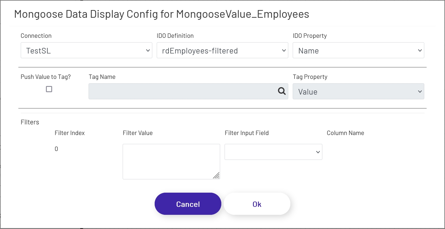
Mongoose Value Display 
This shape displays a single value from a Mongoose IDO call. The value will update when the diagram is first loaded, and any time an associated update button (see here) is clicked. To configure this shape, drag the element onto the canvas and then click the 'Configure Mongoose Data Display' button in the left panel:
- Connection: Choose the Mongoose connection this button should make its IDO calls through. Most sites will only have one, in which case the option will be selected automatically.
- IDO Definition: Choose the name of the IDO Definition you want to display a returned value from.
- IDO Property: Choose the name of the IDO Property in the definition selected above whose value you want to display. This must be a single value able to be displayed in simple text, after any filters are applied (see below). If a list of values needs to be displayed, use the Mongoose dropdown shape (see below).
- Push Value to Tag?: If this is checked, the value displayed in this Mongoose shape will be pushed into the specified Tag Name and Tag Property in the Data Acquisition Engine whenever the value in this shape is updated.
- Tag Name: The tag to push values to when this shape updates, if 'Push Value to Tag?' is checked.
- Tag Property: The tag property to push values to when this shape updates, if 'Push Value to Tag?' is checked.
If filters were set up on the IDO, a row for each will be listed in this section of the form. The 'Filter Index' is the number that will be replaced with the value specified for each filter row (see the linked page above for more info). Each row can specify either a predefined value set by the diagram designer, or a 'live' value provided by the operator.
- Filter Value: If you want to use a predefined value, put it here. This field also supports tokens.
- Filter Input Field: If you want the filter value to come from a user input field on the diagram, choose its name from this dropdown.
- Column Name: If the shape chosen for a Filter Input Field is a grid (see below), choose the column the filter value should come from. The user will select that value by clicking on a row in the grid.
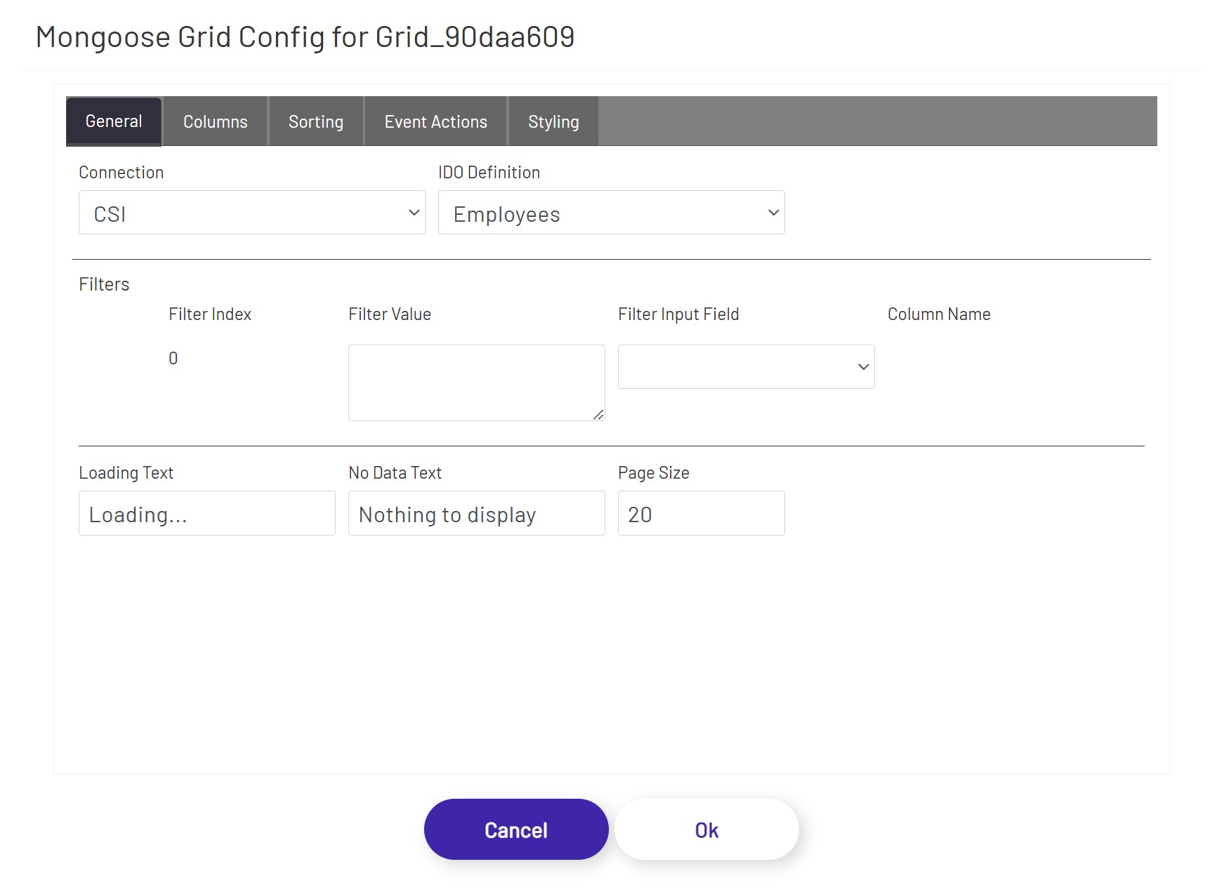
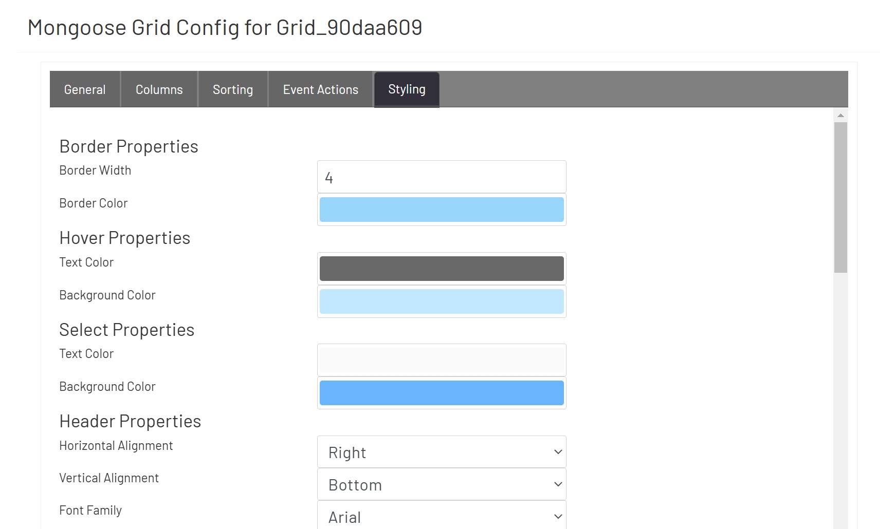
Mongoose Grid 
This shape allows users to see a grid of information, and select rows to use as inputs for other shapes if necessary. There are built-in paging controls, and other inputs on the diagram can be used to filter down the results shown in the grid. To configure one of these grids, drag it onto the canvas and then click the 'Configure Mongoose Grid' button in the left panel:
- Connection: Choose the Mongoose connection this grid should make its IDO calls through. Most sites will only have one, in which case the option will be selected automatically.
- IDO Definition: Choose the name of the IDO Definition you want to display returned values from.
If filters were set up on the IDO, a row for each will be listed in this section of the form. The 'Filter Index' is the number that will be replaced with the value specified for each filter row (see the linked page above for more info). Each row can specify either a predefined value set by the diagram designer, or a 'live' value provided by the operator in another shape.
- Filter Value: If you want to use a predefined value, put it here. This field also supports tokens.
- Filter Input Field: If you want the filter value to come from a user input field on the diagram, choose its name from this dropdown.
- Column Name: If the shape chosen for a Filter Input Field is another grid, choose the column the filter value should come from. The user will select that value by clicking on a row in the other grid.
There are 3 general settings for the grid:
- Loading Text: If the IDO call is taking more than a couple of seconds to return results and populate the grid, this text will display in an overlay over the grid shape.
- No Data Text: This will display at the top of the grid shape if no rows were returned to display in the grid.
- Page Size: How many rows of data to show per page. Depending on this value and the size of the grid shape on the diagram, the user may have to scroll up and down or click between pages to see all results.
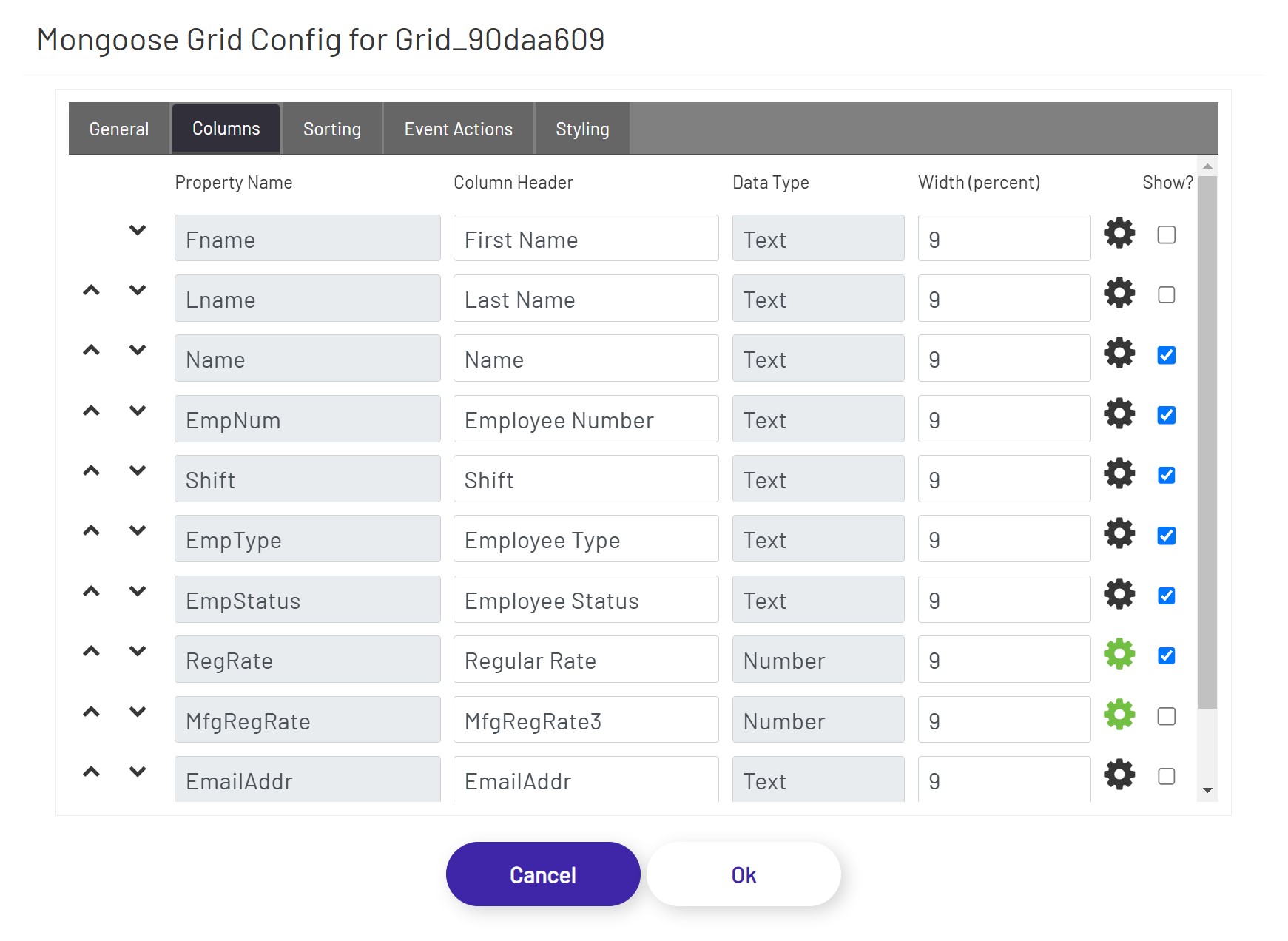
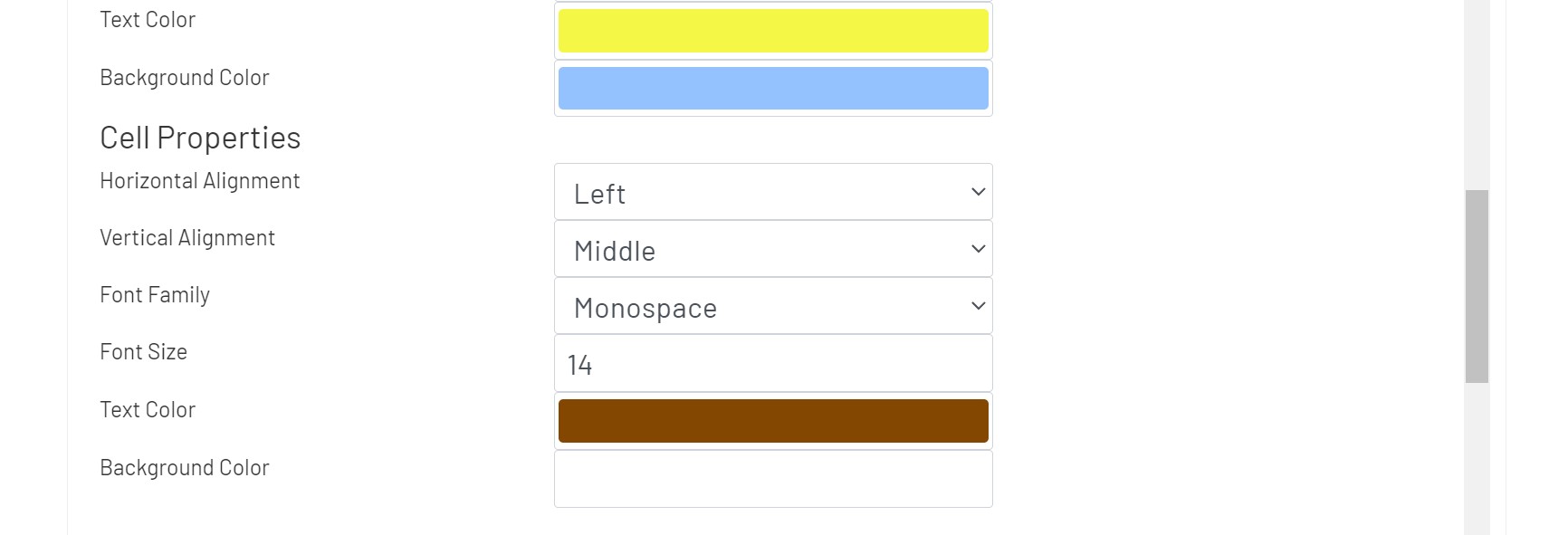
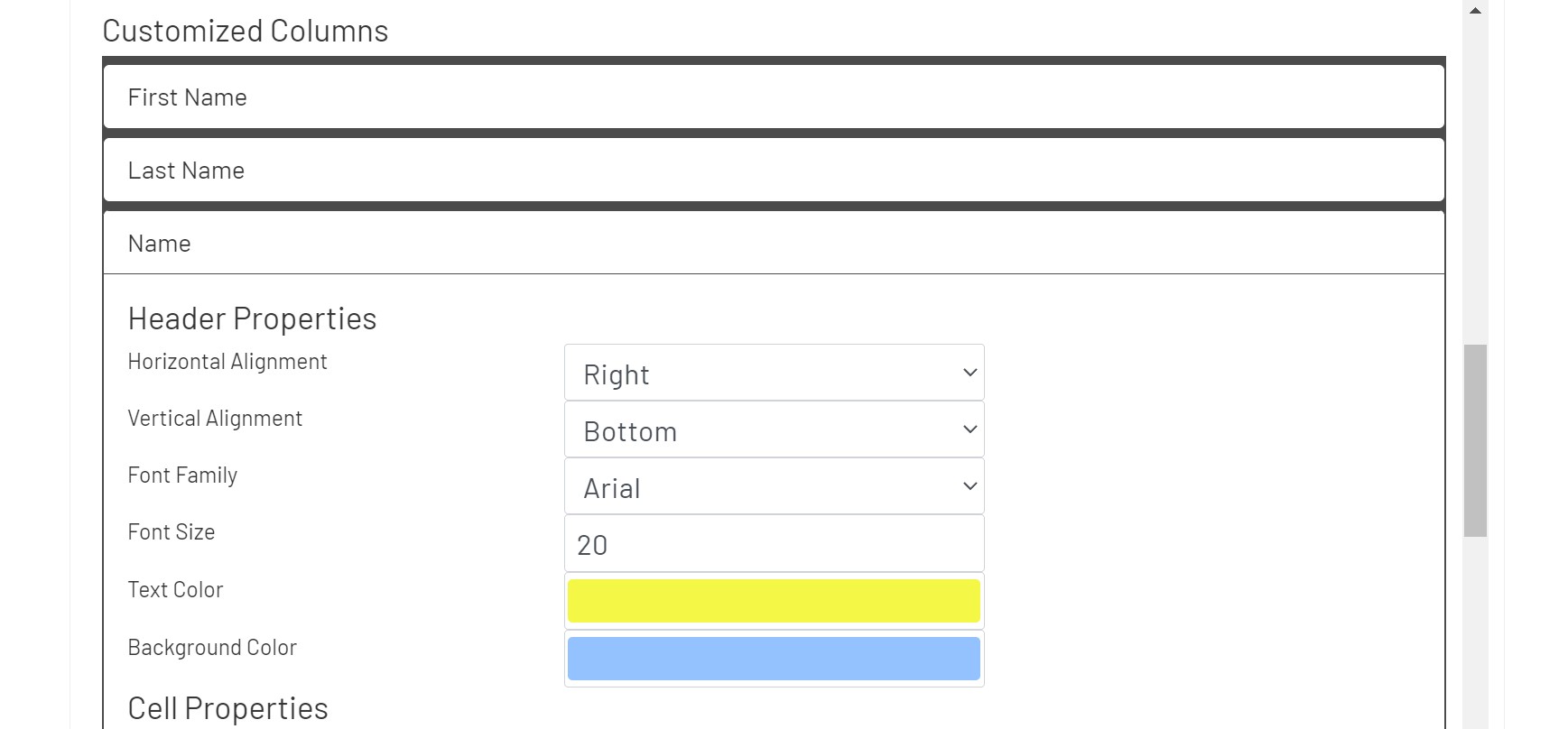
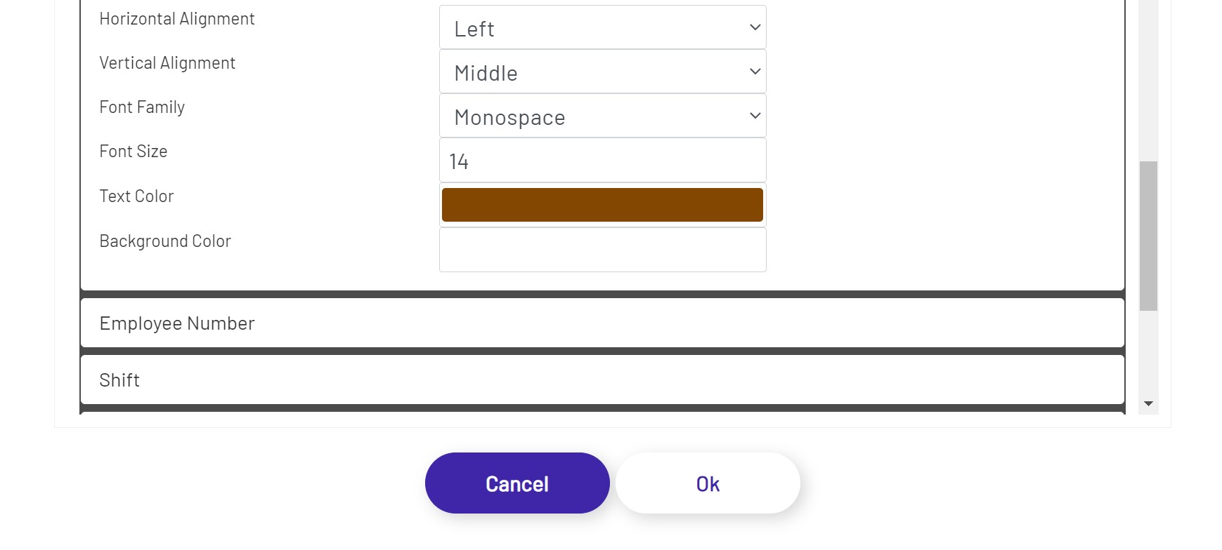
Each property set up on the IDO will also display on the Columns tab. The diagram designer can choose which column(s) appear in the grid, and configure some basic information for each:
- Column Order: Move columns up/down to define the order of the columns to be displayed in the grid.
- Column Header: This will be the label at the top of the column in the grid. It defaults to the name of the property from the IDO.
- Width (percent): Use this value to control how wide each column appears in the grid. These values should add up to 100 for the properties that have 'Show?' checked.
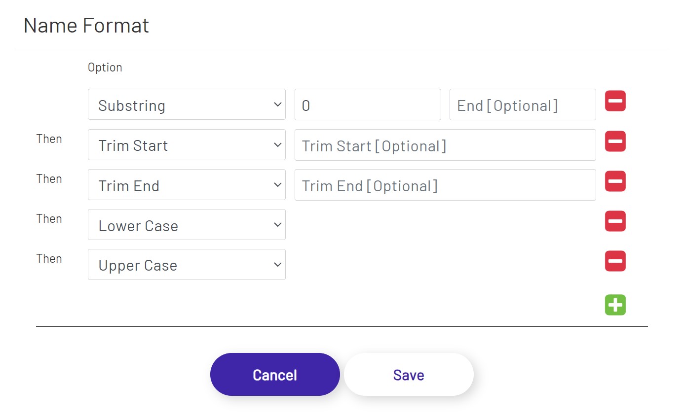
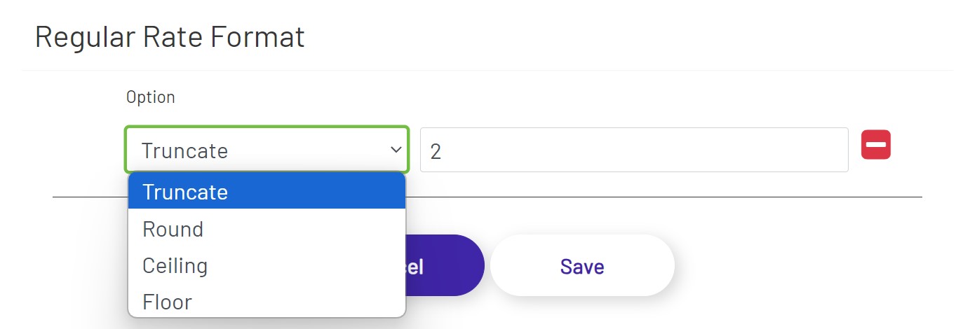
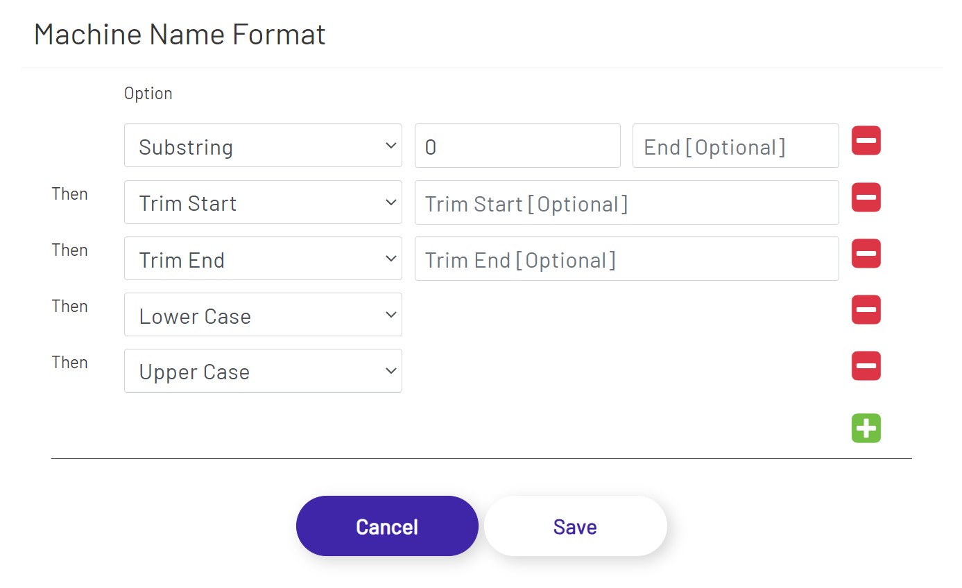
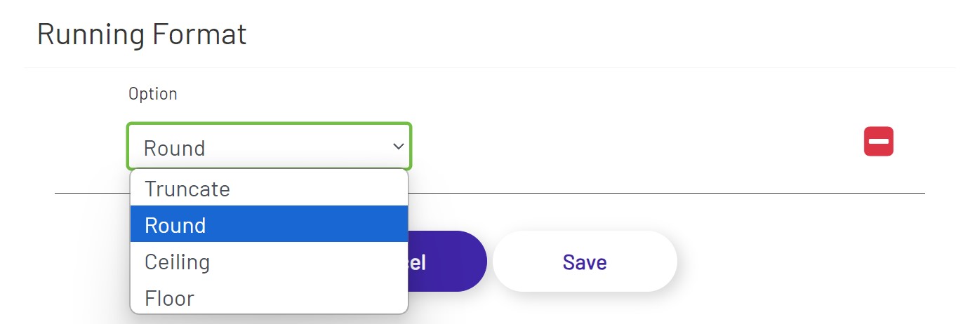
- Format: Apply data format to the values that are displayed in the columns. Text and number data types have different sets of options.
- Trim Start/Trim End: Whitespace is trimmed if no value is provided. Any provided value is treated as a pattern to trim from original text.
- Round: Returns the value of a number rounded to the nearest integer.
- Truncate: Returns a number with the specified number of decimal places.
- Ceiling: Returns the smallest integer greater than or equal to a given number. Example: 6.0 returns 6; 6.1 returns 7.
- Floor: Returns the largest integer less than or equal to a given number. Example: 6.0 returns 6; 6.9 returns 6.
- Show?: Uncheck this box if the property doesn't need to be displayed in the grid at all.
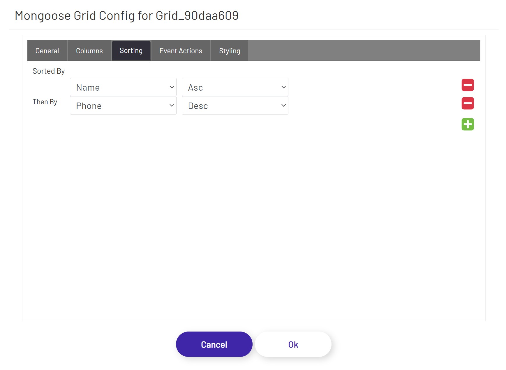
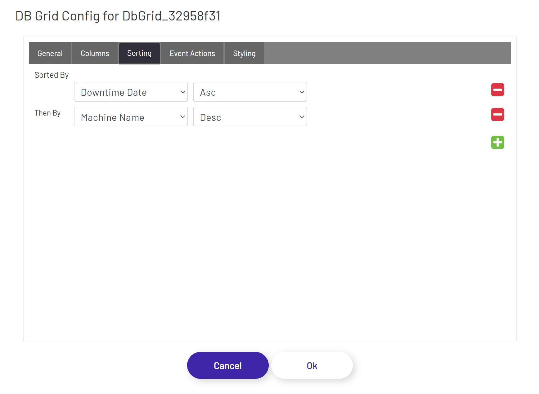
In the Sorting tab, the diagram designer can apply sorting orders on one or more column(s) in ascending or descending orders.
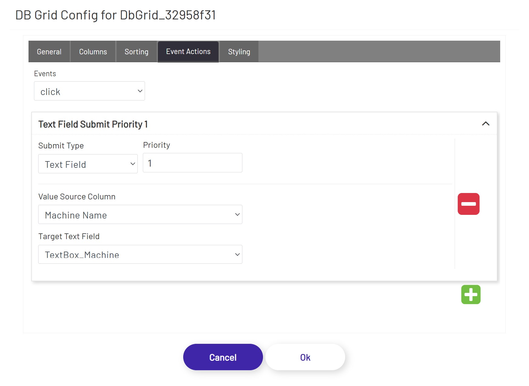
In the Event Actions tab, the diagram designer can define triggering one or more actions when a row of this grid is clicked.
The Mongoose Grid supports the actions listed below:
Text Field - This option allows the user to choose a column from this grid and a targeted text field. When a row of this grid is clicked, the targeted text field will be populated with the value of the selected column in that row.
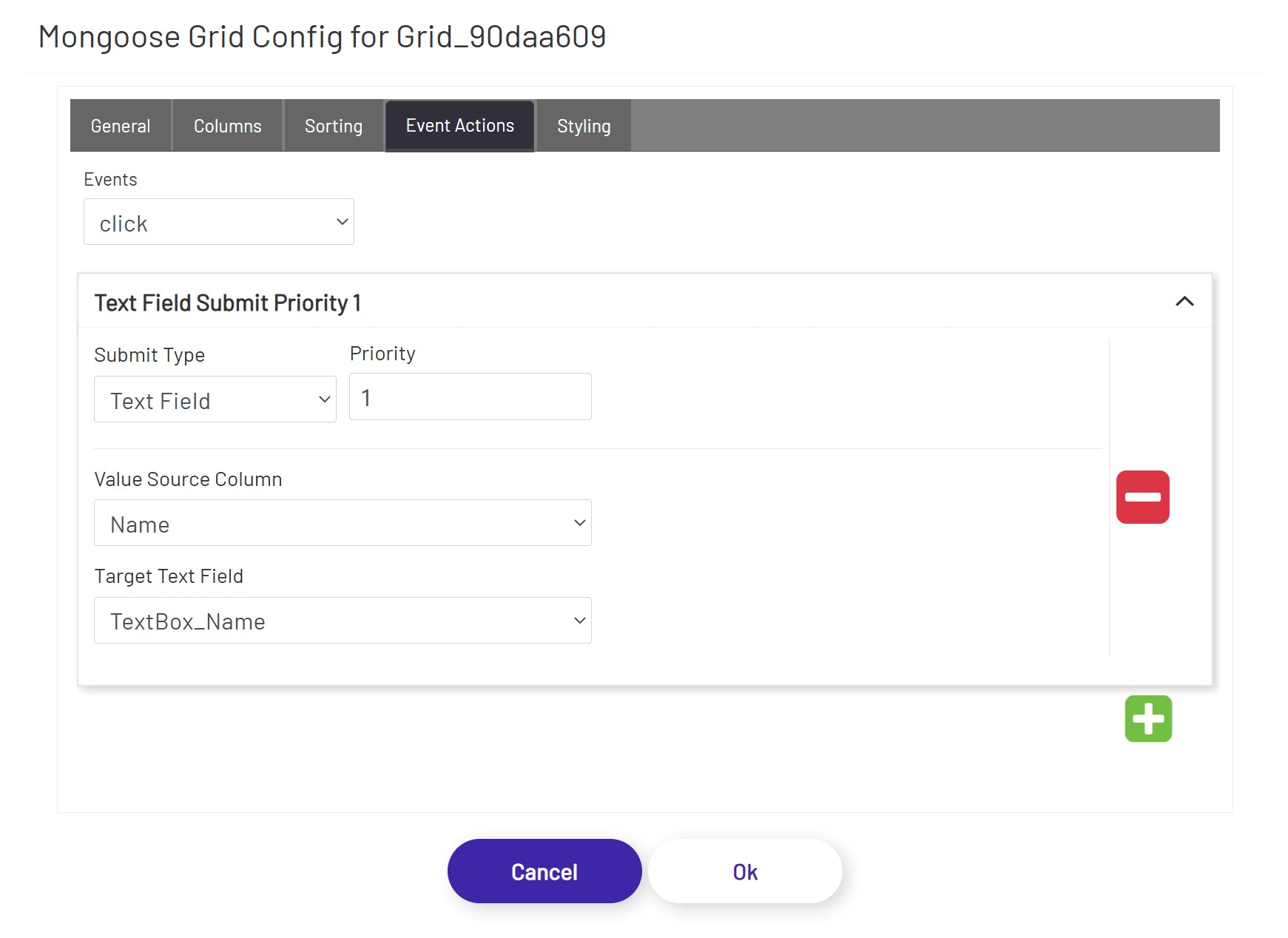
Tag Submit, Tag Refresh, Mongoose, Database, and BarTender see Submit Types
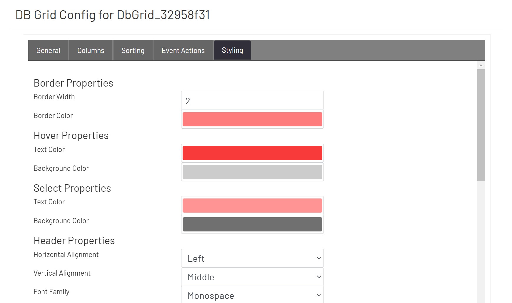
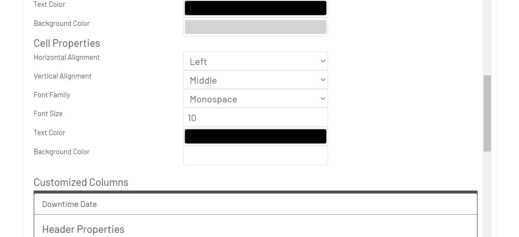
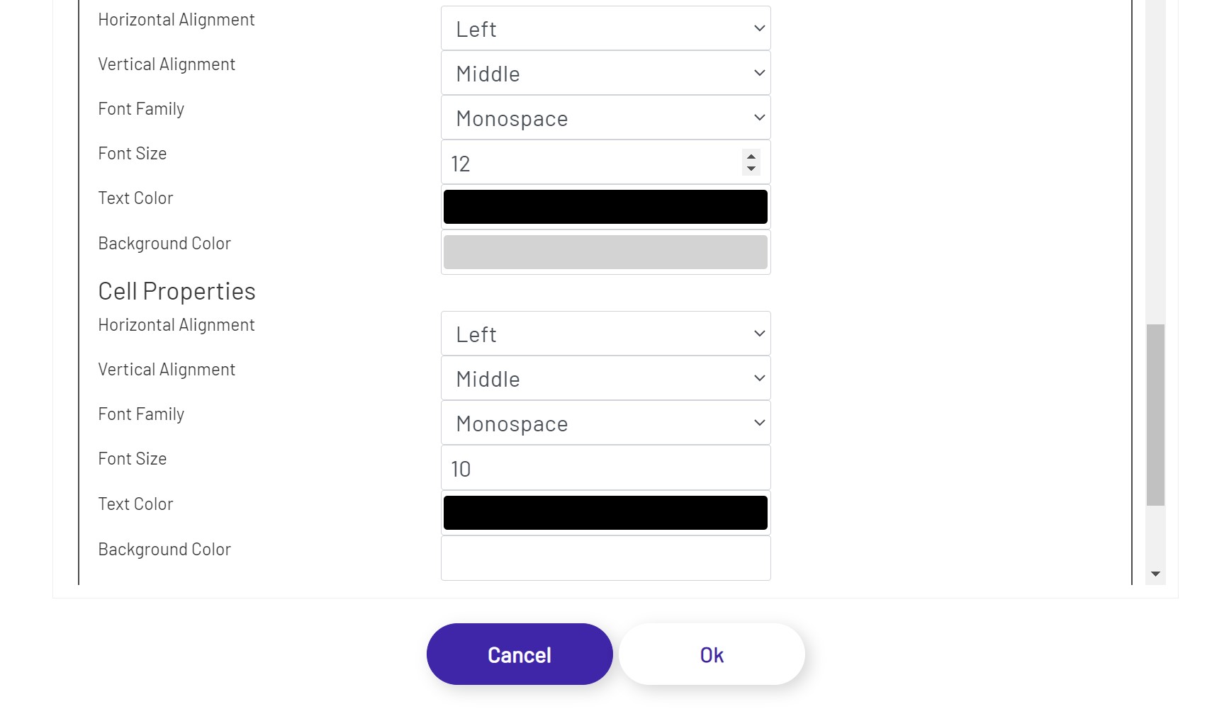
In the Styling tab, the diagram designer can apply styling properties to headers and cells with border, text styles, background color, and alignment etc.
DB Grid 
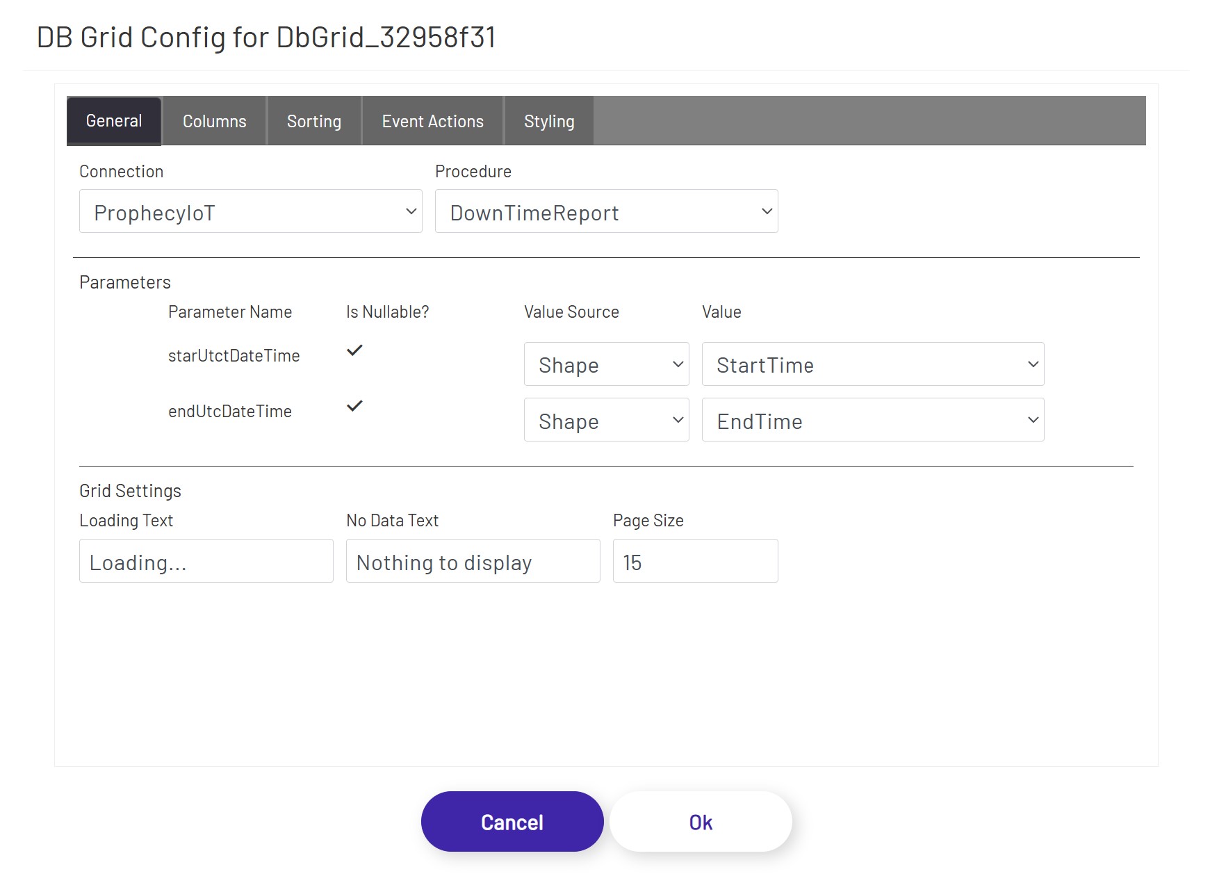
The DB grid shape let's users execute stored procedures from any database, and render the resulting tabular data in a grid. The grid offers some built-in features such as being able to page through the records, be able to sort by any column, filtration capabilities, and the ability to select rows and use the column values as inputs for other shapes, if necessary. To configure an instance of this shape, drag and drop it on to the canvas, and click the 'Configure DB Grid' button in the left panel. If the user is reconfiguring an existing instance, the previously saved settings will be populated in the grid, but if this is the first configuration, the grid will sequentially show the options as the prerequisites are being completed:
- Connection: Choose the database connection this grid should use for stored procedure execution. This grid control allows users to store and retrieve data from an arbitrary number of databases, and let's the user execute stored procedure based logic against any of those as long as the connections are configured in the admin section. Once a connection is selected, the configuration dialog will populate the Procedure drop down with all the available stored procedures in that database.
- Procedure: Choose the stored procedure to execute. The procedure could be one that takes no inputs but returns a set of data, one that takes input but does not return anything back (in which case, nothing will be rendered in the grid), one that doesn't take any inputs nor returns an output but executes logic inside the database, or any hybrid between those options and combinations.
Once the options above have been populated, the dialog will then render the Parameters section to allow the user to be able to set the stored procedure inputs. The DB grid shape can automatically detect the inputs expected by a stored procedure, and all the properties have to be populated before moving on to the next stage. In case the selected stored procedure does not have any input parameters, the dialog proceeds to the next set of options once the procedure is selected.
The inputs for each parameter should come from another shape, and is the only available option under Value Source. After picking Shape as the Value Source, pick the control that will be feeding the value into the parameter using the Value drop down.
If the stored procedure does not have any input parameters or after all the input parameters have been configured, the dialog then displays the next 2 sections that let's the user control grid properties as well as setting up the output columns.
The following configuration options are available under the Grid Settings section:
- Loading Text: If the stored procedure call is taking more than a couple of seconds to return results and populate the grid, this text will display in an overlay over the grid shape.
- No Data Text: This will display at the top of the grid shape if no rows were returned to display in the grid.
- Page Size: How many rows of data to show per page. Depending on this value and the size of the grid shape on the diagram, the user may have to scroll up and down or click between pages to see all the results.
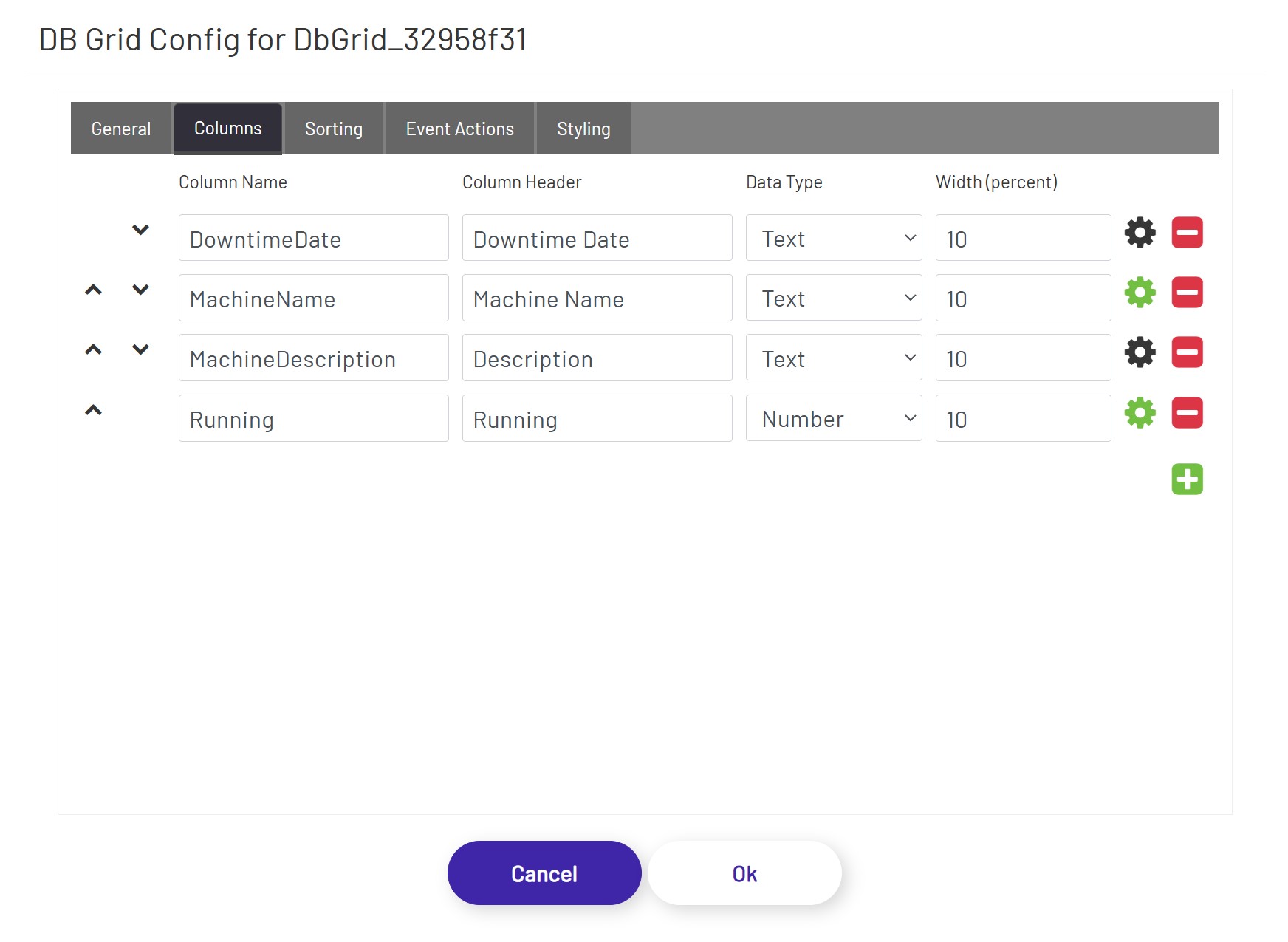
In the Columns tab, if the stored procedure returns data as output, the necessary subset of columns can be bound to the grid. The form of the output data of a stored procedure cannot be pre-calculated, and the column bindings have to be specified manually:
- Column Order: Move columns up/down to define the order of the columns to be displayed in the grid.
- Column Name: The name of the column as it appears inside the stored procedure.
- Column Header: The preferred label to be displayed at the top of the grid as the column header.
- Data Type: By default, all data will be interpreted and be rendered as Text, but by changing the data type (if the output from the stored procedure for that column is guaranteed to be in the grid data type that is being selected), the grid can use that information to render the data differently. For example, if BLOB data type is selected, the grid expects the stored procedure column output to be a base-64 encoded string of a file (content). If BLOB is selected, instead of rendered the returned base-64 encoded string, the grid cell will display a button that'll let the user either open or download the file content (depending on browser type, version, settings, etc. - if the browser can handle the file format, it will be opened in a separate tab, and if the browser cannot handle the file format, the user will be prompted to download the file).
- Width (percent): Use this value to control how wide each column appears in the grid. These values should add up to 100.
- Format: Apply data format to the values that are displayed in the columns. Text and number data types have different sets of options.
In the Sorting tab, the diagram designer can apply sorting orders on one or more column(s) in ascending or descending orders.
In the Event Actions tab, the diagram designer can define triggering one or more actions when a row of this grid is clicked.
The DB Grid supports the actions listed below:
Text Field - This option allows the user to choose a column from this grid and a targeted text field. When a row of this grid is clicked, the targeted text field will be populated with the value of the selected column in that row.
Tag Submit, Tag Refresh, Mongoose, Database, and BarTender see Submit Types
In the Styling tab, the diagram designer can apply styling properties to headers and cells with border, text styles, background color, and alignment etc.
Mongoose Update Button 
This button tells the diagram to call the IDO(s) configured for one or more Mongoose value displays, dropdowns, or combo boxes to fetch new values. The individual configuration for each shape specified is used, which means that multiple calls to multiple IDOs (and even multiple connections) can be made at once.
To configure an update button, drag it onto the canvas and then click the 'Configure Mongoose Button' button in the left panel. Add as many rows as are needed, and specify each shape that should fetch a new value when this button is clicked:
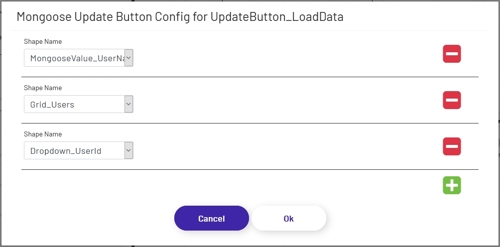
Note that clicking these buttons in design view will not actually submit the button. The diagram needs to be in live mode for buttons to function.
Background Icons
Both submit and update buttons support using a set of icon images for their backgrounds:
To use one of these backgrounds, simply choose from the radio button list above. If a button uses icon backgrounds, there are a few changes to how it works:
-
Color Rules change the color of the icon lines, rather than the button background color. Icon buttons still allow you to choose a separate background color as well.
-
Icon buttons cannot have preset text or Text Rules. Use a separate text shape if a label is needed in addition to the icon.
-
Icon buttons must always be square to prevent warping of the icon image, so the diagram tool enforces that.
Note: To make the button round to match the icon shape, set the corner radius to 1/2 the width of the shape.
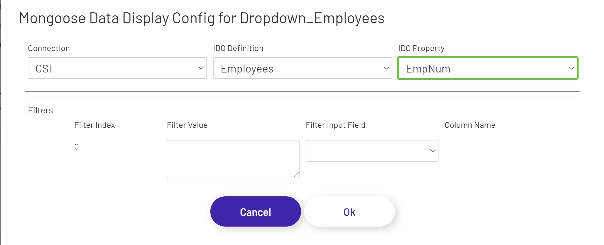
Mongoose Dropdown 
This shape allows the diagram designer to provide the operator with a list of options to choose from. Unlike the predefined dropdown option, this shape fetches its values from an IDO call. To configure one of these dropdowns, drag it onto the canvas and then click the 'Configure Mongoose Data Display' button in the left panel:
- Connection: Choose the Mongoose connection this button should make its IDO calls through. Most sites will only have one, in which case the option will be selected automatically.
- IDO Definition: Choose the name of the IDO Definition you want to display returned values from.
- IDO Property: Choose the name of the IDO Property in the definition selected above that whose values you want to display.
If filters were set up on the IDO, a row for each will be listed in this section of the form. The 'Filter Index' is the number that will be replaced with the value specified for each filter row (see the linked page above for more info). Each row can specify either a predefined value set by the diagram designer, or a 'live' value provided by the operator. Make sure that your filters are usually going to result in multiple values being returned, to populate the dropdown. If it's likely that only a single value will be returned, the Mongoose Value Display shape (see above) is probably a better fit for this part of the diagram.
- Filter Value: If you want to use a predefined value, put it here. This field also supports tokens.
- Filter Input Field: If you want the filter value to come from a user input field on the diagram, choose its name from this dropdown.
- Column Name: If the shape chosen for a Filter Input Field is a grid (see below), choose the column the filter value should come from. The user will select that value by clicking on a row in the grid.
Data Point Value 
Data Point Value shapes are used to display the value of Data Points on diagrams. Once the shape is dragged onto the canvas, click the 'Configure Data Point Display' button in the left panel to set it up. See here for an explanation of the different parts of the form.
Mongoose Combo Box 
Mongoose combo boxes allow users to type or scan input into a field, with a list of matching options presented in a dropdown as they type. This helps ensure that accurate values are provided, while still allowing the operator to enter a value other than the predefined list when necessary. Unlike the predefined combo box option, this shape fetches its values from an IDO call. Combo boxes are configured the same way Dropdowns are Mongoose Dropdown.