HMIs can be used for simple "read only" Andon-style boards, or for allowing operators to submit values to the Data Acquisition Engine or CSI (through Mongoose). The shapes described here are used for displaying data. For buttons allowing operators to perform actions, see here.
Tag Value 
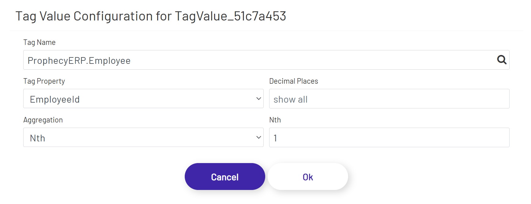
The first element is used to display a value from the selected tag on the diagram. That value is updated every second. Once the shape is dragged onto the canvas, click the 'Configure Tag Value Display' button in the left panel to set it up:
- Tag Name: This is the name of the tag you want to show the value of.
- Tag Property: This is the name of the tag property you are showing the value of. Note that some of the properties in this dropdown depend on features being enabled on that tag. For example, choosing to display an alarm limit value will not work if that alarm limit isn't enabled on the tag.
- Decimal Places: If a numeric Tag property is chosen above, this rounds the value to a specified number of decimals if it is not blank.
- Aggregation: If a DB Tag or an ERP Tag is chosen above, this aggregation selects/calculates a value from that Tag.
- Nth: If 'Nth' is chosen above as Aggregation, this defines the index of the value from its Tag property's value collection.
Trend Graph 
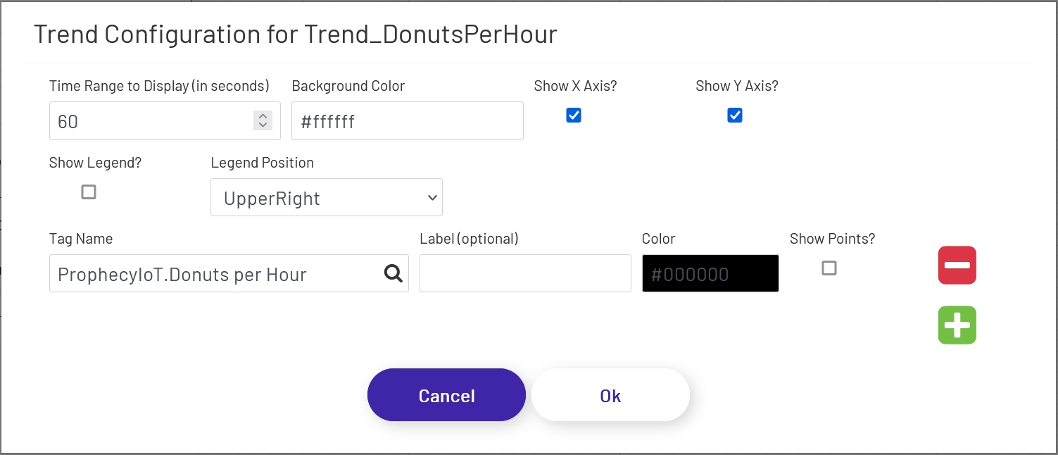
This shape allows you to show historical tag data over a period of X seconds. To add this to a diagram, drag this shape onto the canvas, then click the 'Configure Trend Display' button in the left-hand panel. The following window will open, with a few options to configure for the chart:
- Time Range to Display (in seconds): This sets how many seconds of data the trend chart should show. The max is 100. Unless the trend shape is very wide on the diagram, it generally looks best to set this to a low value, especially if points are being shown (see below).
- Background Color: This sets the color of the background of the 'main' area of the trend chart. Note that the outer area cannot be changed, so there will always be at least a small white area outside of the background, depending on the axis settings below.
- Show X Axis?: If checked, time stamps will be shown along the bottom of the trend chart. The chart will try to pick time stamps far enough apart that they display well given the width of the chart shape on the diagram, so the number of time stamps shown will vary.
- Show Y Axis?: If checked, values will be shown along the left side of the trend chart. The chart tries to scale the line and values shown to the range currently visible on the trend, so if the values of the tag being shown vary widely, the scale on the left will change over time. The chart will try to pick value labels far enough apart that they display well given the height of the chart shape on the diagram, so the number of values shown will vary.
- Show Legend?: If checked, a legend showing the line colors and labels of the displayed tags will appear at the location chosen below.
- Legend Position: This sets where the legend should appear in the chart - UpperRight, UpperLeft, BottomRight, or BottomLeft.
The next few config settings will be displayed for each tag showing on the trend shape. Click the green plus sign or red minus sign to the right of the form to add or remove tags to display on the trend.
- Tag Name: The name of the tag whose historical values should be shown. Note that the tag must be set as a 'Trend Point' in the Data Acquisition Engine. Contact the Prophecy Consulting Group for help getting that set up.
- Label: This sets the label to be shown for this tag in the legend if it is being displayed. If no label is set, the full tag name will be used.
- Color: The color of the line to draw for this tag on the chart.
- Show Points?: If checked, the trend line for this tag will have point marks (dots) at each value. This generally only looks good if a short time range is being displayed.
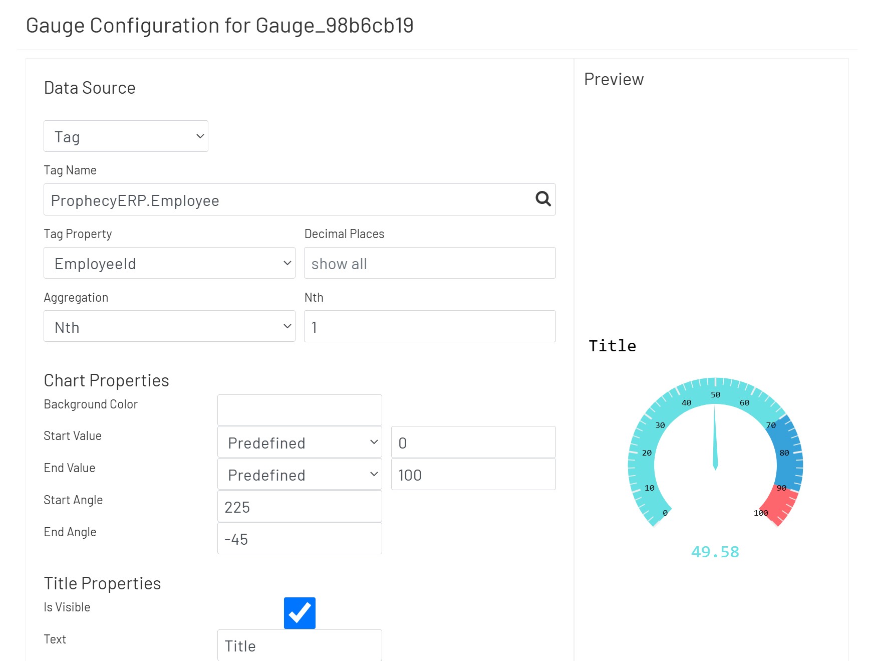
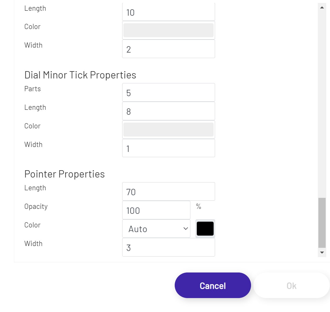
Gauge Charts 
Gauge Charts allow the user to display numeric values in a radial scale. Once the user has the gauge chart sized and positioned as desired, click the 'Configure Gauge Chart' button in the left-hand panel and set it up:
-
Data Source: This sets the source of the value displayed in the gauge, which can (among other things) affect how often the value refreshes.
- If a Data Point is being used, see here for details on how to configure that portion of the setup.
- If a Tag is being used
- Tag Name: If 'Data Source' is set to 'Tag', this is the name of the tag whose data the gauge will display. Click the magnifying glass icon to open the tag selector window.
- Tag Property: This is the property of the tag that is used to retrieve the value.
- Decimal Places: If a numeric Tag property is chosen above, this rounds the value to a specified number of decimals if it is not blank.
- Aggregation: If a DB Tag or an ERP Tag is chosen above, this aggregation selects/calculates a value from that Tag.
- Nth: If 'Nth' is chosen above as Aggregation, this defines the index of the value from its Tag property's value collection.
-
Chart Properties
- Start Value: The value at the most counter clock wise position. This configures a value between 'Predefined' and 'Tag'.
- End Value: The value at the most clock wise position. This configures a value between 'Predefined' and 'Tag'.
- Start Angle: The most counter clock wise position.
- End Angle: The most clock wise position. Value of End Angle should be smaller than Start Angle.
-
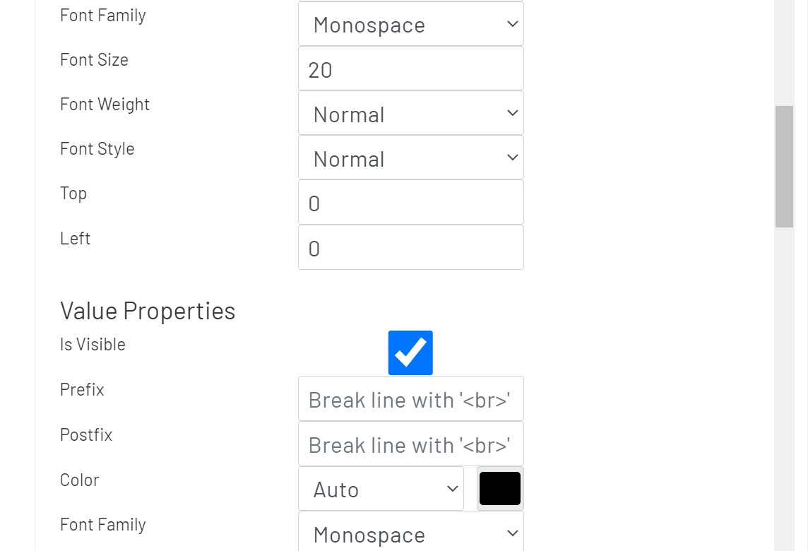
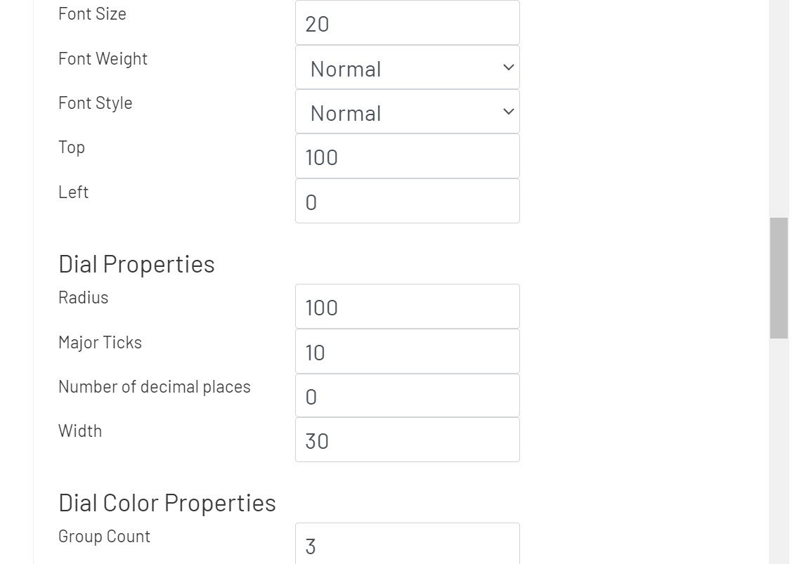
Title Properties
- Top: The distance from the top of this chart.
- Left: The distance from left of this chart.
-
Value Properties
- Top: The distance from the center of this chart.
- Left: The distance from the center of this chart.
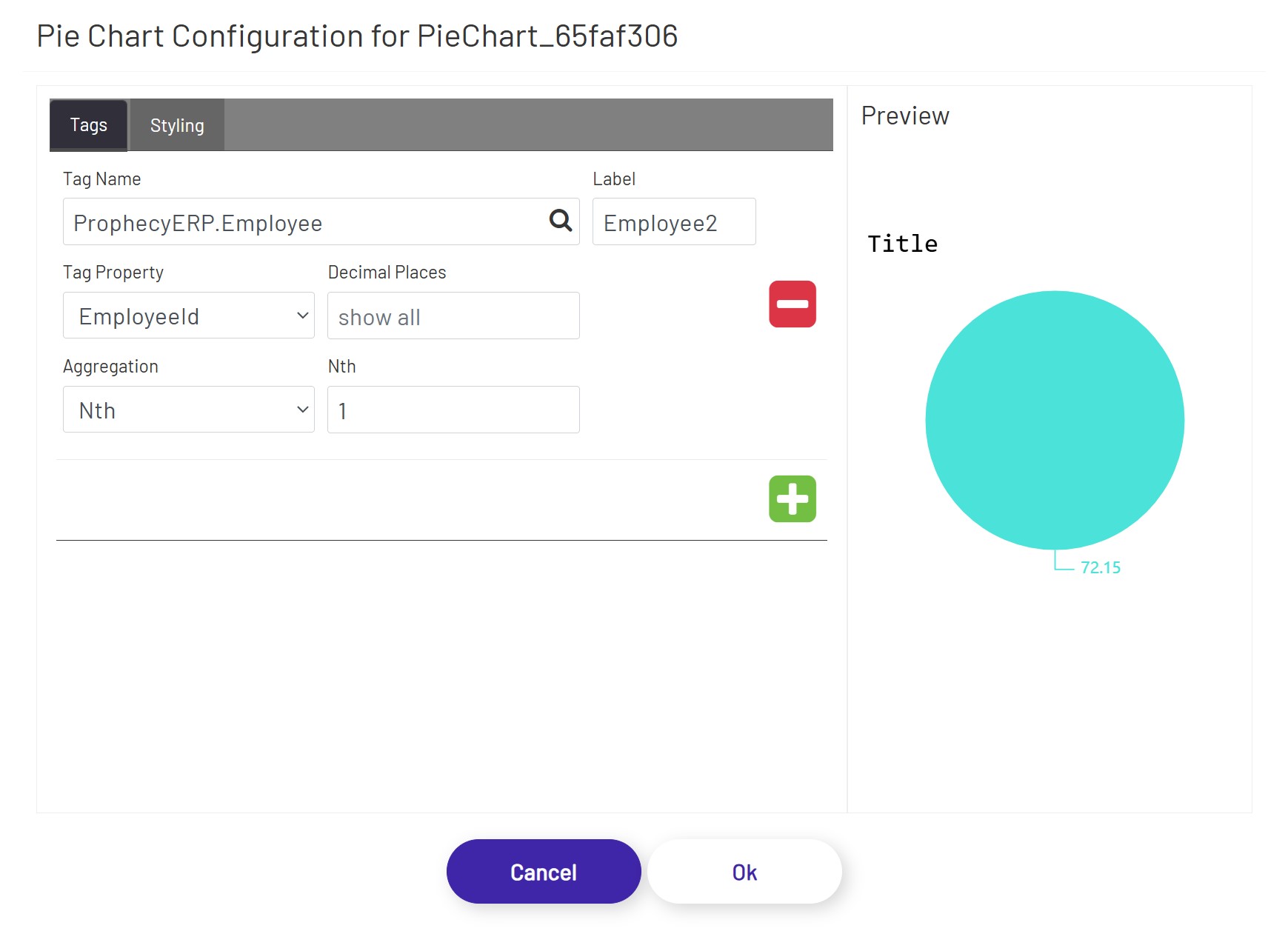
Pie Charts 
Pie Charts allow the user to display numeric values in circular form and in relation to each other. Once the user has the pie chart sized and positioned as desired, click the 'Configure Pie Chart' button in the left-hand panel and set it up:
In the Tags tab, the user can define tags to be shown in the pie chart.
- Tag Name: This tag selector allows the designer to choose which tag's value will be shown. Click the magnifying glass icon to open the tag selector window.
- Tag Property: This is the tag property whose value will be shown in the chart.
- Label: If a value is entered here, it will be used as the label text for that tag (if legends are visible).
- Decimal Places: If a numeric Tag property is chosen above, this rounds the value to a specified number of decimals if it is not blank.
- Aggregation: If a DB Tag or an ERP Tag is chosen above, this aggregation selects/calculates a value from that Tag.
- Nth: If 'Nth' is chosen above as Aggregation, this defines the index of the value from its Tag property's value collection.
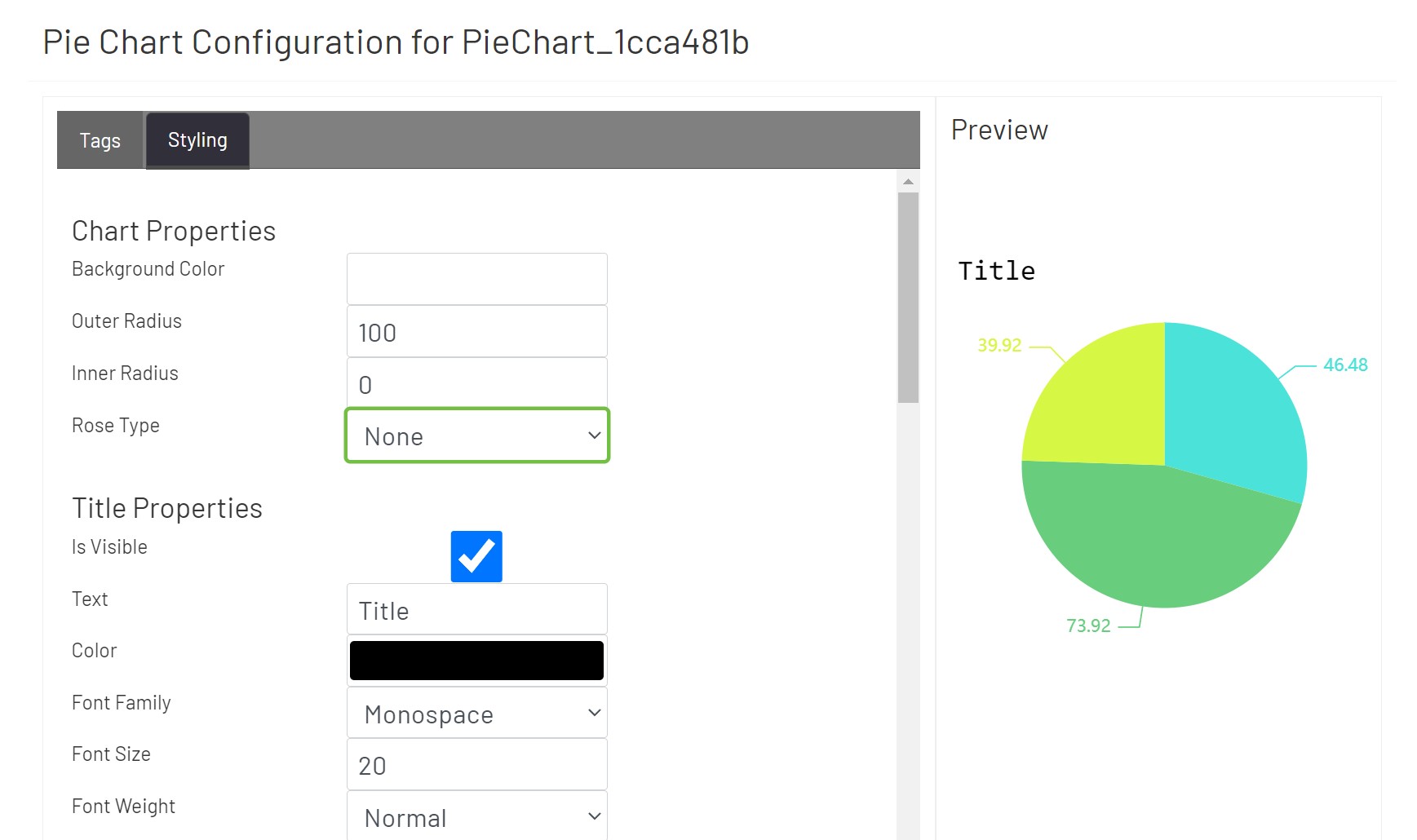
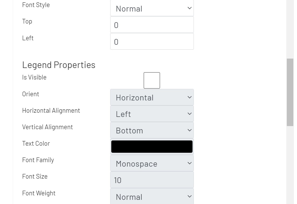
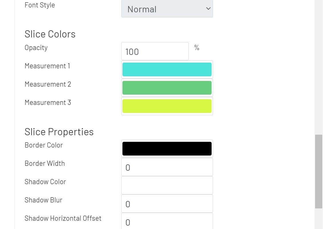
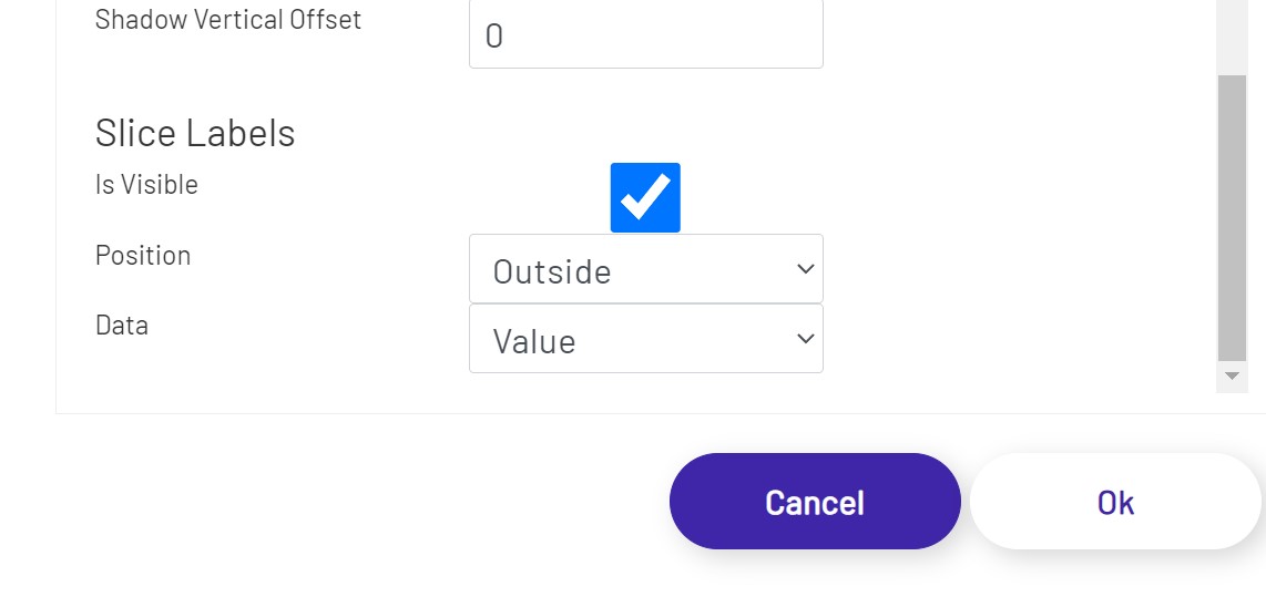
In the Styling tab, the user can apply styling properties for title, legends, and slices with text styles, background colors, and alignments etc.
- Title Properties
- Top: The distance from the top of this chart.
- Left: The distance from the left of this chart.
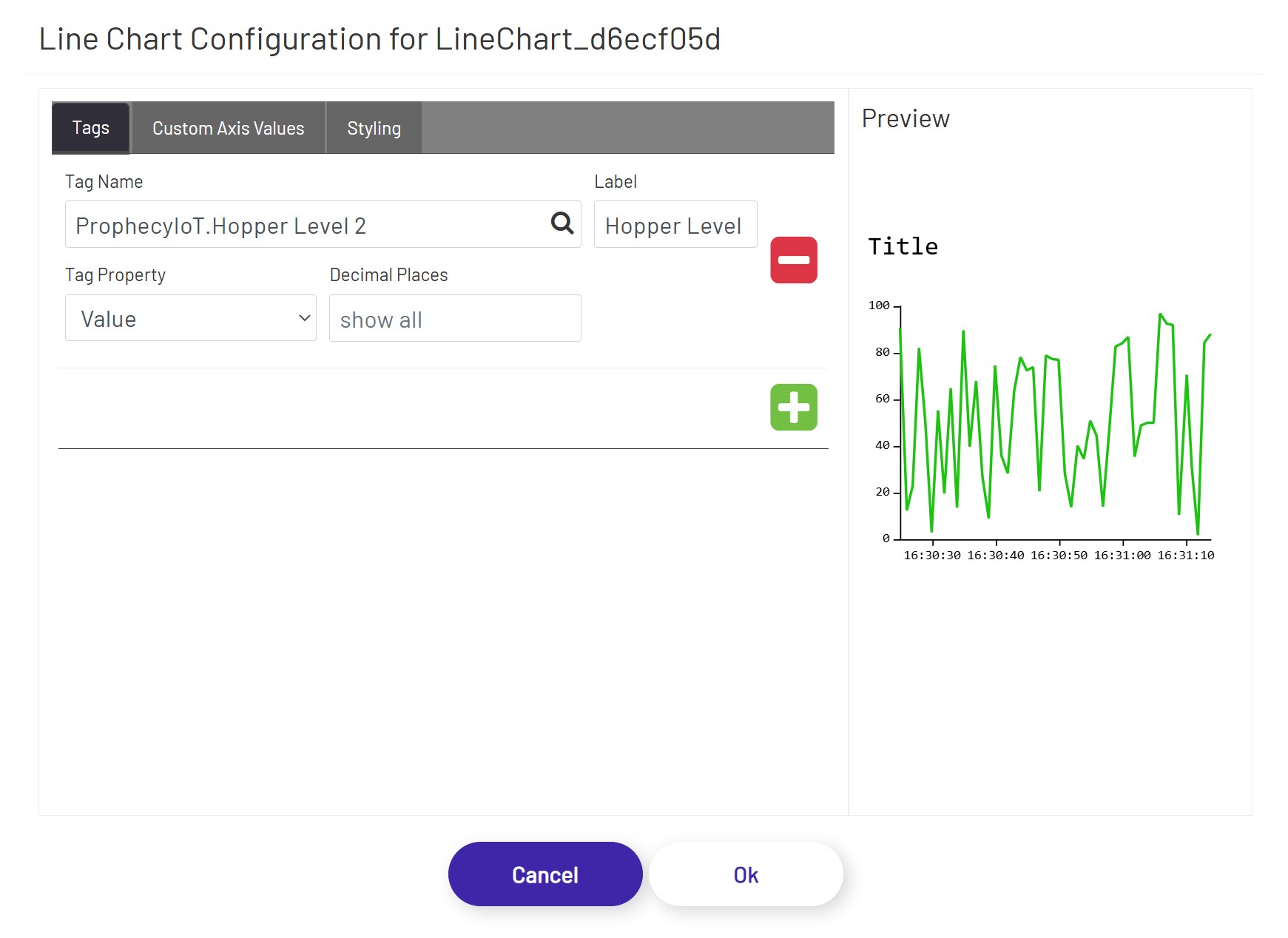
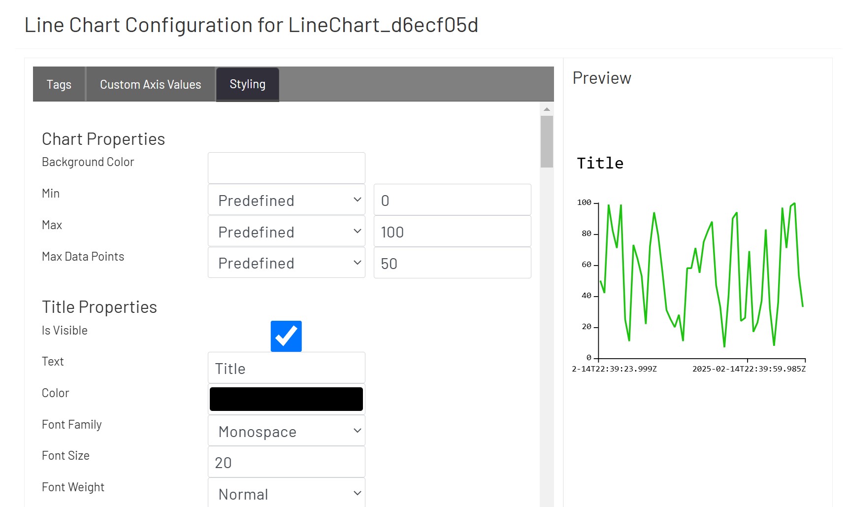
Line Charts 
Line Charts allow the user to display numeric values in line, bar, or scatter style. Once the user has the chart sized and positioned as desired, click the 'Configure Line Chart' button in the left-hand panel and set it up:
In the Tags tab, the user can define tags to be shown in the line chart.
- Tag Name: This tag selector allows the designer to choose which tag's value will be shown. Click the magnifying glass icon to open the tag selector window.
- Tag Property: This is the tag parameter whose value will be shown in the chart.
- Label: If a value is entered here, it will be used as the label text for that tag (if legends are visible).
- Decimal Places: If a numeric Tag property is chosen above, this rounds the value to a specified number of decimals if it is not blank.
- Aggregation: If a DB Tag or an ERP Tag is chosen above, this aggregation selects/calculates a value from that Tag.
- Nth: If 'Nth' is chosen above as Aggregation, this defines the index of the value from its Tag property's value collection.
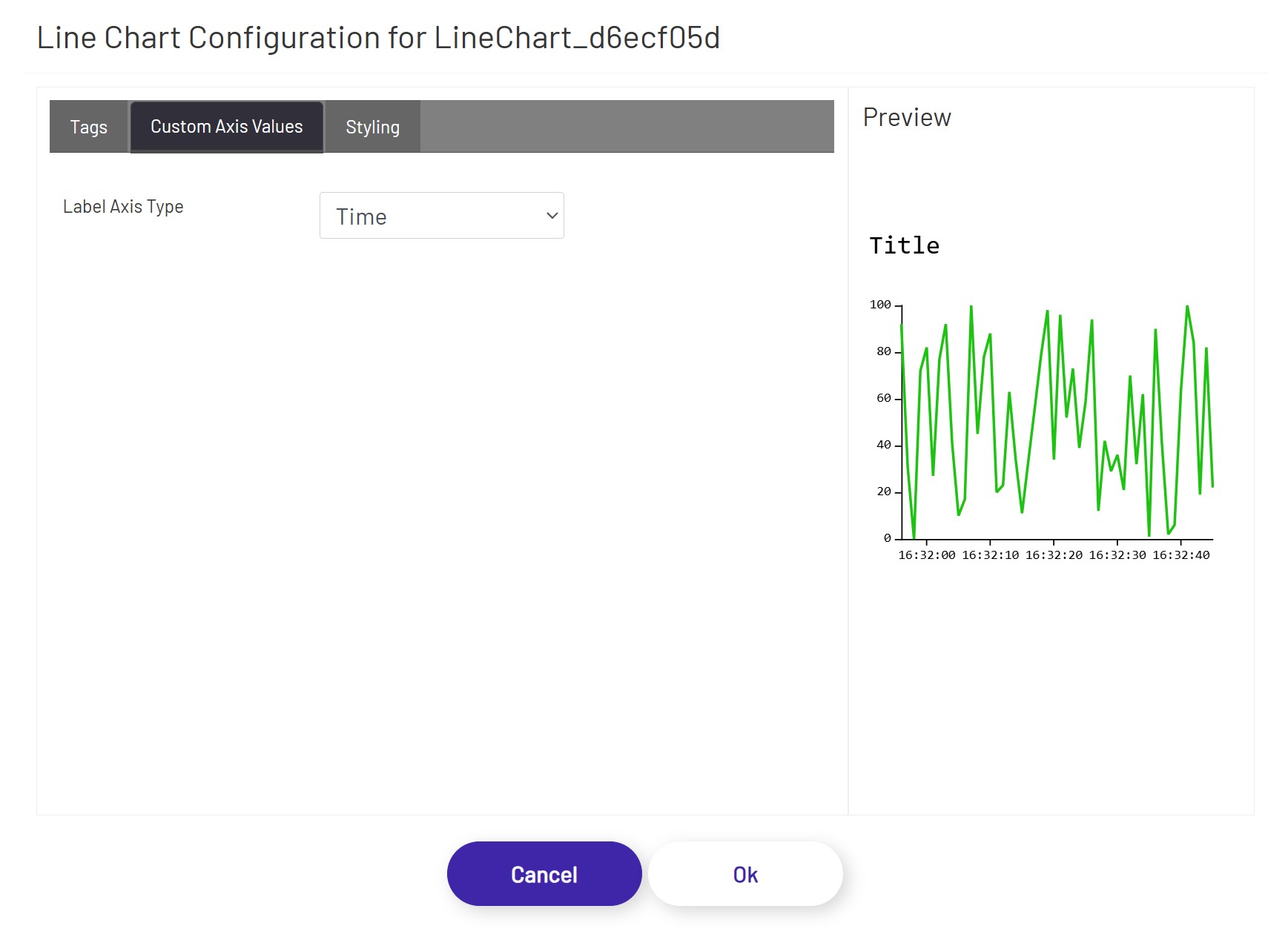
In the Custom Axis Values tab, the user can define the data aggregation for this chart.
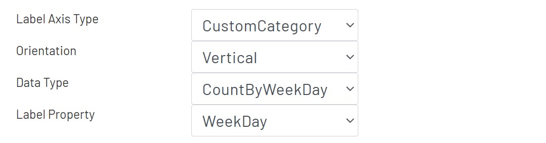
- Label Axis Type: The user can define this chart to display in Time series mode or CustomCategory mode. Only DB Tags and EPR Tags support 'CustomCategory' mode. If 'CustomCategory' is selected, following options become available.
- Orientation: Choose between horizontal and vertical orientation of this chart.
- Date Type: Choose the data type, which is used to select a property from it in 'Label Property'.
- Label Property: Choose the property to group the data then apply aggregations defined in Tags.
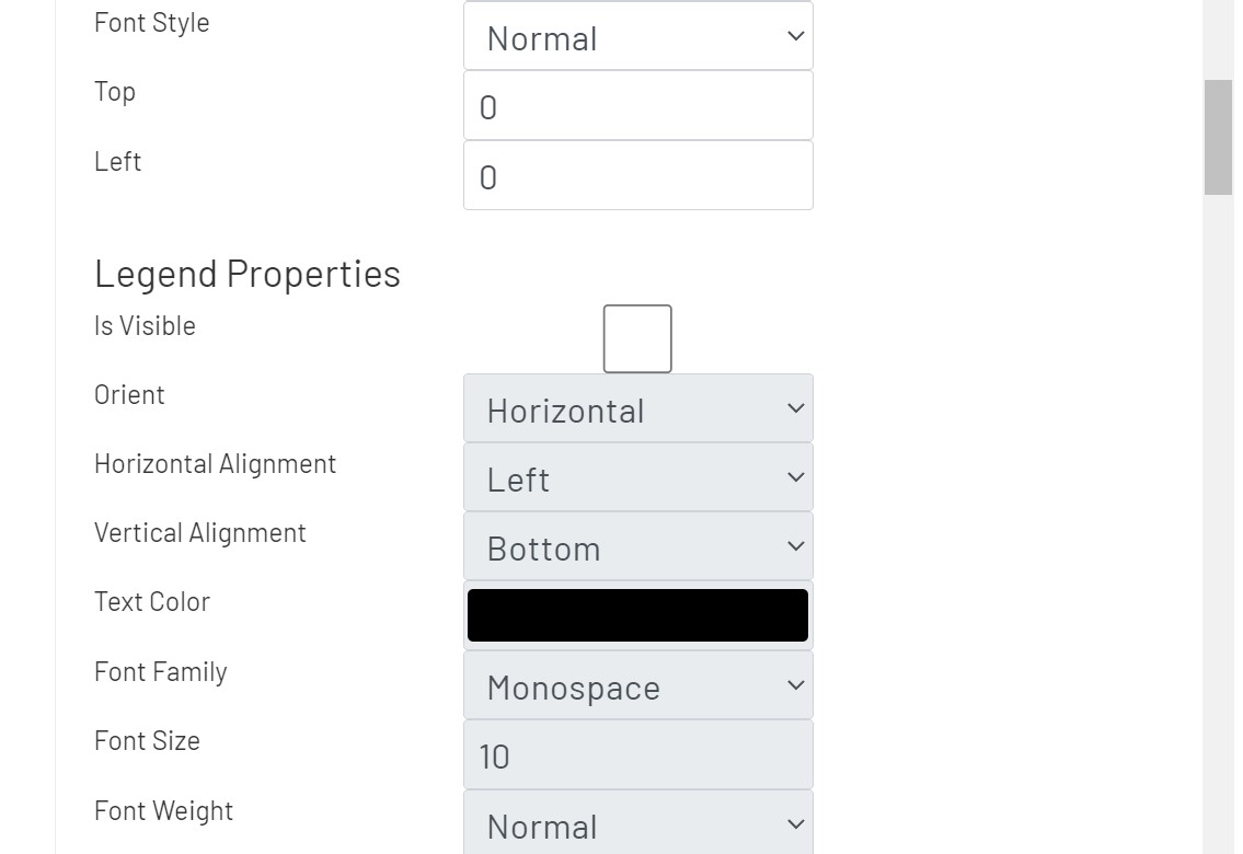
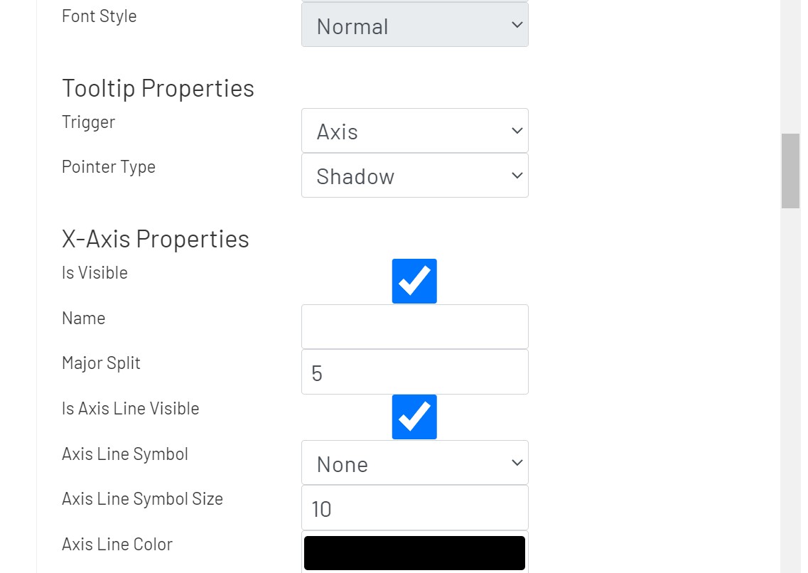
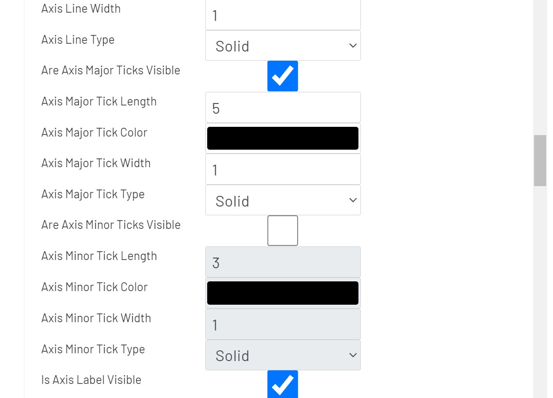
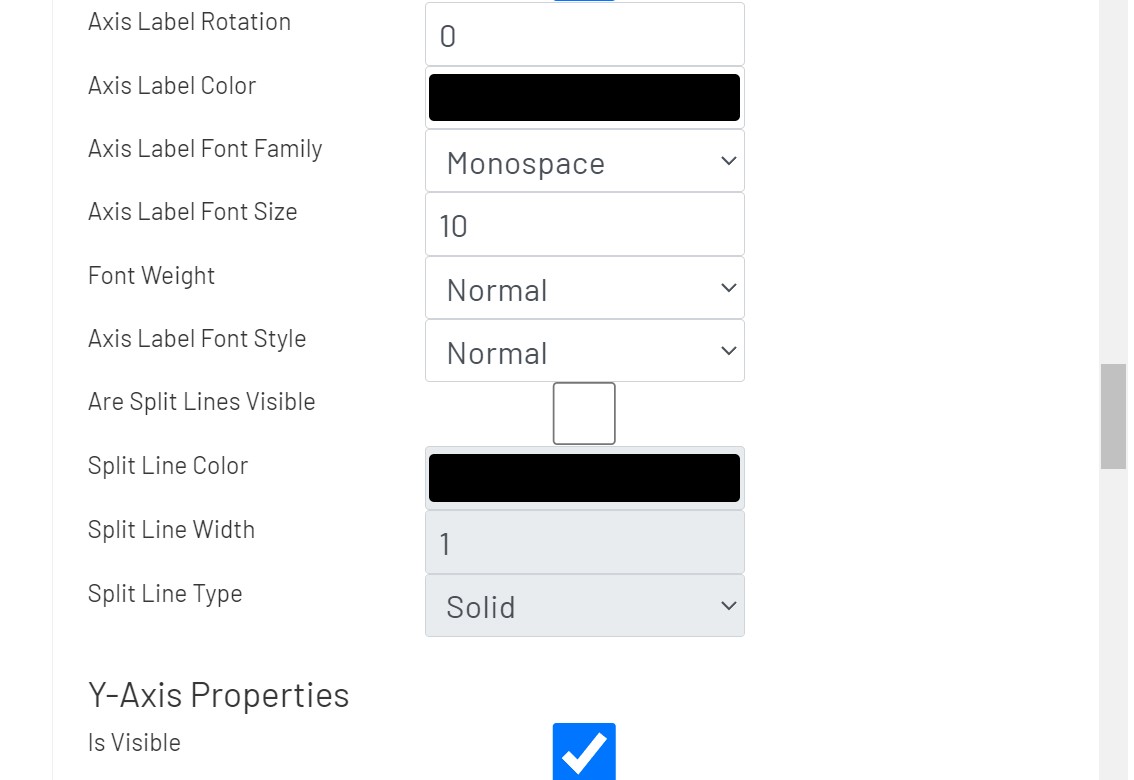
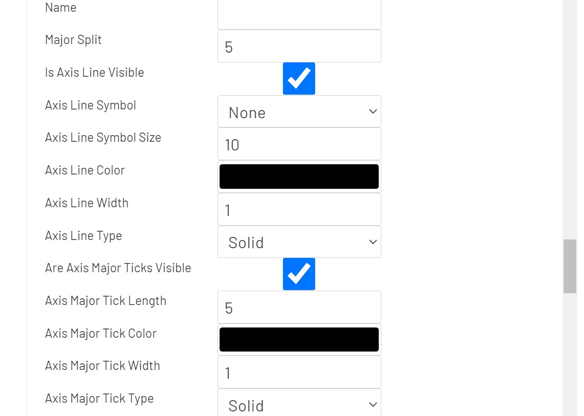
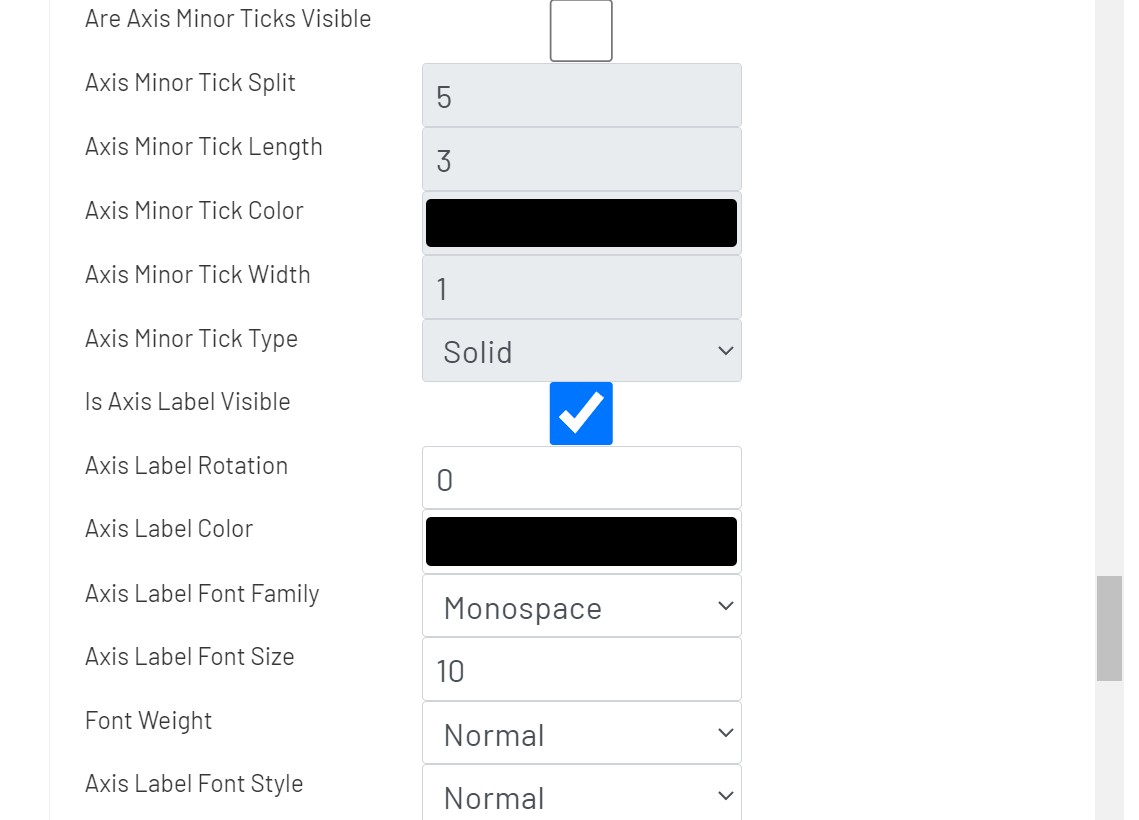
In the Styling tab, the user can apply styling properties for title, legends, and axes with text styles, background colors, and alignments etc.
-
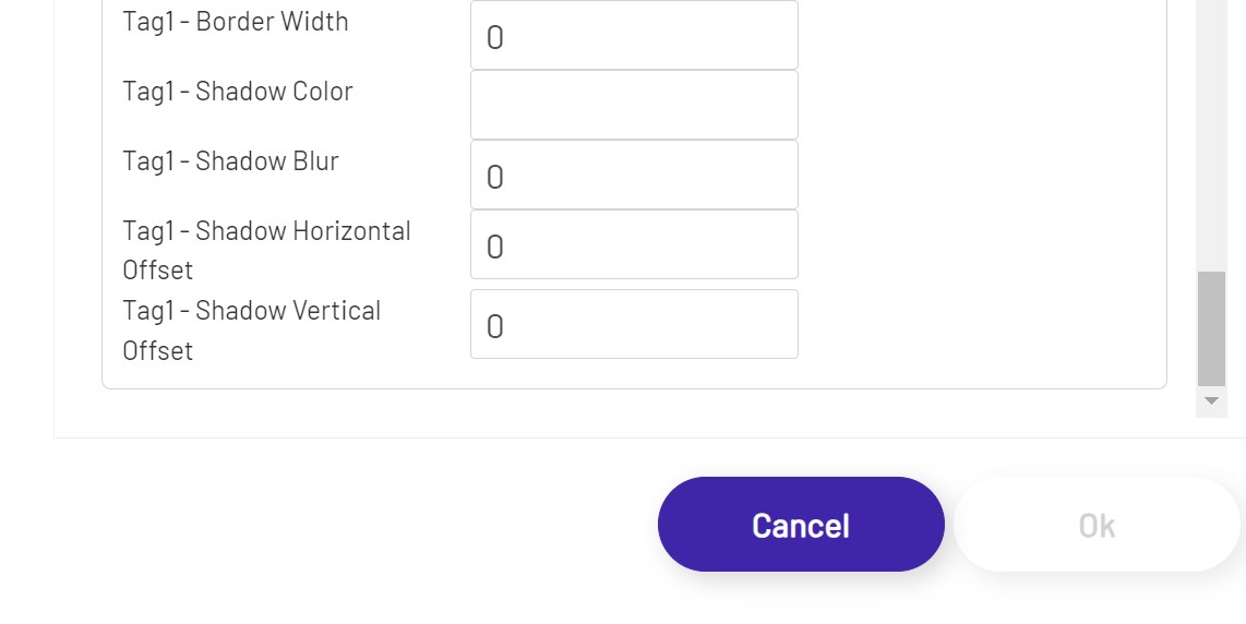
Chart Properties
- Max Data Points: The maximum number of data points to be displayed along the y-axis when using the time-series mode.
-
Title Properties
- Top: The distance from the top of this chart.
- Left: The distance from the left of this chart.
-
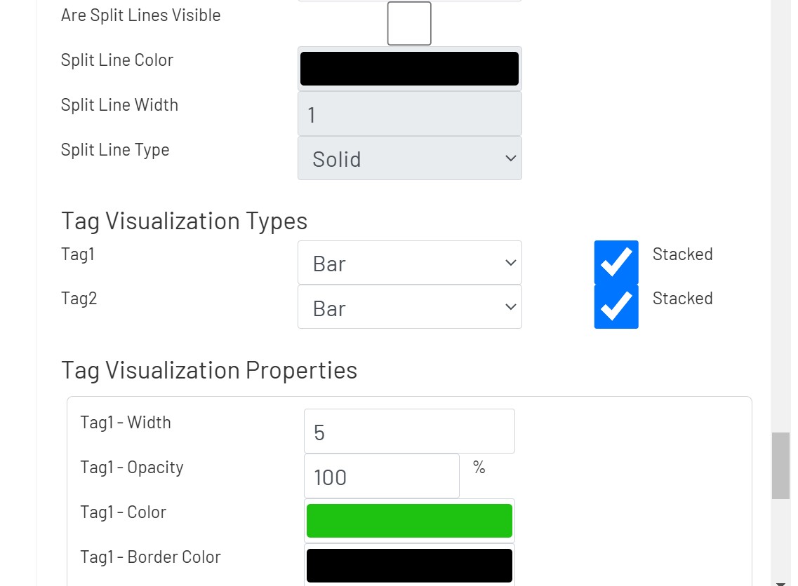
Tag Visualization Types
- For each tag, select the display style among line, bar, scatter, and effect scatter.
- Tags can be stacked up when they are displayed as bar charts
- For each tag, select the display style among line, bar, scatter, and effect scatter.
Unified Grid 
This shape allows users to see a tag with a complex data type in a grid. There are built-in paging controls, and other inputs on the diagram can be used to filter down the results shown in the grid. To configure one of these grids, drag it onto the canvas and then click the 'Configure Grid' button in the left panel:
General
In the General tab, the user can define a tag to be shown in the grid and other grid configurations.
- Tag: This tag selector allows the designer to choose which tag's value will be shown. Click the magnifying glass icon to open the tag selector window.
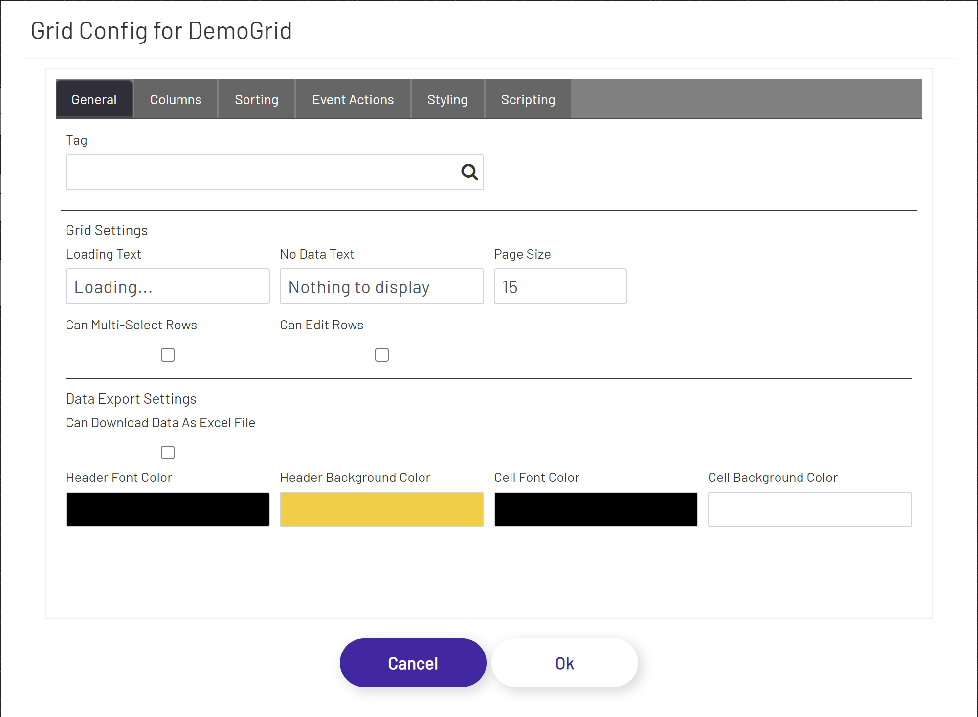
The following configuration options are available under the Grid Settings section:
- Loading Text: If the stored procedure call is taking more than a couple of seconds to return results and populate the grid, this text will display in an overlay over the grid shape.
- No Data Text: This will display at the top of the grid shape if no rows were returned to display in the grid.
- Page Size: How many rows of data to show per page. Depending on this value and the size of the grid shape on the diagram, the user may have to scroll up and down or click between pages to see all the results.
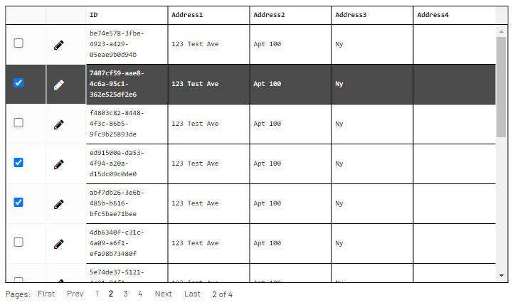
- Can Multi-Select Rows: Enable the ability to select multiple rows from the grid. When enabled, the system will automatically add a checkbox column at the left-most position, and each row will contain a checkbox. Checking the checkbox will mark the row as being selected, and when used as a data source in an event action, will construct a collection of records instead of the usual one to be submitted to the action. Since script tags are the only tag type that can handle a collection of records as an input, the selected Tag should be of that type.
- Can Edit Rows: Enable the ability to edit values inside the grid cells themselves. When enabled, the grid will have a special column to the left of the data cells. If muti-selection is not enabled, this will be the left-most column, and if it is, this will be the second column from the left. Each row in this column will have an edit
 icon. The operational parameters and conditions are as follows:
- When clicking the edit icon, all the data columns (all columns except for the multi-select and in-place editing columns) become text boxes, allowing the user to edit the data directly in the cell. This operation also replaces the editing (Figure #1) icon with an accept/ok (check mark) icon and a cancel (cross) icon (Figure #2).
- When clicking the cancel icon, then the text boxes are replaced with the original values that were in the cells. This operation also replaces the accept/ok and cancel icons with the editing icon.
- When clicking the accept/ok icon, then the text boxes are replaced with the new values that were in the text boxes. This operation also replaces the accept/ok and cancel icons with the editing icon (Figure #4).
- When the underlying tag that provides the data hits a new refresh cycle and has new data, then the new data from the tag overwrite the original and in-place changed data in the grid. Data from the source always take precedence and will overwrite any data that is currently in the grid. To prevent unnecessary overwrites and erasing user changes, either set tags that provide the data to a higher polling frequency, or use on-demand tag reads.
- When using the values from any of the changed cells in event actions, the new value is used for any submissions (and every other type of event action).
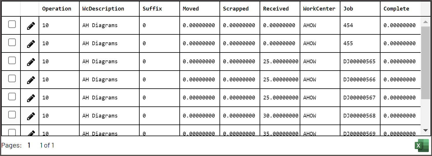
- Can Download Data as Excel File: Enables the ability to download the data presented in the grid to an Excel file. When this option is selected, the grid will display an Excel icon in the bottom right corner of the grid. With this option enabled, the below Excel formatting options become available:
- Header Font Color: This will set the header font color in the exported Excel document.
- Header Background Color: This will set the header background color in the exported Excel document.
- Cell Font Color: This will set the cell font color in the exported Excel document.
- Cell Background Color: This will set the cell background color in the exported Excel document.
(Figure #1)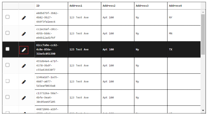 |
(Figure #2)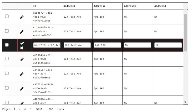 |
(Figure #3)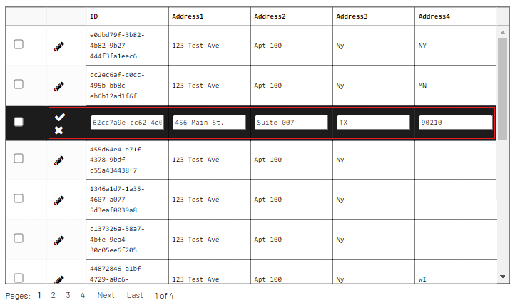 |
(Figure #4)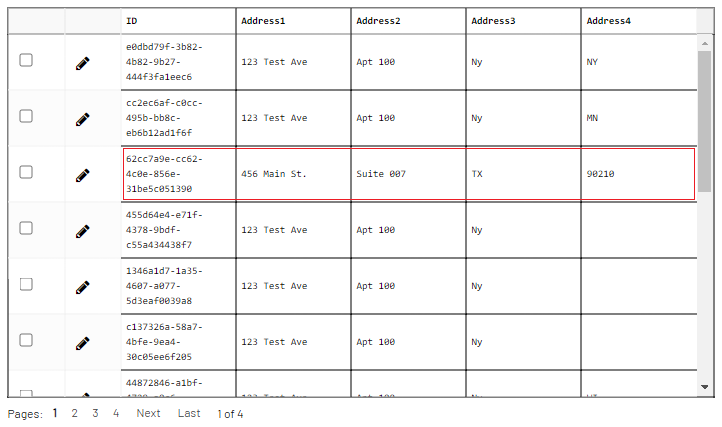 |
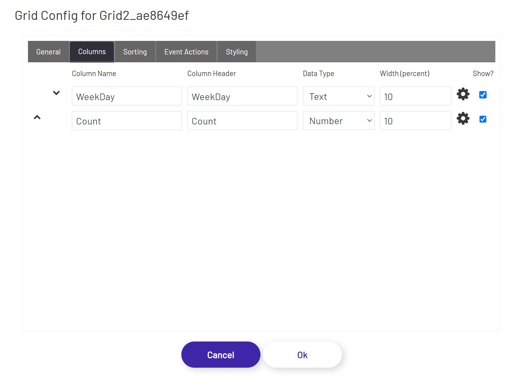
Columns
In the Columns tab, if the stored procedure returns data as output, the necessary subset of columns can be bound to the grid. The form of the output data of a stored procedure cannot be pre-calculated, and the column bindings must be specified manually:
- Column Order: Move columns up/down to define the order of the columns to be displayed in the grid.
- Column Name: The name of the column as it appears inside the stored procedure.
- Column Header: The preferred label to be displayed at the top of the grid as the column header.
- Data Type: By default, all data will be interpreted and rendered as Text, but by changing the data type (if the output from the stored procedure for that column is guaranteed to be in the grid data type that is being selected), the grid can use that information to render the data differently. For example, if BLOB data type is selected, the grid expects the stored procedure column output to be a base-64 encoded string of a file (content). If BLOB is selected, instead of rendered the returned base-64 encoded string, the grid cell will display a button that'll let the user either open or download the file content (depending on browser type, version, settings, etc. - if the browser can handle the file format, it will be opened in a separate tab, and if the browser cannot handle the file format, the user will be prompted to download the file).
- Width (percent): Use this value to control how wide each column appears in the grid. These values should add up to 100.
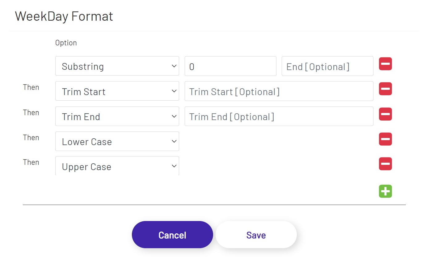
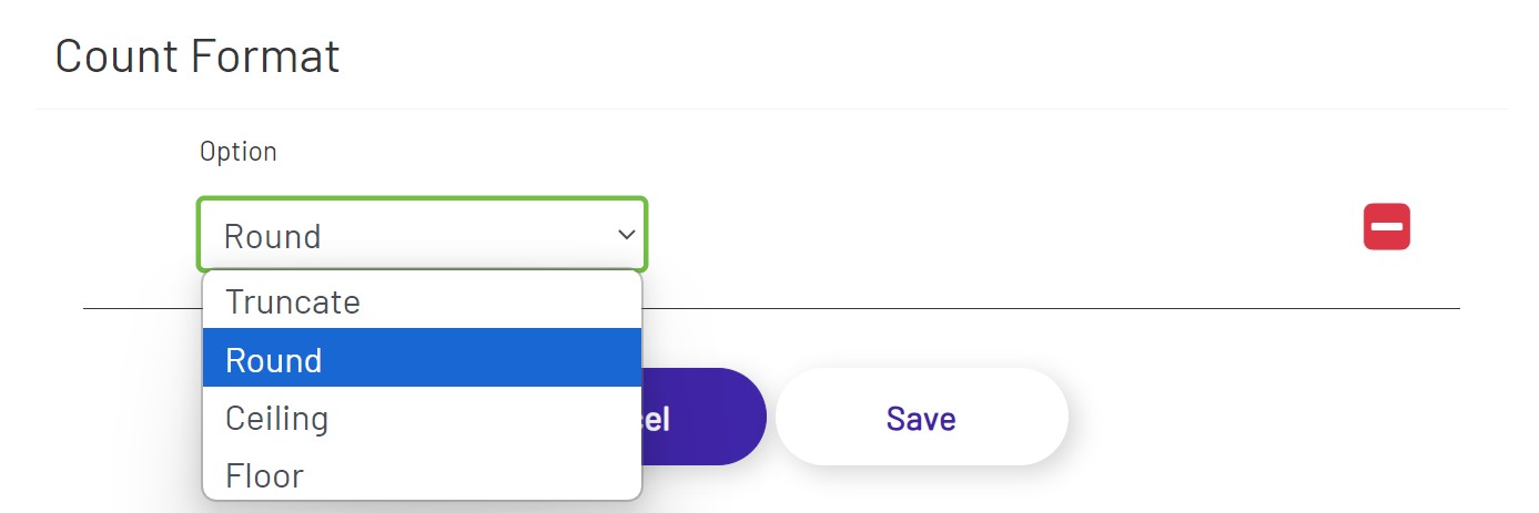
- Format: Apply data format to the values that are displayed in the columns. Text and number data types have different sets of options.
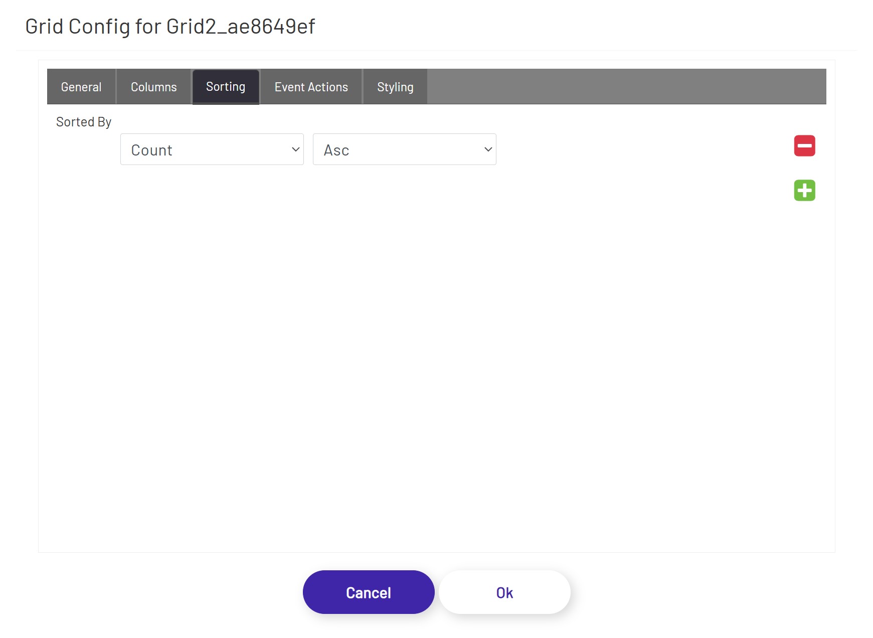
Sorting
In the Sorting tab, the diagram designer can apply sorting orders on one or more column(s) in ascending or descending orders.
Event Actions
In the Event Actions tab, the diagram designer can define triggering one or more actions when a row of this grid is clicked.
The Unified Grid supports the actions listed below:
Text Field - This option allows the user to choose a column from this grid and a targeted text field. When a row of this grid is clicked, the targeted text field will be populated with the value of the selected column in that row.
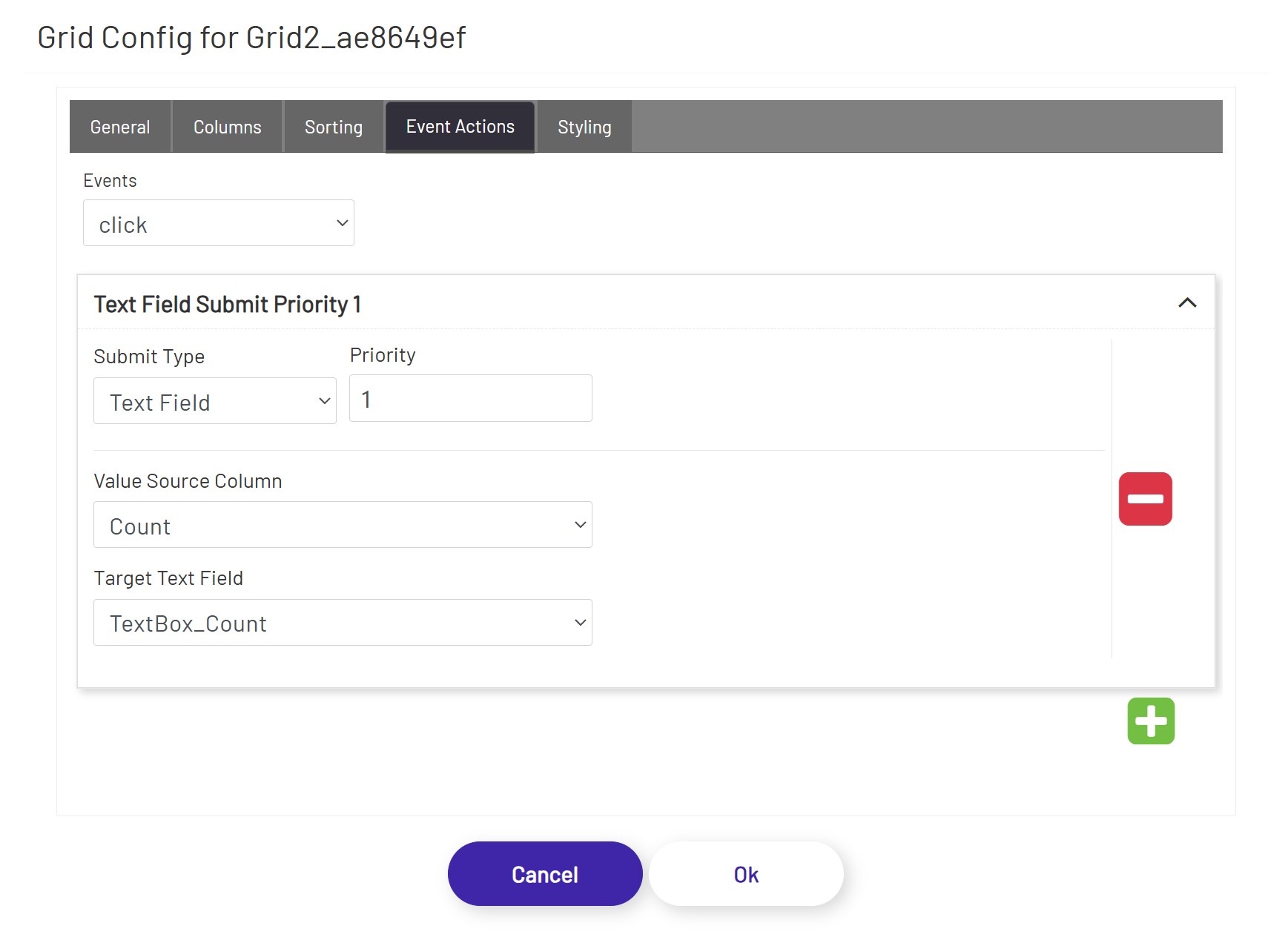
Tag Submit, Tag Refresh, Mongoose, Database, and BarTender see Submit Types
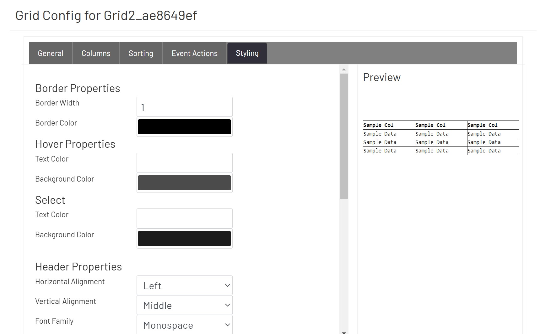
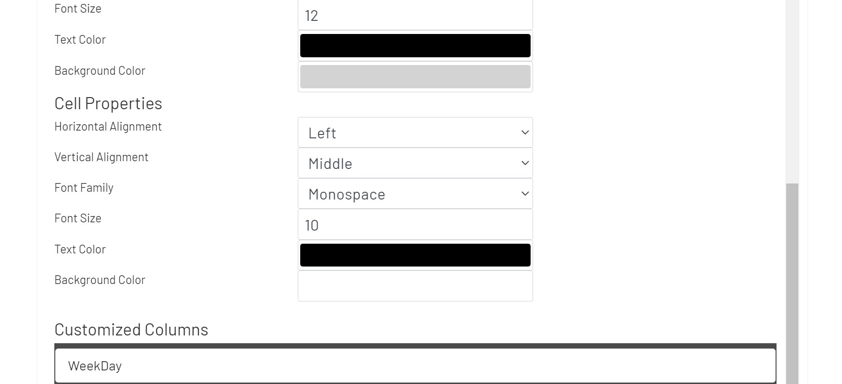
Styling
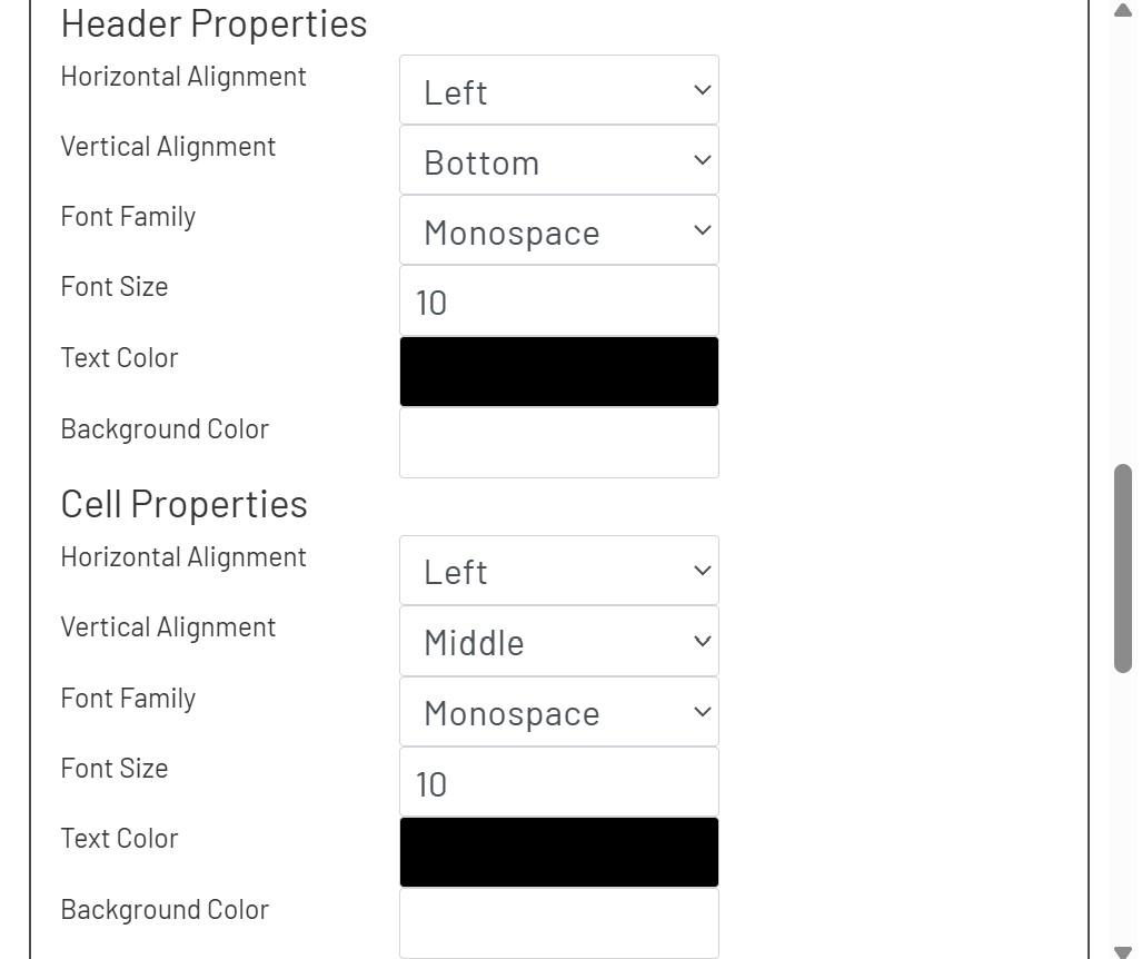
In the Styling tab, the diagram designer can apply styling properties to headers and cells with border, text styles, background color, and alignment etc.
Scripting
Users can use the Scripting tab to implement custom operations as JavaScript functions. This tab exposes several grid events that can be used as triggers for these custom scripted behaviors. Each trigger could have its own custom script, and each one could either be written inline in the editor inside the tab or could be selected from the list that has been created and persisted through the Script Manager.
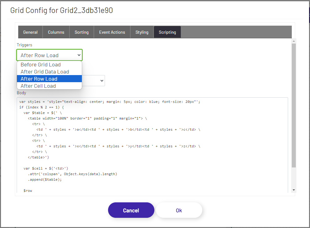
Grid Events
The following grid events are available as triggers:
- Before Grid Load: Executed before the grid is loaded or rendered. The event method has the following signature:
/*
$grid - jQuery object reference to the grid the trigger is attached to.
columns - The list of columns that belong to this grid. The column object has the following structure:
{
title: 'Header Name', // column header name
name: 'Column Name', // column name
type: 'text', // data type - text, number, boolean, etc.
sorter: 'number', // number/string - whether to sort as numbers or as text values
width: 100, // the width of the column
style: {
cell: {
horizontalAlignment: 'center', // left, center, right, etc. - https://developer.mozilla.org/en-US/docs/Web/CSS/text-align
verticalAlignment: 'center', // start, center, end, etc. - https://developer.mozilla.org/en-US/docs/Web/CSS/align-content
fontFamily: 'serif', // serif, sans-serif, monospace, etc. - https://developer.mozilla.org/en-US/docs/Web/CSS/font-family
fontSize: 10, // the font size in pixels
textColor: '#ffc0ab', // the font color as a hexadecimal value or a known color value - https://developer.mozilla.org/en-US/docs/Web/CSS/color_value
backgroundColor: '#d8d8cc' // the background color as a hexadecimal value or a known color value - https://developer.mozilla.org/en-US/docs/Web/CSS/color_value
},
header: {
horizontalAlignment: 'center', // left, center, right, etc. - https://developer.mozilla.org/en-US/docs/Web/CSS/text-align
verticalAlignment: 'center', // start, center, end, etc. - https://developer.mozilla.org/en-US/docs/Web/CSS/align-content
fontFamily: 'serif', // serif, sans-serif, monospace, etc. - https://developer.mozilla.org/en-US/docs/Web/CSS/font-family
fontSize: 10, // the font size in pixels
textColor: '#ffc0ab', // the font color as a hexadecimal value or a known color value - https://developer.mozilla.org/en-US/docs/Web/CSS/color_value
backgroundColor: '#d8d8cc' // the background color as a hexadecimal value or a known color value - https://developer.mozilla.org/en-US/docs/Web/CSS/color_value
}
},
index: 7 // the index/position of the column
}
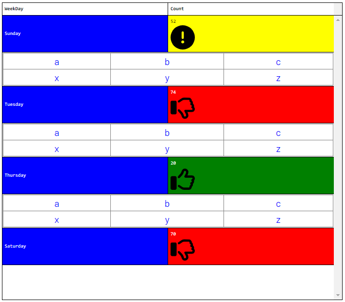
data - The data that gets rendered in the grid. The parameter is an array which is the collection of rows. The array is an array of objects, each one representing the data for that row. The object property keys are the column names, and the property values are the column values. Ex. -
[
{ "Count": "82", "WeekDay": "Sunday" },
{ "Count": "72", "WeekDay": "Monday" },
{ "Count": "84", "WeekDay": "Tuesday" },
{ "Count": "55", "WeekDay": "Wednesday" },
{ "Count": "19", "WeekDay": "Thursday" },
{ "Count": "78", "WeekDay": "Friday" },
{ "Count": "80", "WeekDay": "Saturday" }
]
*/
function ($grid, columns, data) {
// Code that gets executed when the before the grid is loaded.
}
- After Grid Data Load: Executed after the grid has been loaded and rendered. This includes the initial load as well as data loading and rendering events when a user pages through data or reorders column data. The event method has the following signature:
/*
$grid   - jQuery object reference to the grid the trigger is attached to.
columns - The list of columns that belong to this grid. The column object has the following structure:
            {
                title: 'Header Name', // column header name
                name: 'Column Name', // column name
                type: 'text', // data type - text, number, boolean, etc.
                sorter: 'number', // number/string - whether to sort as numbers or as text values
                width: 100, // the width of the column
                style: {
                    cell: {
                        horizontalAlignment: 'center', // left, center, right, etc. - https://developer.mozilla.org/en-US/docs/Web/CSS/text-align
                        verticalAlignment: 'center', // start, center, end, etc. - https://developer.mozilla.org/en-US/docs/Web/CSS/align-content
                        fontFamily: 'serif', // serif, sans-serif, monospace, etc. - https://developer.mozilla.org/en-US/docs/Web/CSS/font-family
                        fontSize: 10, // the font size in pixels
                        textColor: '#ffc0ab', // the font color as a hexadecimal value or a known color value - https://developer.mozilla.org/en-US/docs/Web/CSS/color_value
                        backgroundColor: '#d8d8cc' // the background color as a hexadecimal value or a known color value - https://developer.mozilla.org/en-US/docs/Web/CSS/color_value
                    },
                    header: {
                        horizontalAlignment: 'center', // left, center, right, etc. - https://developer.mozilla.org/en-US/docs/Web/CSS/text-align
                        verticalAlignment: 'center', // start, center, end, etc. - https://developer.mozilla.org/en-US/docs/Web/CSS/align-content
                        fontFamily: 'serif', // serif, sans-serif, monospace, etc. - https://developer.mozilla.org/en-US/docs/Web/CSS/font-family
                        fontSize: 10, // the font size in pixels
                        textColor: '#ffc0ab', // the font color as a hexadecimal value or a known color value - https://developer.mozilla.org/en-US/docs/Web/CSS/color_value
                        backgroundColor: '#d8d8cc' // the background color as a hexadecimal value or a known color value - https://developer.mozilla.org/en-US/docs/Web/CSS/color_value
                    }
                },
                index: 7 // the index/position of the column
            }
data    - The data that gets rendered in the grid. The parameter is an array which is the collection of rows. The array is an array of objects, each one representing the data for that row. The object property keys are the column names, and the property values are the column values. Ex. -
            [
                { "Count": "82", "WeekDay": "Sunday" },
                { "Count": "72", "WeekDay": "Monday" },
                { "Count": "84", "WeekDay": "Tuesday" },
                { "Count": "55", "WeekDay": "Wednesday" },
                { "Count": "19", "WeekDay": "Thursday" },
                { "Count": "78", "WeekDay": "Friday" },
                { "Count": "80", "WeekDay": "Saturday" }
            ]
*/
function ($grid, columns, data) {
    // Code that gets executed after the grid has been loaded.
}
- After Row Load: Executed after the row has been loaded and rendered. This function gets executed for each row, for all the rows for the initial page as well as for all the rows that get loaded and rendered when a user pages through data or reorders column data. The event method has the following signature:
/*
$row    - jQuery object reference to the row the trigger is attached to.
data    - The data that gets rendered in the row. The parameter is an object representing all the columns and the data for those respective columns. The object property keys are the column names, and the property values are the column values. Ex. -
            {
                "Count": "82",
                "WeekDay": "Sunday"
            }
index   - The index of the row which starts with 0 (row 1 has an index of 0, row 2 has an index of 1, row 54 has an index of 53, etc.). This includes the pagination information and not just the visual index. For example, in a grid where each page displays 10 rows, row 3 from the top in page 5 would be the 43rd row, giving it an index of 42.
          ** Index = ((PageNumber - 1) * PageSize) + RowPosition - 1 **
*/
function ($row, data, index) {
    // Code that gets executed after a row has been loaded.
}
- After Cell Load: Executed for every cell after it has been loaded and rendered. This function gets executed for each row for each column, for all the rows and columns for the initial page as well as for all the rows and columns that get loaded and rendered when a user pages through data or reorders column data. The event method has the following signature:
/*
$cell   - jQuery object reference to the cell the trigger is attached to.
column  - Column information. The object has the following structure:
            {
                title: 'Header Name', // column header name
                name: 'Column Name', // column name
                type: 'text', // data type - text, number, boolean, etc.
                sorter: 'number', // number/string - whether to sort as numbers or as text values
                width: 100, // the width of the column
                style: {
                    cell: {
                        horizontalAlignment: 'center', // left, center, right, etc. - https://developer.mozilla.org/en-US/docs/Web/CSS/text-align
                        verticalAlignment: 'center', // start, center, end, etc. - https://developer.mozilla.org/en-US/docs/Web/CSS/align-content
                        fontFamily: 'serif', // serif, sans-serif, monospace, etc. - https://developer.mozilla.org/en-US/docs/Web/CSS/font-family
                        fontSize: 10, // the font size in pixels
                        textColor: '#ffc0ab', // the font color as a hexadecimal value or a known color value - https://developer.mozilla.org/en-US/docs/Web/CSS/color_value
                        backgroundColor: '#d8d8cc' // the background color as a hexadecimal value or a known color value - https://developer.mozilla.org/en-US/docs/Web/CSS/color_value
                    },
                    header: {
                        horizontalAlignment: 'center', // left, center, right, etc. - https://developer.mozilla.org/en-US/docs/Web/CSS/text-align
                        verticalAlignment: 'center', // start, center, end, etc. - https://developer.mozilla.org/en-US/docs/Web/CSS/align-content
                        fontFamily: 'serif', // serif, sans-serif, monospace, etc. - https://developer.mozilla.org/en-US/docs/Web/CSS/font-family
                        fontSize: 10, // the font size in pixels
                        textColor: '#ffc0ab', // the font color as a hexadecimal value or a known color value - https://developer.mozilla.org/en-US/docs/Web/CSS/color_value
                        backgroundColor: '#d8d8cc' // the background color as a hexadecimal value or a known color value - https://developer.mozilla.org/en-US/docs/Web/CSS/color_value
                    }
                },
                index: 7 // the index/position of the column
            }
value   - The original value that will be rendered in the cell.
*/
function ($cell, column, value) {
    // Code that gets executed after a cell has been loaded.
}
Examples
- After Row Load - After rows are loaded, for alternating rows (odd rows), clear out what was going to be rendered (all the cells and the cell contents), create one column/cell that spans the entire row, and insert a dynamically created table with custom content into that one cell.
var styles = 'style="text-align: center; margin: 5px; color: blue; font-size: 20px"';
if (index % 2 == 1) {
  var $table = $(' \
    <table width="100%" border="1" padding="1" margin="1"> \
      <tr> \
        <td ' + styles + '>a</td><td ' + styles + '>b</td><td ' + styles + '>c</td> \
      </tr> \
      <tr> \
        <td ' + styles + '>x</td><td ' + styles + '>y</td><td ' + styles + '>z</td> \
      </tr> \
    </table>');

  var $cell = $('<td>')
    .attr('colspan', Object.keys(data).length)
    .append($table);

  $row
    .empty()
    .append($cell);
}
- After Cell Load - After cells are loaded, for the "Count" column, if the value is over 66, color the text in white and the background in red, if the value is between 34 and 65 (inclusive), color the text in black and the background in yellow, and if it's less than that or equal to 33, color the text in white and the background in green. In addition to this, insert a unique SVG image into each cell based on the above mentioned value ranges, and upon clicking the image, print the value to the browser console.
var colorizeBackground = function(count) {
    if (count > 66) return 'red';
    else if (count > 33) return 'yellow';
    else return 'green';
};
var colorizeText = function(count) {
    if (count > 66) return 'white';
    else if (count > 33) return 'black';
    else return 'white';
};

var svgGood = '<svg xmlns="http://www.w3.org/2000/svg" viewBox="0 0 512 512"><path d="M323.8 34.8c-38.2-10.9-78.1 11.2-89 49.4l-5.7 20c-3.7 13-10.4 25-19.5 35l-51.3 56.4c-8.9 9.8-8.2 25 1.6 33.9s25 8.2 33.9-1.6l51.3-56.4c14.1-15.5 24.4-34 30.1-54.1l5.7-20c3.6-12.7 16.9-20.1 29.7-16.5s20.1 16.9 16.5 29.7l-5.7 20c-5.7 19.9-14.7 38.7-26.6 55.5c-5.2 7.3-5.8 16.9-1.7 24.9s12.3 13 21.3 13L448 224c8.8 0 16 7.2 16 16c0 6.8-4.3 12.7-10.4 15c-7.4 2.8-13 9-14.9 16.7s.1 15.8 5.3 21.7c2.5 2.8 4 6.5 4 10.6c0 7.8-5.6 14.3-13 15.7c-8.2 1.6-15.1 7.3-18 15.2s-1.6 16.7 3.6 23.3c2.1 2.7 3.4 6.1 3.4 9.9c0 6.7-4.2 12.6-10.2 14.9c-11.5 4.5-17.7 16.9-14.4 28.8c.4 1.3 .6 2.8 .6 4.3c0 8.8-7.2 16-16 16l-97.5 0c-12.6 0-25-3.7-35.5-10.7l-61.7-41.1c-11-7.4-25.9-4.4-33.3 6.7s-4.4 25.9 6.7 33.3l61.7 41.1c18.4 12.3 40 18.8 62.1 18.8l97.5 0c34.7 0 62.9-27.6 64-62c14.6-11.7 24-29.7 24-50c0-4.5-.5-8.8-1.3-13c15.4-11.7 25.3-30.2 25.3-51c0-6.5-1-12.8-2.8-18.7C504.8 273.7 512 257.7 512 240c0-35.3-28.6-64-64-64l-92.3 0c4.7-10.4 8.7-21.2 11.8-32.2l5.7-20c10.9-38.2-11.2-78.1-49.4-89zM32 192c-17.7 0-32 14.3-32 32L0 448c0 17.7 14.3 32 32 32l64 0c17.7 0 32-14.3 32-32l0-224c0-17.7-14.3-32-32-32l-64 0z"/></svg>';
var svgWarn = '<svg xmlns="http://www.w3.org/2000/svg" viewBox="0 0 512 512"><path d="M256 512A256 256 0 1 0 256 0a256 256 0 1 0 0 512zm0-384c13.3 0 24 10.7 24 24l0 112c0 13.3-10.7 24-24 24s-24-10.7-24-24l0-112c0-13.3 10.7-24 24-24zM224 352a32 32 0 1 1 64 0 32 32 0 1 1 -64 0z"/></svg>';
var svgBad = '<svg xmlns="http://www.w3.org/2000/svg" viewBox="0 0 512 512"><path d="M323.8 477.2c-38.2 10.9-78.1-11.2-89-49.4l-5.7-20c-3.7-13-10.4-25-19.5-35l-51.3-56.4c-8.9-9.8-8.2-25 1.6-33.9s25-8.2 33.9 1.6l51.3 56.4c14.1 15.5 24.4 34 30.1 54.1l5.7 20c3.6 12.7 16.9 20.1 29.7 16.5s20.1-16.9 16.5-29.7l-5.7-20c-5.7-19.9-14.7-38.7-26.6-55.5c-5.2-7.3-5.8-16.9-1.7-24.9s12.3-13 21.3-13L448 288c8.8 0 16-7.2 16-16c0-6.8-4.3-12.7-10.4-15c-7.4-2.8-13-9-14.9-16.7s.1-15.8 5.3-21.7c2.5-2.8 4-6.5 4-10.6c0-7.8-5.6-14.3-13-15.7c-8.2-1.6-15.1-7.3-18-15.2s-1.6-16.7 3.6-23.3c2.1-2.7 3.4-6.1 3.4-9.9c0-6.7-4.2-12.6-10.2-14.9c-11.5-4.5-17.7-16.9-14.4-28.8c.4-1.3 .6-2.8 .6-4.3c0-8.8-7.2-16-16-16l-97.5 0c-12.6 0-25 3.7-35.5 10.7l-61.7 41.1c-11 7.4-25.9 4.4-33.3-6.7s-4.4-25.9 6.7-33.3l61.7-41.1c18.4-12.3 40-18.8 62.1-18.8L384 32c34.7 0 62.9 27.6 64 62c14.6 11.7 24 29.7 24 50c0 4.5-.5 8.8-1.3 13c15.4 11.7 25.3 30.2 25.3 51c0 6.5-1 12.8-2.8 18.7C504.8 238.3 512 254.3 512 272c0 35.3-28.6 64-64 64l-92.3 0c4.7 10.4 8.7 21.2 11.8 32.2l5.7 20c10.9 38.2-11.2 78.1-49.4 89zM32 384c-17.7 0-32-14.3-32-32L0 128c0-17.7 14.3-32 32-32l64 0c17.7 0 32 14.3 32 32l0 224c0 17.7-14.3 32-32 32l-64 0z"/></svg>';

var getSvg = function(count) {
    if (count > 66) return svgBad;
    else if (count > 33) return svgWarn;
    else return svgGood;
};

var $wrapper = $('<div>')
    .width('50px')
    .height('50px')
    .append(getSvg(value))
    .click(function() {
        console.log(value);
    });

$cell
    .text(value)
    .css('background', column.name === 'Count' ? colorizeBackground(value) : 'blue')
    .css('color', column.name === 'Count' ? colorizeText(value) : 'white');

if (column.name === 'Count') {
    $cell.append($wrapper);
}
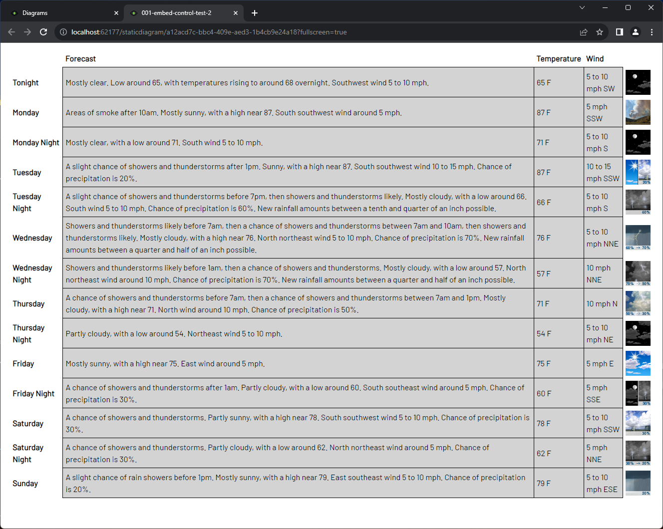
- Before Grid Load - Before the grid is loaded, destroy and remove the original grid. This grid does not have any tags selected to provide data. Instead, in the load event, call a web service to fetch weather information based on a latitude and a longitude, create a new grid dynamically, and insert the fetched data into it, including images that were fetched through the service.
// These could be provided through a tag to create a dynamic weather app.
var latitude = 112;
var longitude = 54;

$.get(`https://api.weather.gov/gridpoints/MPX/${latitude},${longitude}/forecast`, function(data, status) {
    if (
        status === "success" &&
        !!data &&
        !!data.properties &&
        !!data.properties.periods &&
        Array.isArray(data.properties.periods) &&
        data.properties.periods.length > 0
    ) {
        var $parent = $grid.parents('#diagram-hmi-grid-wrapper');
        var cellCommonStyle = {
            'margin': '5px',
            'padding': '5px'
        };

        $grid.jsGrid("destroy");

        var $table = $('<table>');
        $('<tr>')
            .append($('<td>').css(cellCommonStyle))
            .append($('<td>').css(cellCommonStyle).html('<b>Forecast</b>'))
            .append($('<td>').css(cellCommonStyle).html('<b>Temperature</b>'))
            .append($('<td>').css(cellCommonStyle).html('<b>Wind</b>'))
            .append($('<td>').css(cellCommonStyle))
            .appendTo($table);

        for (var index in data.properties.periods) {
            var period = data.properties.periods[index];
            var cellStyle = {
                ...cellCommonStyle,
                'border': '1px solid black',
                'background-color': 'lightgray'
            };

            var $row = $('<tr>');
            $('<td>').css(cellCommonStyle).html(`<b>${period.name}</b>`).appendTo($row);
            $('<td>').css(cellStyle).text(period.detailedForecast).appendTo($row);
            $('<td>').css(cellStyle).text(`${period.temperature} ${period.temperatureUnit}`).appendTo($row);
            $('<td>').css(cellStyle).text(`${period.windSpeed} ${period.windDirection}`).appendTo($row);
            $('<td>').css(cellCommonStyle).html(`<img src='${period.icon}' width='50px' />`).appendTo($row);
            $table.append($row);
        }

        $parent.append($table);
    }
});
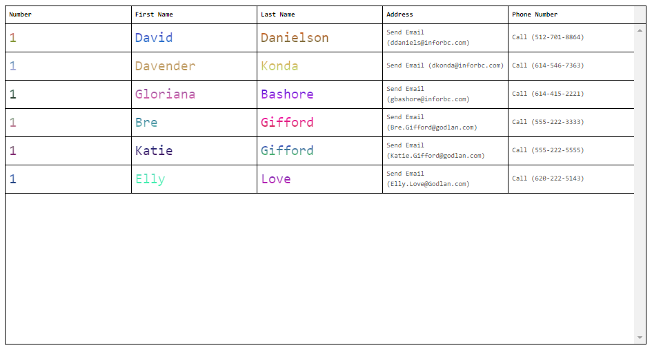
- After Cell Load - After the cell has been loaded, intercept the data, and format the cell and the text based on which column it is. If it's the address column, format the value to be in the format of "Send Email (email address)" which opens up the local email client with the to address filled in, if it's the phone number column, format the value to be in the format of "Call (phone number)" which opens up the preferred calling app on the local machine and dials the given phone number, and add gradient text colors in a larger font in the other columns.
var generateRandomColor = function() {
  const maxVal = 0xFFFFFF;
  let randomNumber = Math.floor(Math.random() * (maxVal + 1));
  let hexColor = randomNumber.toString(16);

  hexColor = hexColor.padStart(6, '0');

  return `#${hexColor.toUpperCase()}`;
}

if (column.name === 'Address') {
    $cell.html(`<a href="mailto:${value}">Send Email (${value})</a>`);
}
else if (column.name === 'PhoneNumber') {
    var phone = value.replace(/\D*/g, '');

    $cell.html(`<a href="tel:+1${phone}">Call (${value})</a>`);
}
else {
    $('<div>')
        .css({
            'width': '100%',
            'height': '100%',
            'font-size': '20px',
            'background': `-webkit-linear-gradient(${generateRandomColor()}, ${generateRandomColor()})`,
            '-webkit-background-clip': 'text',
            '-webkit-text-fill-color': 'transparent'
        })
        .text(value)
        .appendTo($cell);
}
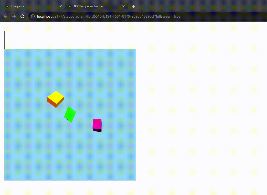
- Before Grid Load - Before the grid is loaded, destroy and remove the original grid. Import Three.js, and create and render a simple 3D scene in a canvas that's created dynamically in the place of the original grid. The scene contains 3 rotating boxes and several lights.
var $parent = $grid.parents('#diagram-hmi-grid-wrapper');
$grid.jsGrid("destroy");

const moduleCode = `
    import * as THREE from 'https://cdnjs.cloudflare.com/ajax/libs/three.js/r128/three.module.js';

    // 1. Scene
    const scene = new THREE.Scene();
    scene.background = new THREE.Color(0x87ceeb); // Sky blue background

    // 2. Camera
    const camera = new THREE.PerspectiveCamera(
        75, // Field of view (FOV)
        window.innerWidth / window.innerHeight, // Aspect ratio
        0.1, // Near clipping plane
        1000 // Far clipping plane
    );
    camera.position.set(0, 3, 7); // Position camera back and slightly up
    camera.lookAt(0, 0, 0); // Point the camera towards the origin

    // 3. Renderer
    const renderer = new THREE.WebGLRenderer({ antialias: true }); // Anti-aliasing for smoother edges
    renderer.setSize(500, 500); // Set renderer size
    document.getElementById('diagram-hmi-grid-wrapper').appendChild(renderer.domElement); // Add renderer to the DOM

    // 4. Lights
    // Ambient Light: Illuminates the entire scene equally
    const ambientLight = new THREE.AmbientLight(0xffffff, 0.4); // Softer white ambient light
    scene.add(ambientLight);

    // Directional Light: Simulates sunlight or a distant light source
    const directionalLight = new THREE.DirectionalLight(0xffffff, 0.8);
    directionalLight.position.set(10, 15, 10); // Position the light
    directionalLight.target.position.set(0, 0, 0); // Point the light at the origin
    scene.add(directionalLight);
    scene.add(directionalLight.target); // Add the target to the scene for proper light targeting

    // Point Light: Emits light from a single point in all directions
    const pointLight1 = new THREE.PointLight(0xff0000, 1.5, 50); // Red light
    pointLight1.position.set(-5, 5, 0); // Position the light
    scene.add(pointLight1);

    const pointLight2 = new THREE.PointLight(0x0000ff, 1.5, 50); // Blue light
    pointLight2.position.set(5, 5, 0); // Position the light
    scene.add(pointLight2);

    // Spot Light: Emits light in a cone shape
    const spotLight = new THREE.SpotLight(0xffff00, 2, 60, Math.PI / 6, 0.5, 2); // Yellow light
    spotLight.position.set(0, 10, 0); // Position the spotlight above the scene
    spotLight.target.position.set(0, 0, 0); // Point the spotlight at the origin
    scene.add(spotLight);
    scene.add(spotLight.target); // Add the target to the scene

    // 5. Create objects (boxes)
    const material = new THREE.MeshPhongMaterial({ color: 0x00ff00 }); // Green material, responds to light

    // Box 1 (Original)
    const geometry1 = new THREE.BoxGeometry(1, 1, 1);
    const cube1 = new THREE.Mesh(geometry1, material);
    cube1.position.set(0, 0, 0);
    scene.add(cube1);

    // Box 2 (Larger, different position and rotation)
    const geometry2 = new THREE.BoxGeometry(2, 0.5, 1.5);
    const cube2 = new THREE.Mesh(geometry2, new THREE.MeshPhongMaterial({ color: 0xffa500 })); // Orange material
    cube2.position.set(-2, 1, -2);
    cube2.rotation.set(Math.PI / 4, Math.PI / 6, 0); // Rotate on X and Y axes
    scene.add(cube2);

    // Box 3 (Smaller, different position and rotation)
    const geometry3 = new THREE.BoxGeometry(0.8, 0.8, 0.8);
    const cube3 = new THREE.Mesh(geometry3, new THREE.MeshPhongMaterial({ color: 0x800080 })); // Purple material
    cube3.position.set(3, -0.5, 1);
    cube3.rotation.set(0, Math.PI / 3, Math.PI / 2); // Rotate on Y and Z axes
    scene.add(cube3);

    // 6. Animation loop
    function animate() {
        requestAnimationFrame(animate); // Request the browser to call animate() again for the next frame

        // Rotate the cubes
        cube1.rotation.x += 0.01;
        cube1.rotation.y += 0.01;

        cube2.rotation.y += 0.005;
        cube2.rotation.z += 0.005;

        cube3.rotation.x += 0.008;
        cube3.rotation.z += 0.008;

        renderer.render(scene, camera); // Render the scene with the camera
    }

    animate(); // Start the animation loop

    // Handle window resizing
    window.addEventListener('resize', () => {
        camera.aspect = window.innerWidth / window.innerHeight; // Adjust camera aspect ratio
        camera.updateProjectionMatrix(); // Update camera's projection matrix
        renderer.setSize(window.innerWidth, window.innerHeight); // Resize renderer
    });

    // A few exported members that will be accessed from outside the module definition
    export function greet(name) {
        return 'Hello, ' + name + '!';
    }

    export const PI = 3.14159;
`;

const blob = new Blob([moduleCode], { type: 'text/javascript' });
const moduleUrl = URL.createObjectURL(blob);

import(moduleUrl)
    .then(module => {
        // Access and use the module's exports
        console.log(module.greet('Dynamic Module')); // Output: Hello, Dynamic Module!
        console.log(module.PI); // Output: 3.14159
    })
    .catch(error => {
        console.error('Error loading dynamic module:', error);
    });
Embedded Shape 
This shape allows users to load content from other data sources, such as Diagrams, Dashboards, websites, and documents into a Diagram. All options allow loading this content based on a static value or by using a Tag. To add an Embedded shape to a Diagram, drag the shape from the palette and drop it on the Diagram canvas.
Data Sources
The Embedded shape supports the data sources listed below:
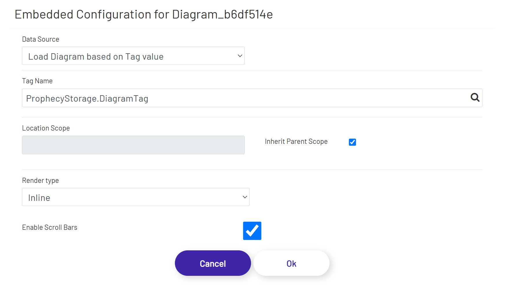
Load Diagram Based on Tag value - This option allows the user to load a Diagram using a Tag value. This can be a static Tag value, a Tag set based on an event, or the result of a condition using a Calculation tag. When this option is selected, the Tag selector will be visible, allowing the user to open the Tag Tree for Tag selection.
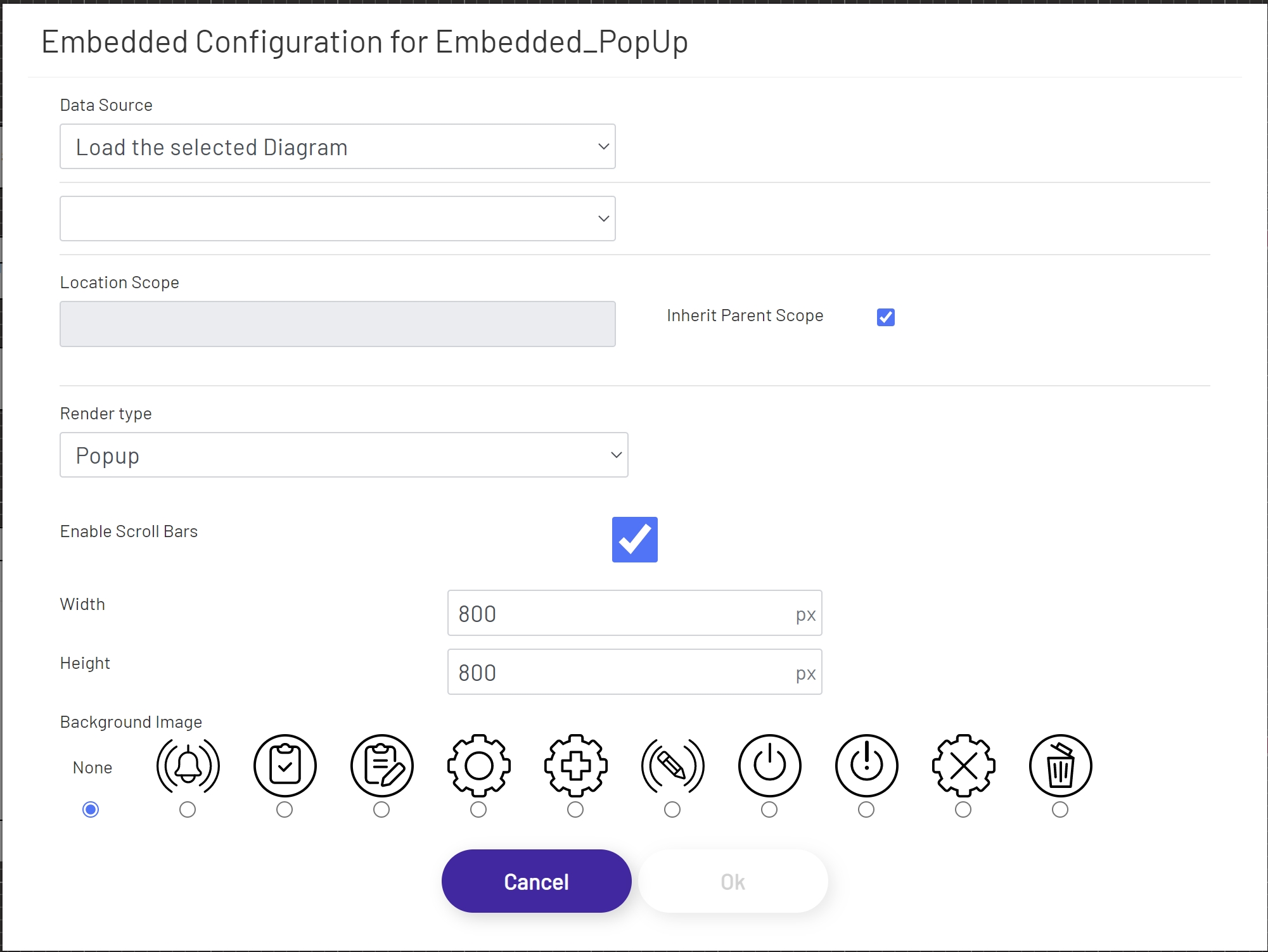
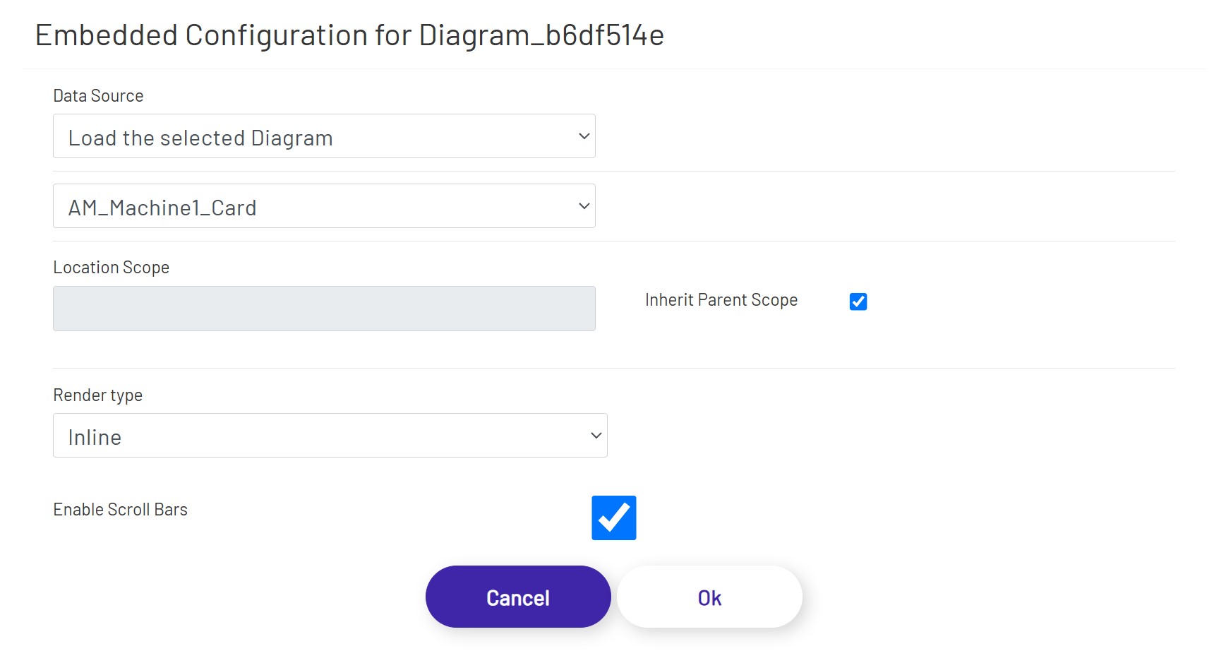
Load Selected Diagram - This option allows the user to load an existing Diagram from the current Prophecy instance. Selecting this option will present the user with a dropdown below the Data Source dropdown populated with Diagrams available in the current instance.
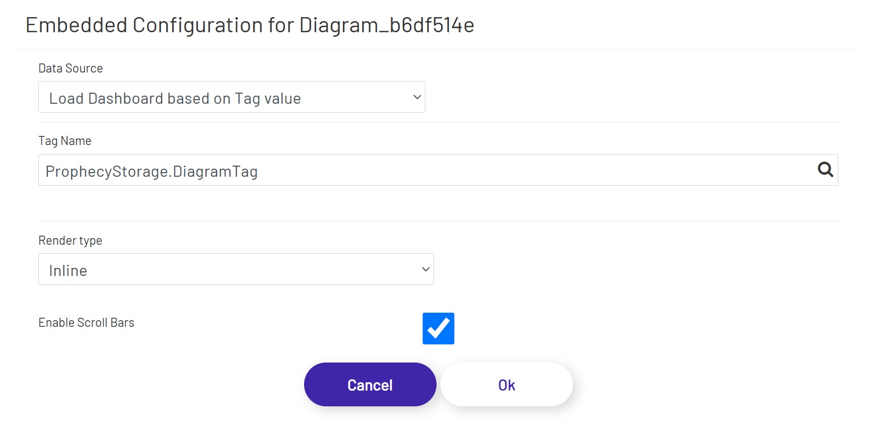
Load Dashboard Based on Tag value - This option allows the user to load a Dashboard using a Tag value. This can be a static Tag value, a Tag set based on an event, or the result of a condition using a Calculation tag. When this option is selected, the Tag selector will be visible, allowing the user to open the Tag Tree for Tag selection.
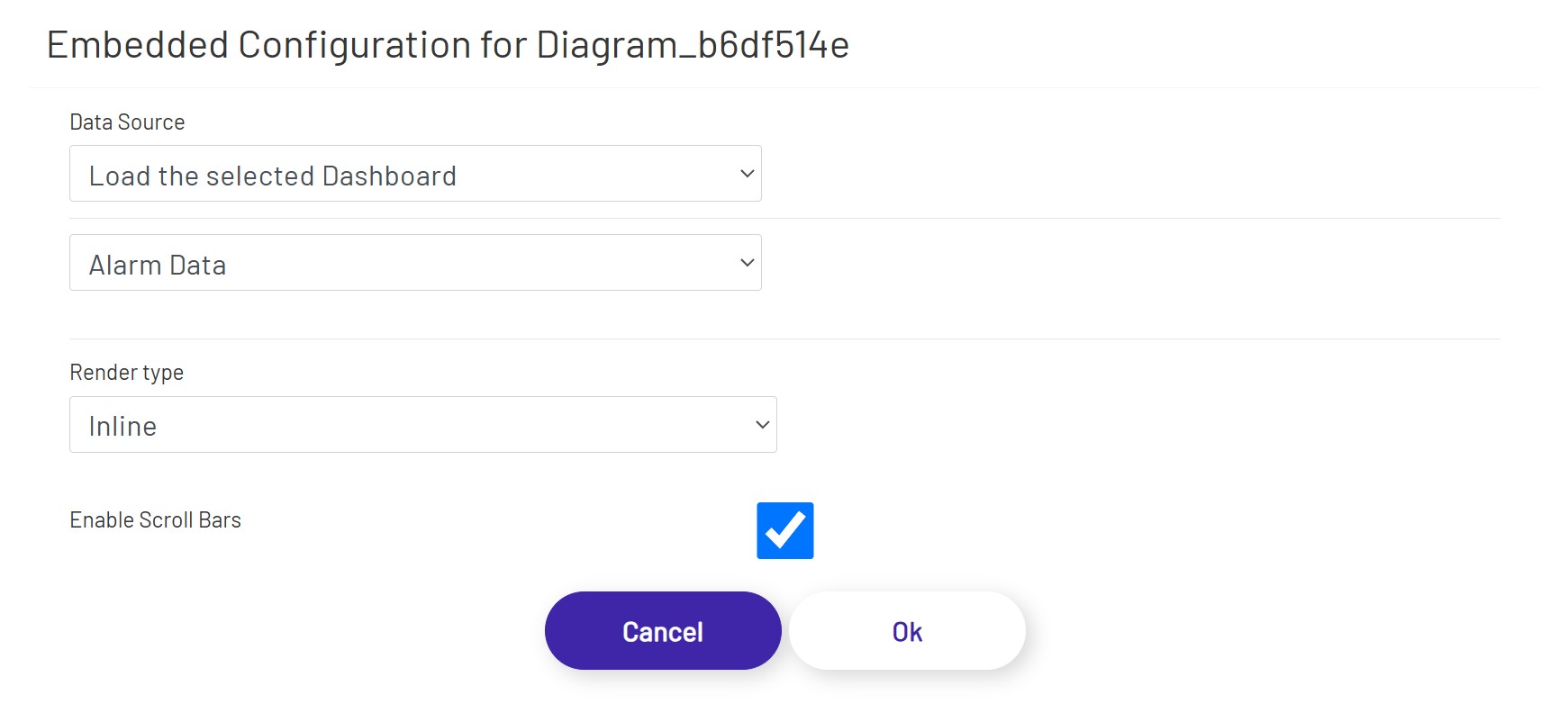
Load Selected Dashboard - This option allows the user to load an existing Dashboard from the current Prophecy instance. Selecting this option will present the user with a dropdown below the Data Source dropdown populated with Dashboards available in the current instance.
Load a website/app based on Tag value - This option allows the user to load an existing website or app using a Tag value. This can be a static Tag value, a Tag set based on an event, or the result of a condition using a Calculation tag. When this option is selected, the Tag selector will be visible, allowing the user to open the Tag Tree for Tag selection.

Load a website/app - This option allows the user to load a website or app using a static value. Selecting this option will present the user with an input to enter a URL for the website\app.

Note: Some websites may have security in place that will not allow them to be open in other applications
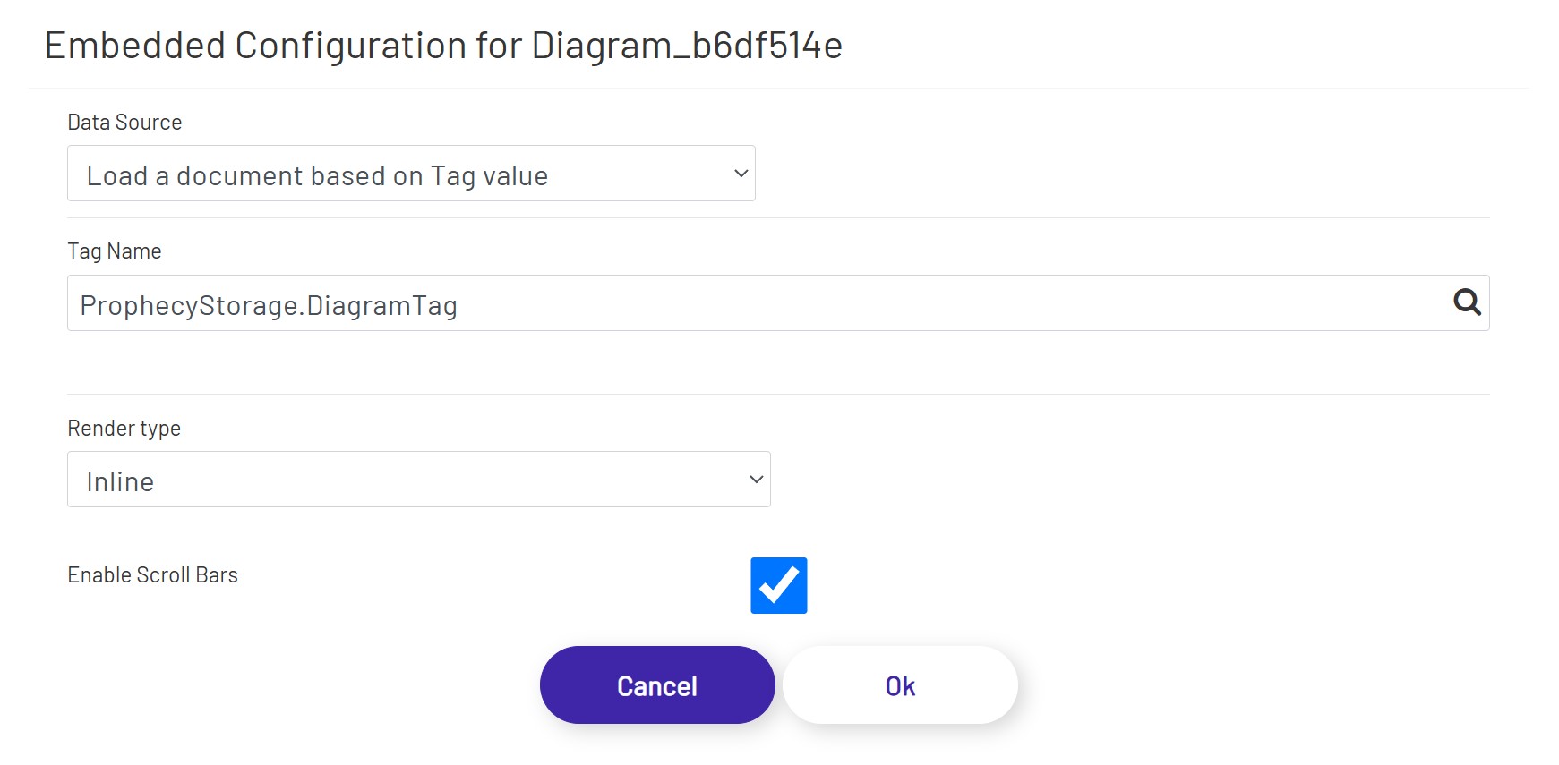
Load a document based on Tag value - This option allows the user to load a document, for example, a PDF file. This can be a static Tag value, a Tag set based on an event, or the result of a condition using a Calculation tag. When this option is selected, the Tag selector will be visible, allowing the user to open the Tag Tree for Tag selection.
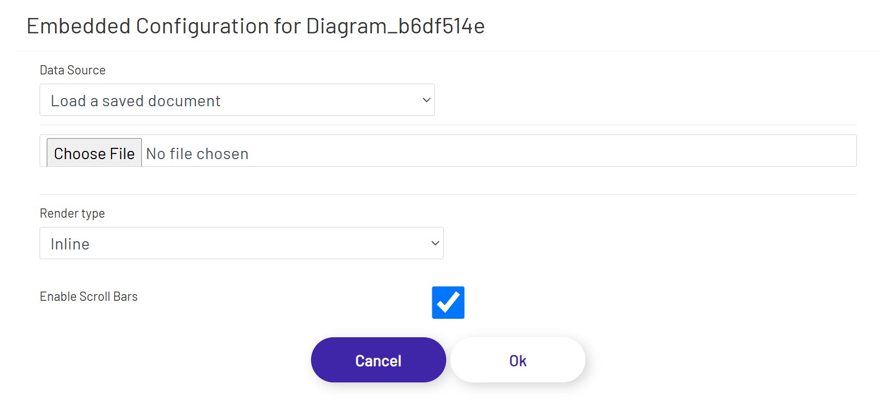
Load a saved document - This option allows the user to upload and save a document, for example, a PDF file. Selecting this option will present the user with a "Choose File" option to upload a file from the user's file system.
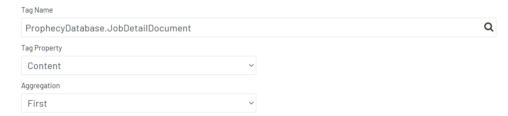
Note: When a DB Tag or a ERP Tag is used for the data source, the user will be presented with options to select/calculate a value from that Tag
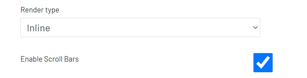
Render type
The Embedded shape supports the render types listed below:
Inline - This option renders the content in the area of this embedded shape.

Note1: When designing Diagrams that will be displayed inside other Diagrams, it is recommended that the diagram be set to 'Responsive'. This will allow the content to scale in the shape container.
NewTab - This option renders a button on the canvas for the embedded shape. When the button is clicked, a new tab with the content will be opened in the browser. When NewTab is selected, the Embedded shape config will have the additional options below:
- Background Image: This is a default image that can be added to the popup button. The default image is set to 'None'.
Note: When this option is selected, the embedded shape can be styled like a regular submit button by using the styling options in the left panel of the diagram edit page. The embedded shape button can also be styled using Themes.
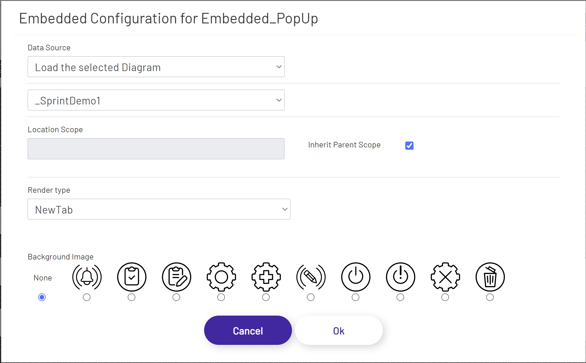
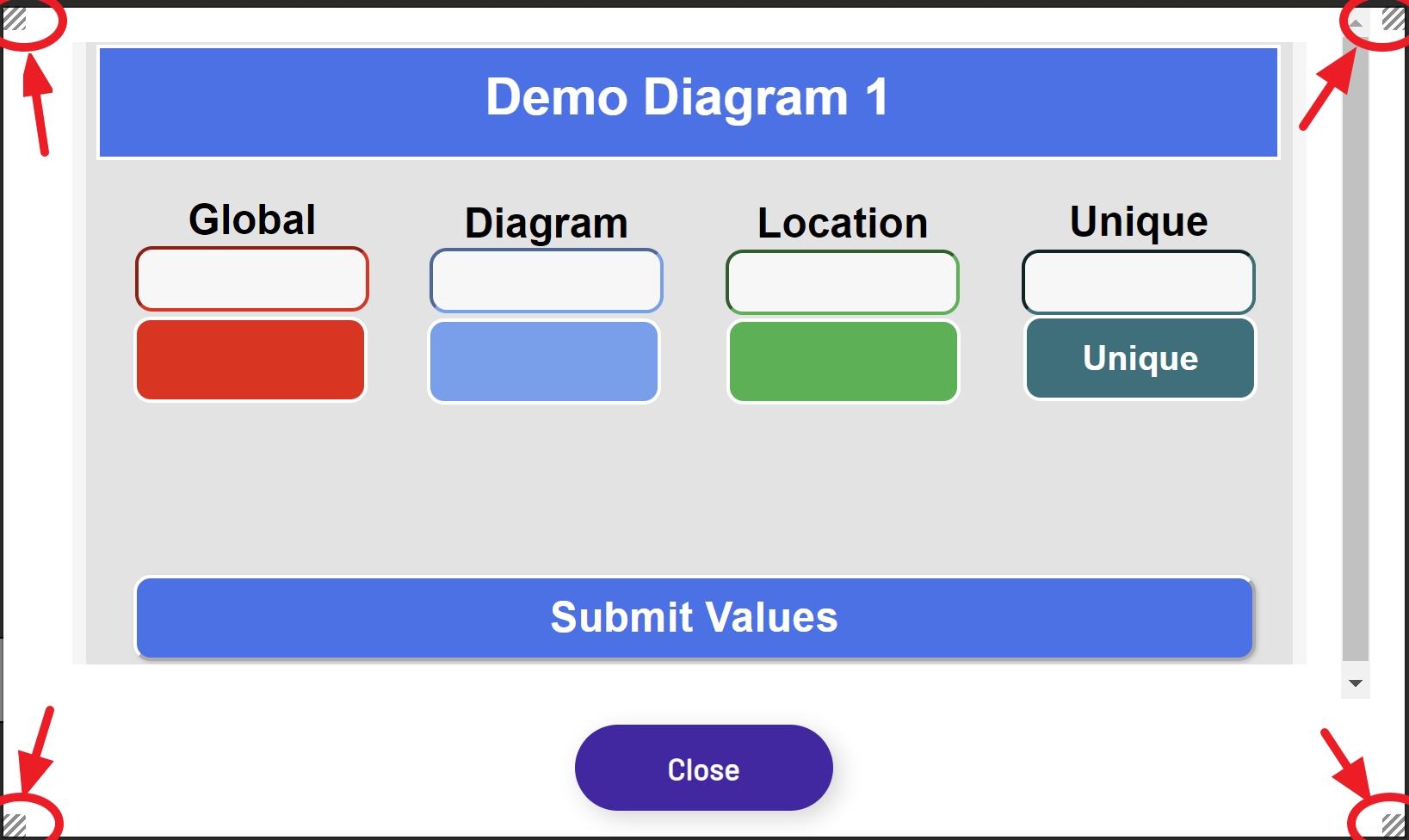
Popup - This option renders a button shape on the Diagram canvas. When the button is clicked, a pop-up window with the selected content will be displayed. When the popup is selected, the Embedded shape config will have the additional options below.
- Width: The initial width of the popup.
- Height: The initial height of the popup.
- Background Image: This is a default image that can be added to the popup button. The default image is set to 'None'.
When the Embedded shape is set to Popup, the pop-up can be resized after it is opened by clicking any one of the handles located at each corner and dragging it up or down.
Note: When this option is selected, the embedded shape can be styled like a regular submit button by using the styling options in the left panel of the diagram edit page. The embedded shape button can also be styled using Themes.