Diagrams that use buttons to submit values to external systems will usually need input fields where operators can specify the values to send. The shapes documented here are the different input options available for operators to use.
Text Input 
To use a 'free form' text box which will allow the operator to enter a wide range of values, drag one of these shapes onto the canvas. If the operator is allowed to enter absolutely any value, then just adding the shape to the canvas is enough to make it work. If there are restrictions on valid values or the input needs to be certain data types, there are more configuration options.
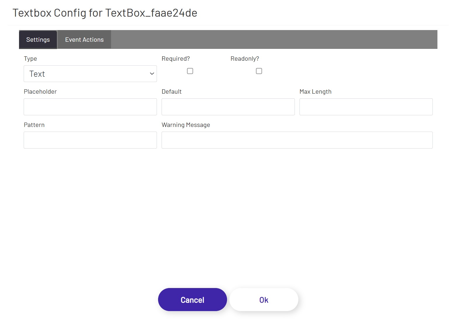
In the Settings tab, the user can define basic configurations of a text box.
- Type: This controls the general type of data the text box is expected to handle. The allowed types are 'Number', 'Range, 'Password', 'Text', 'Date', 'Date/Time', 'Time', 'Month', 'Week', and 'Color' . Each has a different mix of the settings below.
- Required: If checked, operators will be required to provide a value here before clicking any connected submit buttons. If the field is left empty, the operator will see a message that all required fields must be completed.
- Readonly: If checked, this text input control will be read-only.
- Placeholder: A value here will appear as faint text in the text box before an operator clicks into it. This text is different than the 'Default' setting below because the placeholder text is not a real value in that text box, it's just a hint for what the operator should enter. If the operator does not enter anything, that input counts as empty. This is only allowed for 'Text' type inputs.
- Default: A value here will be pre-populated in the text box when the diagram first loads. This text is different than the 'Placeholder' setting above because the placeholder text is not a real value in that text box, it's just a hint for what the operator should enter. The default value is a real value which will be used if the operator doesn't change it.
- Max Length: This is the maximum number of characters allowed in this field. This is only allowed for 'Text' type inputs.
- Pattern: This setting allows a designer to provide a regular expression to enforce rules on the format of data entered. Regular expressions are complex. Third-party tools like regex101 can be used to help create them, or you can contact the Prophecy Consulting Group for assistance. This is only allowed for 'Text' type inputs.
- Warning Message: This optional setting can be used to specify the error message shown to an operator when any of the configured restrictions are violated. If left empty, each restriction type has its own default error message, e.g. "Value cannot be more than X characters.".
- Min: For 'Number' type inputs, this specifies the minimum value the operator is allowed to enter.
- Max: For 'Number' type inputs, this specifies the maximum value the operator is allowed to enter.
Note: Different browsers enforce restrictions like valid characters, max counts, etc. differently. It is sometimes possible for operators to bypass those restrictions by copy/pasting a value into that field, for example. The diagram will enforce the rules as best as possible, but input values may need further validation in other systems.
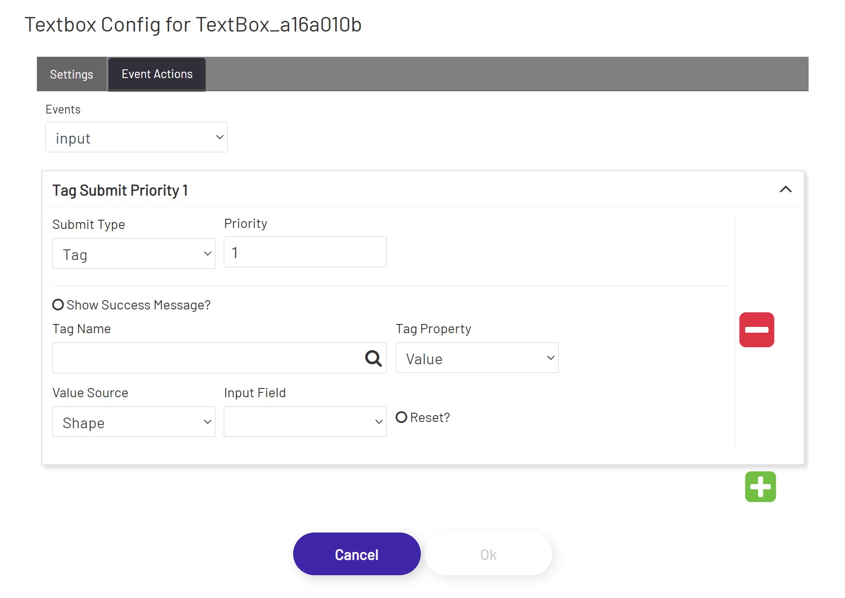
In the Event Actions tab, the user can define triggering one or more actions when an event occurs in this text box.
- Events: This is the event of this text box that trigger action(s) below. Each event has its own set of actions.
- Submit Type: This is the type of action that will be performed when this submit's turn comes up - Tag, Mongoose, or Database.
- Priority: This sets the order in which the submits triggered by this button click will occur. As noted above, if a submit fails, the button processing aborts and any lower-priority submits will not happen.
- Show Success Message?: If enabled, a message will be displayed to the operator that says 'Action completed successfully.' if this action is successful. Note that only one success message will appear on the screen at once. Those messages fade away over 5 seconds, so if another submit succeeds after that long (after a long-running Mongoose query, for example) the message will display again and start fading again.
Note: In View Live, if the user moves off of the tab that the diagram is running in, the blur event is triggered and when returning to the live diagram tab, the focus event is triggered.
Text Area 
To use a multi-line text input control, drag one of these shapes onto the canvas. If the operator is allowed to enter absolutely any value, then just adding the shape to the canvas is enough to make it work. If there are restrictions on valid values, there are more configuration options.
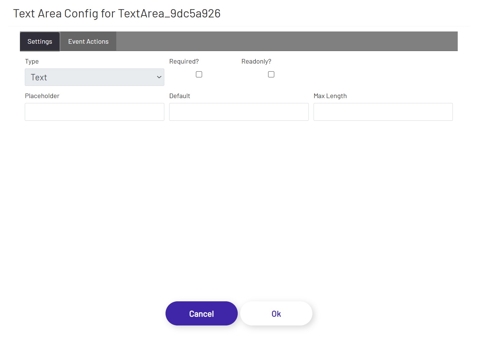
In the Settings tab, the user can define basic configurations of a text area.
- Required: If checked, operators will be required to provide a value here before clicking any connected submit buttons. If the field is left empty, the operator will see a message that all required fields must be completed.
- Readonly: If checked, this text input control will be read-only.
- Placeholder: A value here will appear as faint text in the text box before an operator clicks into it. This text is different than the 'Default' setting below because the placeholder text is not a real value in that text box, it's just a hint for what the operator should enter. If the operator does not enter anything, that input counts as empty.
- Default: A value here will be pre-populated in the text box when the diagram first loads. This text is different than the 'Placeholder' setting above because the placeholder text is not a real value in that text box, it's just a hint for what the operator should enter. The default value is a real value which will be used if the operator doesn't change it.
- Max Length: This is the maximum number of characters allowed in this field.
Note: Different browsers enforce restrictions like valid characters, max counts, etc. differently. It is sometimes possible for operators to bypass those restrictions by copy/pasting a value into that field, for example. The diagram will enforce the rules as best as possible, but input values may need further validation in other systems.
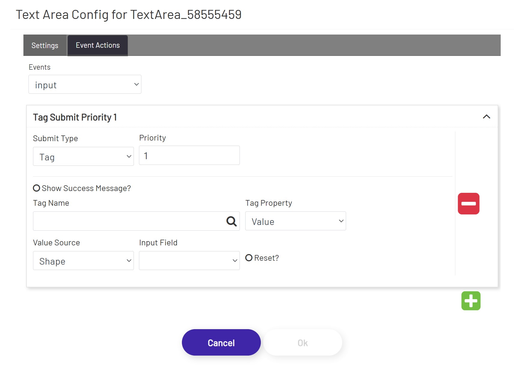
In the Event Actions tab, the user can define triggering one or more actions when an event occurs in this text area.
- Events: This is the event of this text area that trigger action(s) below. Each event has its own set of actions.
- Submit Type: This is the type of action that will be performed when this submit's turn comes up - Tag, Mongoose, or Database.
- Priority: This sets the order in which the submits triggered by this button click will occur. As noted above, if a submit fails, the button processing aborts and any lower-priority submits will not happen.
- Show Success Message?: If enabled, a message will be displayed to the operator that says 'Action completed successfully.' if this action is successful. Note that only one success message will appear on the screen at once. Those messages fade away over 5 seconds, so if another submit succeeds after that long (after a long-running Mongoose query, for example) the message will display again and start fading again.
Dropdown 
If you prefer to restrict the HMI user to specific values rather than using a text box, drag one of these shapes onto the canvas. Once the shape is on the canvas, make sure it is selected and click the 'Configure Dropdown Options' button in the left panel.
In the Values tab, the user can create the list of options for the operator to choose from.
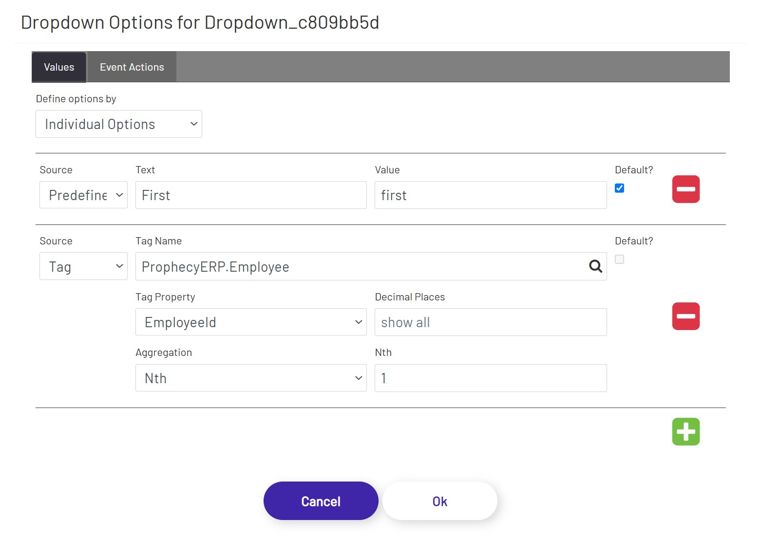
If 'Individual Options' is chosen to create the list of options, each option can be formed from either 'Predefined' or 'Tag'.
When 'Predefined' is chosen as Source for an option: - Text: This is what the operator will see. - Value: This is what will be set on the tag you choose on the button when it is submitted. This does not have to match what is in 'Text', but make sure the Value you enter makes sense for the data type of the tag you're working with. Entering 'Bob' for a tag with an integer data type will cause the tag value to not update. - Default: If this is checked, that option will be pre-selected when the operator first loads the diagram. The dropdown will reset to this value if an associated submit button is clicked.
When 'Tag' is chosen as Source for an option: - Tag Name: This is the name of the tag whose data the option will display. Click the magnifying glass icon to open the tag selector window. - Tag Property: This is the property of the tag that is used to retrieve the value. - Decimal Places: If a numeric Tag property is chosen above, this rounds the value to a specified number of decimals if it is not blank. - Aggregation: If a DB Tag or an ERP Tag is chosen above, this aggregation selects/calculates a value from that Tag. - Nth: If 'Nth' is chosen above as Aggregation, this defines the index of the value from its Tag property's value collection.
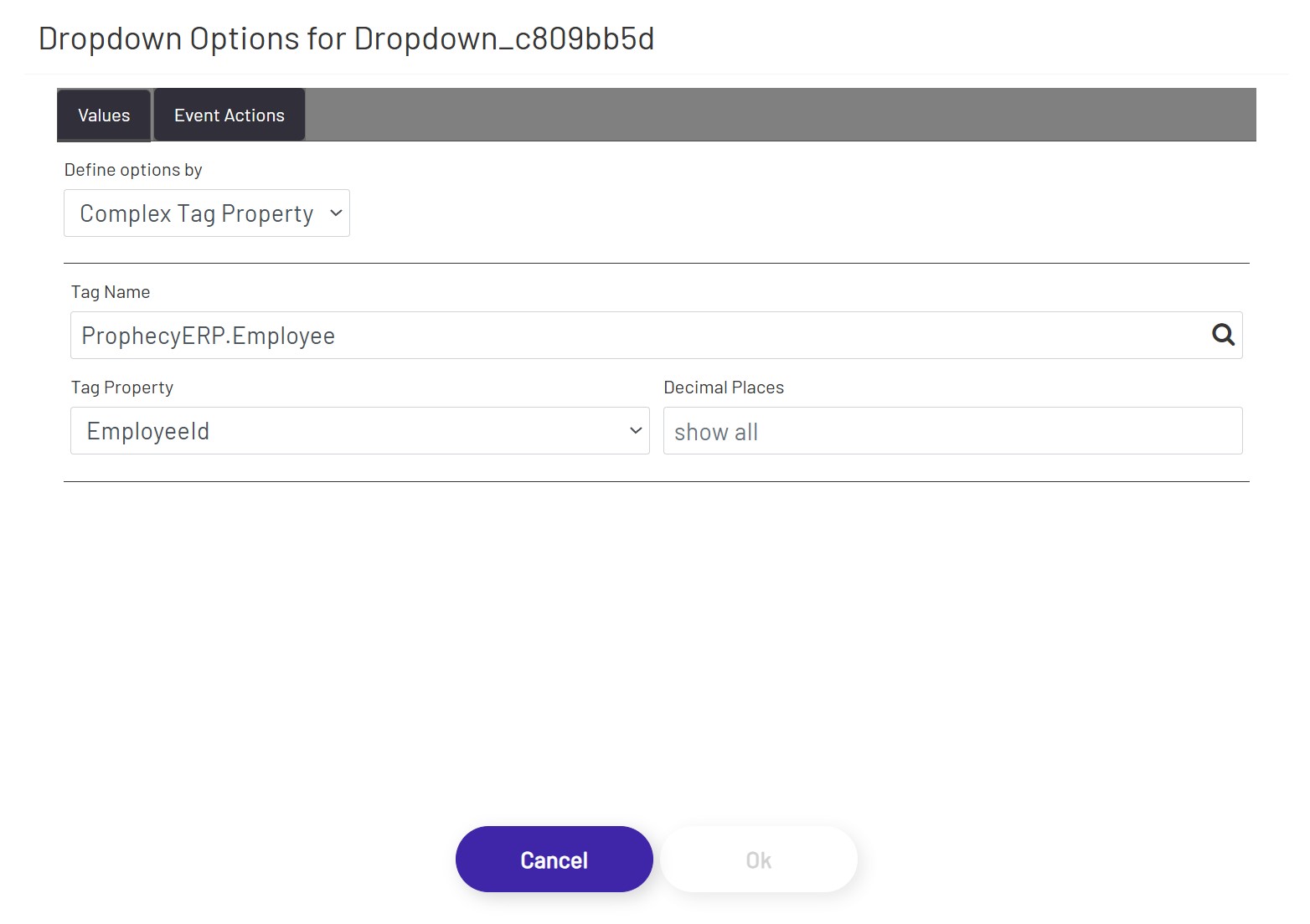
If 'Complex Tag Property' is chosen to create the list of options, the list is formed by the Tag property collection. - Tag Name: This is the name of the tag whose data the options will display. Click the magnifying glass icon to open the tag selector window. - Tag Property: This is the property of the tag that is used to retrieve the value. - Decimal Places: If a numeric Tag property is chosen above, this rounds the value to a specified number of decimals if it is not blank.
In the Event Actions tab, the user can define triggering one or more actions when an event occurs in this dropdown.
- Events: This is the event of this dropdown that trigger action(s) below. Each event has its own set of actions.
- Submit Type: This is the type of action that will be performed when this submit's turn comes up - Tag, Mongoose, or Database.
- Priority: This sets the order in which the submits triggered by this button click will occur. As noted above, if a submit fails, the button processing aborts and any lower-priority submits will not happen.
- Show Success Message?: If enabled, a message will be displayed to the operator that says 'Action completed successfully.' if this action is successful. Note that only one success message will appear on the screen at once. Those messages fade away over 5 seconds, so if another submit succeeds after that long (after a long-running Mongoose query, for example) the message will display again and start fading again.

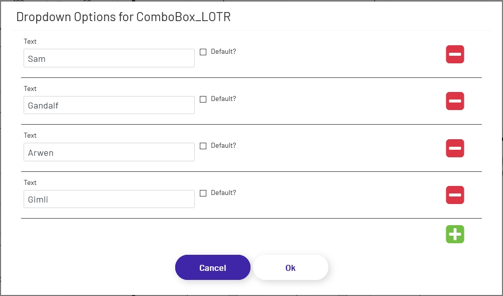
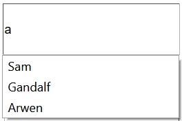
Combo Box 
Combo boxes allow users to type or scan input into a field, with a list of matching options presented in a dropdown as they type. This helps ensure that accurate values are provided, while still allowing the operator to enter a value other than what appears in the predefined list when necessary. Combo boxes are configured the same way Dropdowns are, with the exception that they do not have a separate 'Value' column. When using a combo box, the text shown to the user and the value sent to a tag or CSI will always be the same. If you need to be able to display text to a user but submit a different value, use a dropdown shape.
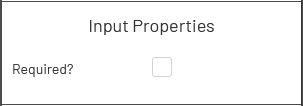
Combo boxes can be marked as required by selecting the shape and then clicking this box in the left properties panel:
Toggle Switch 
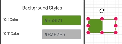
The toggle allows you to restrict operator input to true/false. There is no required configuration for toggles once they're dragged onto the canvas, though you can change the on/off colors if you don't like the defaults:
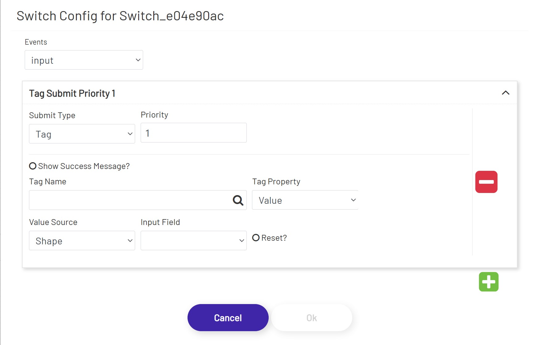
Once the shape is on the canvas, make sure it is selected and click the 'Configure Switch Options' button in the left panel.
- Events: This is the event of this toggle switch that trigger action(s) below. Each event has its own set of actions.
- Submit Type: This is the type of action that will be performed when this submit's turn comes up - Tag, Mongoose, or Database.
- Priority: This sets the order in which the submits triggered by this button click will occur. As noted above, if a submit fails, the button processing aborts and any lower-priority submits will not happen.
- Show Success Message?: If enabled, a message will be displayed to the operator that says 'Action completed successfully.' if this action is successful. Note that only one success message will appear on the screen at once. Those messages fade away over 5 seconds, so if another submit succeeds after that long (after a long-running Mongoose query, for example) the message will display again and start fading again.
Time Input 
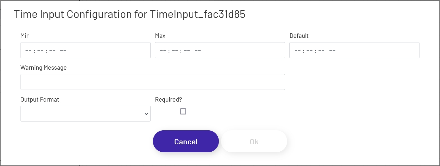
Time input shapes allow operators to input time values that are more likely to be in a valid format than using the free-form text input shape. To configure one of these inputs, drag it onto the canvas and then click the 'Configure Time Input Options' button in the left panel:
- Min: This specifies the minimum value the operator is allowed to enter. It should be in HH:MM:SS AM/PM format.
- Max: This specifies the maximum value the operator is allowed to enter. It should be in HH:MM:SS AM/PM format.
- Default: This is the default value the shape will have when the diagram is first loaded. If the operator does not change the value, this will be used when any associated buttons are clicked. It should be in HH:MM:SS AM/PM format.
- Warning Message: This optional setting can be used to specify the error message shown to an operator when any of the configured restrictions are violated. If left empty, each restriction type has its own default error message, e.g. "One or more required fields is empty.".
- Output Format: Tags and CSI format their dates differently. Choose the target this input value will be sent to and the provided time will be converted to the correct format when the button is clicked.
- Required: If checked, operators will be required to provide a value here before clicking any connected submit buttons. If the field is left empty, the operator will see a message that all required fields must be completed.
Note: Different browsers enforce input restrictions differently. It is sometimes possible for operators to bypass those restrictions by copy/pasting a value into that field, for example. The diagram will enforce the rules as best as possible, but input values may need further validation in other systems.
Required Fields
Most input shapes can be marked as required when needed. If an input marked as required doesn't have a value in it when a button connected to that input field is clicked, the operator will see a message prompting them to fill in all fields:
