Diagram Modeler allows the user to create graphical representations of shop floors, logical flows, organizational charts, etc. Even HMIs and Operator Interfaces that display realtime data and allow operators to enter information can be created. A user must belong to the Diagrams role to work with diagrams.
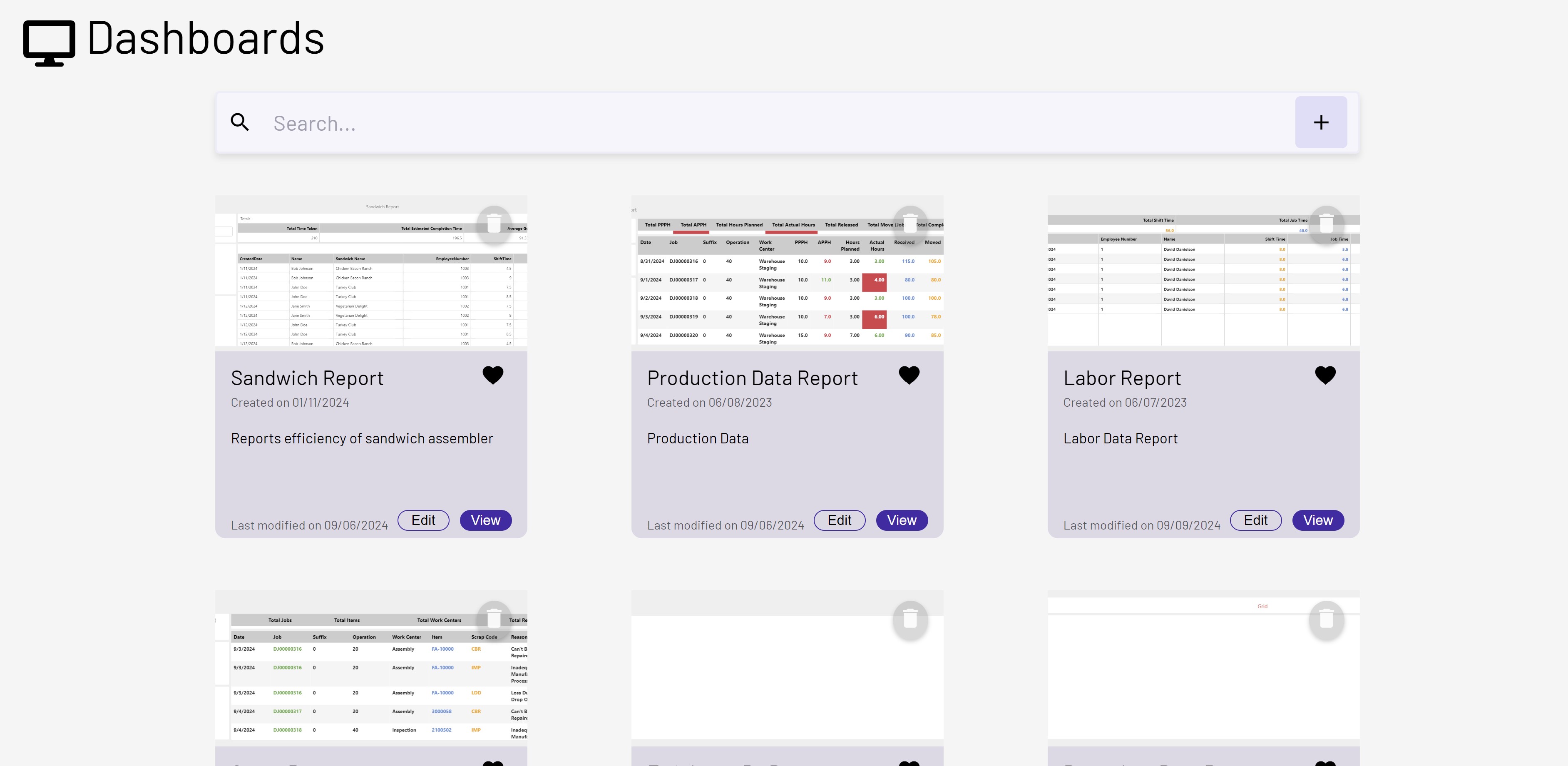
When first loading the Diagrams page, the user should see a page that lists all of the existing diagrams in cards. This page will allow the user to edit, view, favorite or delete a diagram. This page can also search for a diagram using the search bar at top. 10 diagrams will initially be loaded but the page size can be changed or pages can be cycled through using the paginator at the bottom.
Once in edit/create mode, the Diagram Modeler is made up of several main parts. See below the image for descriptions of the usage of each:
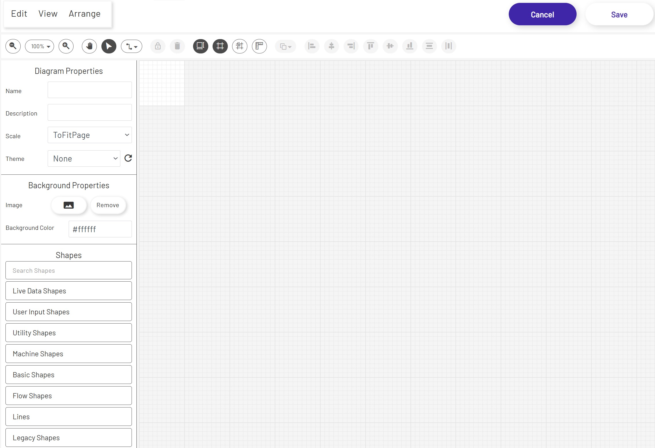
Top Bars
The top bar gives quick access to many drawing functions, editing commands, and arrangement options. If the diagram has been saved, a link will appear at the upper right which opens the diagram in a separate tab in live mode, which can be useful for display on andon boards or for HMIs. Users who do not have the correct permissions to create new or edit specific existing diagrams will see warnings here at the top of the page.
Canvas
The main canvas is the grid area that shapes can be dragged onto from the palette. The size of this canvas is determined by the choice made in the first step above. When no shape is selected, properties for the diagram as a whole such as background color, name, etc can be set in the left panel.
Properties
The left panel allows editing of the currently-selected shape, or the main diagram if no shape is selected. Different types of shapes have different properties, so the options available here will vary depending on what is currently selected on the canvas.
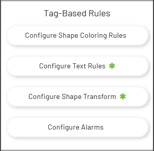
Some shapes have features that require more complex configuration than can be shown in the left panel, so they have buttons to open separate configuration windows. Basic shapes, for example, have several of these options available. See the 'Live Values' section below for more information and links to some of the more complex features configurable with these buttons. Note that if the selected shape has already had configuration for its specific feature set up, a green * will appear on that button as a quick indicator:
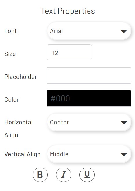
Some shapes like Textbox and Tag Value support font family, font size, font color, and text alignment configuration etc. Placeholders are available for shapes like Tag Value, Data Point Value, and Mongoose Value.
Palettes
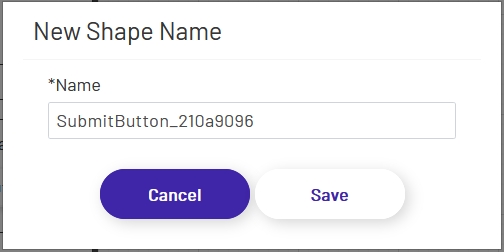
Below the properties panel on the left is the palette, which provides options for various kinds of shapes that can be dragged onto the main canvas. Simpler shapes are given names automatically when added to the canvas. More complex shapes that may need to be used later for configuring some other HMI shapes will open a prompt with an automatically-generated name that the user can approve or edit.
There are several types of shapes available. Users can see the different types by clicking on the accordion headers in this section:
-
Live Data Shapes: These shapes allow a diagram to display live values from Mongoose IDO calls , tags, and Data Points. There are also buttons which allow operators to perform actions.
-
User Input Shapes: These shapes are used to let operators enter the values that will be sent to tags in the Data Acquisition Engine or to CSI.
-
Utility Shapes: This section allows designers to add links, images, and text blocks to the diagram.
-
Machine Shapes: These represent several types of factory machines, along with conveyor shapes that can be 'stitched' together to draw out conveyor lines. These have limited properties that can be set.
-
Basic Shapes: This section contains shapes like circles, rectangles, etc. These shapes have a wide variety of properties that can be set, making them very flexible for sections of a diagram that cannot be represented by one of the predefined machine shapes.
-
Flow shapes: These are standard shapes often used on flowcharts, useful for diagramming logical or procedural processes more than physical plant. Like basic shapes, they have a wide range of properties that can be set, so they can be used to represent many things in a diagram.
-
Lines: This section contains connectors that can be used between other shapes, to represent various types of flows. Each connector has start and endpoint shapes that can be configured, as well as other properties that vary the appearance of the line.
-
Legacy Shapes: This section contains shapes that are obsoleted and they are not recommend to be used in new diagram development.
Live Values
Diagrams can be more powerful than they may appear at first. They support a lot more than simply dragging shapes onto the canvas to draw. Tag Data and Mongoose Data shapes allow display and manipulation of realtime machine and ERP data, and many shapes support coloring, transform, text, and workflow rules that can change diagram display and functionality dynamically according to tag values. Alarm monitoring can even alert workers to potential problems instantly.
Diagram Themes
To use a theme in a Diagram, follow the instructions here for applying themes from the theme designer to the Diagram. Diagram theme's can save a lot of time when building diagrams by allowing the user to provide default theming to controls when creating new diagrams, or when modifying existing diagrams.
Diagram Responsiveness
Every new diagram starts in responsive mode by default. You can toggle this setting with the Responsive checkbox in the left‑hand toolbar:

When responsive is checked, the diagram expands to fill the entire screen and adjusts automatically to different viewports.
When responsive is unchecked, the diagram is locked to the exact height and width specified in the H and W fields beneath the checkbox. It stays centered on the page and does not resize, and shape‑scaling features are disabled.
For detailed guidance on designing with responsiveness, see the instructions here